
In our data-driven world, companies must rely on business intelligence to inform valuable decision-making to remain competitive. A big part of this is having a real-time holistic view of valuable data in a readily accessible format that’s easy to understand. This way, you can boost operational efficiency and ultimately increase return on investment. Business dashboards keep stakeholders and decision-makers aware of what’s happening by displaying essential data, metrics, and key performance indicators (KPIs). While one might say there are over a million and one types of dashboards depending on the content, design, etc., they fall under three categories.
Read on to find out the three categories of business dashboards and learn which is right for your business.
Without further ado, let’s dive in.
Table of Contents
What Is A Dashboard In Business?
A business dashboard, also known as business intelligence (BI) dashboard, is a single-view representation of key business data points, metrics, and KPIs. Successful organizations leverage dashboards to display useful data points, depending on their goals, and keep track of their performance. These organizations often record increased business process efficiency and positive growth markers.
This all makes sense. If you’re actively measuring and monitoring metrics, as business dashboards empower you to, you’re actively aware of your performance. This puts you in the perfect position to affect those metrics positively.
Dashboards are data visualization tools with applications in different industries. For example, healthcare, HR, marketing, sales, logistics, or IT, are implementing different types of business dashboards to improve productivity. So, regardless of your industry, if you aim to improve performance and stay relevant in your market, you must effectively utilize data. Business dashboards empower you with the means to do so.
Why Are BI Dashboards Important To Businesses?
Making data-driven decisions is essential to remain competitive in any market. BI dashboards make it easy to measure and track key metrics in real time. This, in turn, empowers stakeholders and decision-makers with the ability to gain actionable business insights across different departments —for example;
- Customer demographics
- Sales KPIs
- Inventory management
- Fluctuations in financial markets
- Performance forecasting.
In other words, businesses can leverage dashboards to monitor team data in a single view. This simplifies and informs the decision-making process and improves overall business performance.
Tips for creating business dashboards
Types Of Dashboards
While dashboards are great, their specific performance is only as good as their implementation. A big part of business dashboard success lies in the dashboard type. Therefore, choosing the appropriate dashboard type based on your business needs is crucial. Let’s see the different types of dashboards and what needs they satisfy.
Strategic Dashboard
A strategic dashboard is a high-level overview of long-term business performance. This dashboard type tracks data across all departments and can get complex. Senior management and executive team use strategic dashboards to inform long-term decision-making. Therefore, unlike other dashboard types, as we’ll see later on, strategic dashboards update less frequently.
If you aim to inform day-to-day decision-making, strategic BI dashboards are not great options. However, long term, having a bird’s eye view of overall business performance across every department is great for long-term success. Examples of types of data included in a strategic dashboard include:
- Yearly or monthly revenue
- New and returning customer data
- Cost per customer
Let’s look at a strategic dashboard example.
Management Strategic Dashboard
The image below is a sales management dashboard —-a good example of strategic dashboards. It contains only relevant sales data and summarizes the company’s sales performance story. The dashboard focuses on product performance and revenue. It is set to periodically update after specific timeframes, showing KPIs such as Average shipping time, product category by inventory, customer satisfaction, and cost of goods sold.
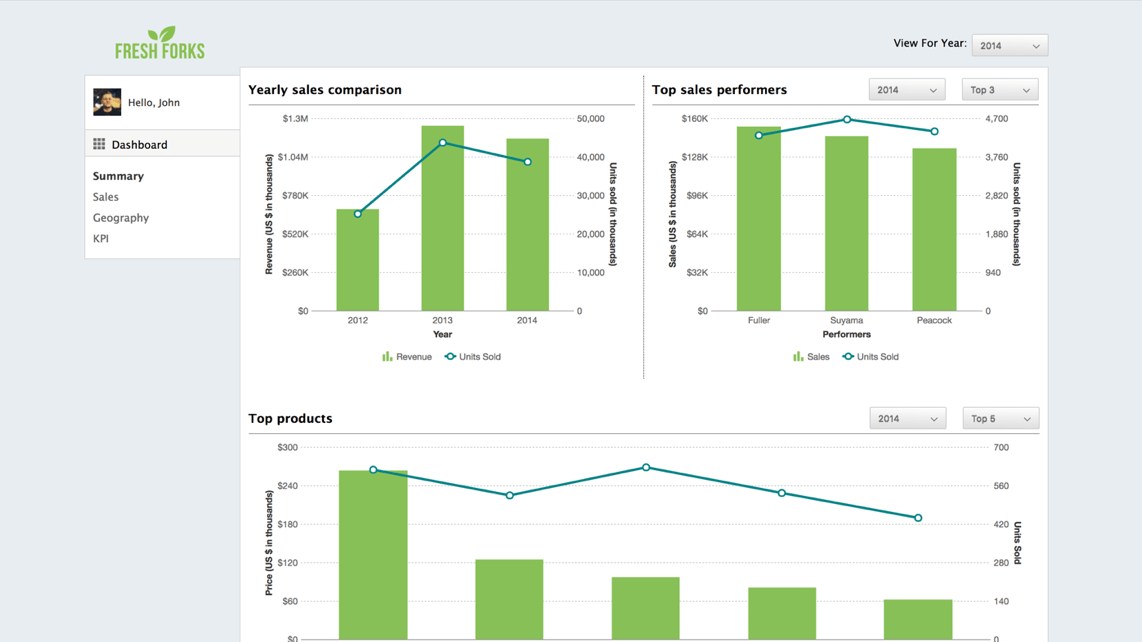
The example above provides answers to questions like:
- What is my revenue compared to this time last year?
- How well do different products perform in different countries and cities?
- Which country produces the most revenue compared to the previous year?
Operational Dashboard
While strategic dashboards give a long-term view of the bigger picture, operational dashboards measure and track individual short-term operations, for example, marketing campaigns. This dashboard type provides real-time data. As a result, it is a great option for keeping track of day-to-day activities.
In today’s fast-paced world, the importance of this dashboard type cannot be overstated. Junior-level managers can leverage operational dashboards to gain insight into the performance of sub-tasks of campaigns. Examples of data types you’ll find in an operational dashboard include:
- Number of landing page visits
- Number of conversions from landing page visitors
- Conversions from a specific ad campaign.
Below’s an operational dashboard example:
Marketing Operational Dashboard
The marketing dashboard below is a great example of an operational dashboard. It shows the performance of a marketing campaign over the last month. It contains important metrics and KPIs such as:
- Leads
- Traffic
- Conversion by traffic source
- Revenue
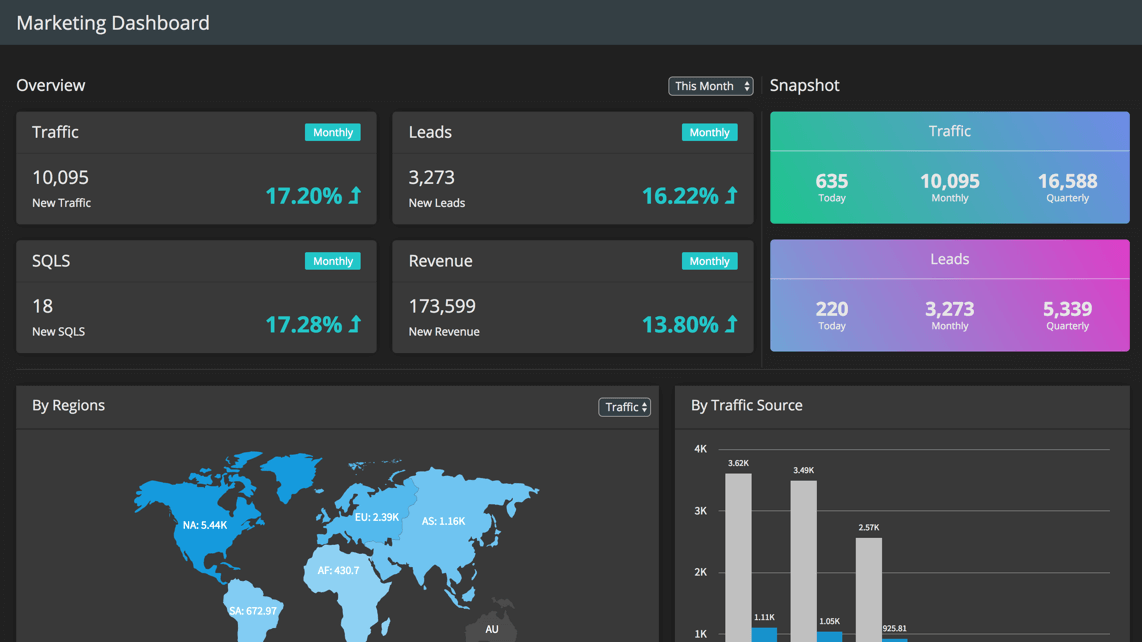
Overall this dashboard allows us to assess the real-time performance of the overall campaign. This way, we can identify areas that need optimization. This is particularly useful for marketing departments that run multiple campaigns. You can track real-time data of all campaigns in a single view using operational dashboards.
Analytical Dashboard
Unlike strategic and operational dashboards, analytical dashboards contain vast data. Therefore, it requires the services of data analysts to retrieve valuable insights. Generally, executives use this dashboard type for extra analytical support. An analyst infers granular data values from an analytical dashboard. Then creates a report, which senior executives can use to inform decision-making.
Let’s look at an example:
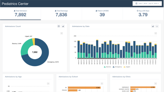
Healthcare Analytical Dashboard For Patients
The below example shows a pediatric center dashboard. It aims to track the number of admissions for different categories. Data included in this dashboard include:
- Total admissions
- Admission by age
- Admission by the level of emergency
- Admission per date for different categories.
Tip: how to build analytical dashboards
Tactical Dashboard
Like analytical dashboards, tactical dashboards can contain loads of data, depending on the use case. It is used to analyze the performance of metrics that directly affect business and/or departmental goals. Tactical dashboards are common in technology teams. Here’s an example.
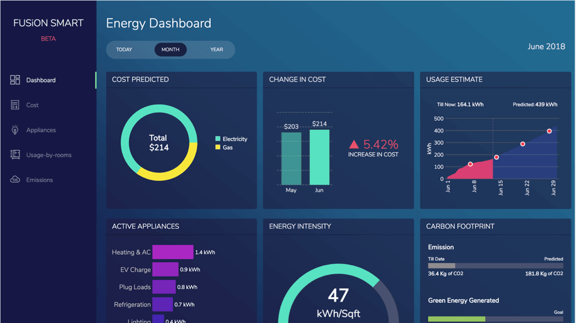
Energy Management Tactical dashboard
This dashboard provides an overview of energy operations: from active appliances, energy intensity, and carbon footprint to predicted cost and real-time cost changes.
Tip: Get more results from your dashboards
Conclusion
It is always best to get off with the right strategy using dashboard design best practices. This will ensure you include only important business data that match your dashboard goals.
The two most important points to consider when implementing a business dashboard are:
- Data puking: representing loads of data without providing any useful insight. Avoid data puking at all costs. It defeats the purpose of a business dashboard.
- Choice of dashboard type: the dashboard type you use significantly impacts what data you track and the purpose for which you’re tracking.
The aim is to use dashboard types that help you achieve your business goals. Fusioncharts offer real-time templates of the different types of dashboards discussed in this article. Check out Fusioncharts business dashboards to get started.


