
Every company, big or small, collects different types of data. However, these data sets are available in raw form. One of the best ways to transform such raw data into actionable insights is by using graphs and charts. Graphs and charts allow businesses to visualize data, identify trends and patterns, and track key performance indicators. As a result, these visualizations help companies make critical strategic decisions. There are many different types of charts and graphs used to visualize different types of data. For example, you can use a bar chart to represent categorical data. Similarly, when you want to depict continuous data over time, you can use a line chart.
In this article, we’ll discuss twenty popular types of charts and graphs that you can easily make with FusionCharts to visualize your data.
Table of Contents
What Are Different Types Of Charts and Graphs?
Bar Chart
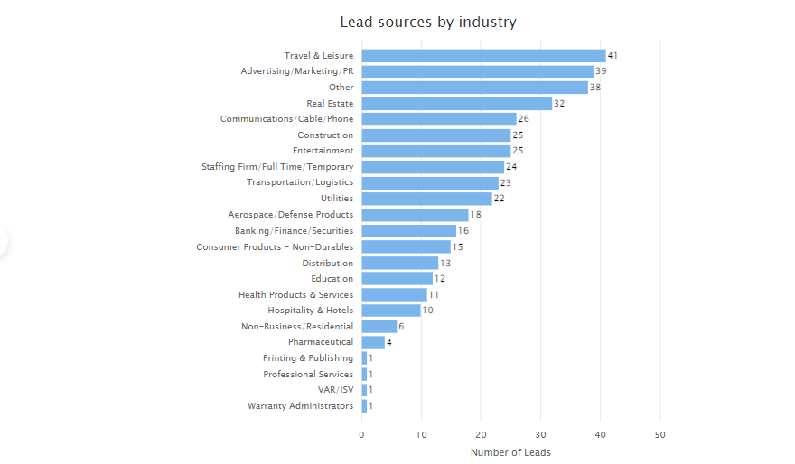
You can use bar charts to represent data that can be divided into several categories. A bar chart consists of horizontal and vertical axes, where one axis consists of bars representing different categories, and the other axis represents discrete values.
Line Chart
Use a line chart or line graph to represent continuous data over time. For example, we can use a line chart to represent changes in stock prices over ten years. Line charts also help identify overall trends.
Pie Chart
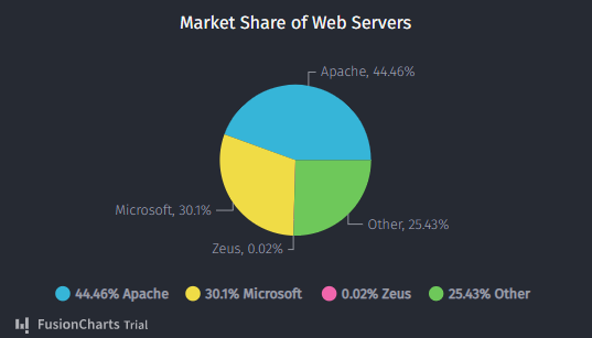
A pie chart allows us to plot categorical data on a circular graph to show the percentages of a whole. Pie charts help depict how a total amount is divided between different categories or variables.
You can learn how to make a pie chart in Excel here.
Density Maps
Maps provide an efficient way to visualize your business’s performance in different regions. For example, you can use maps to show profits and sales in different areas.
Use a density map when your data set consists of a large number of data points in a small geographic area.
Scatter Plot
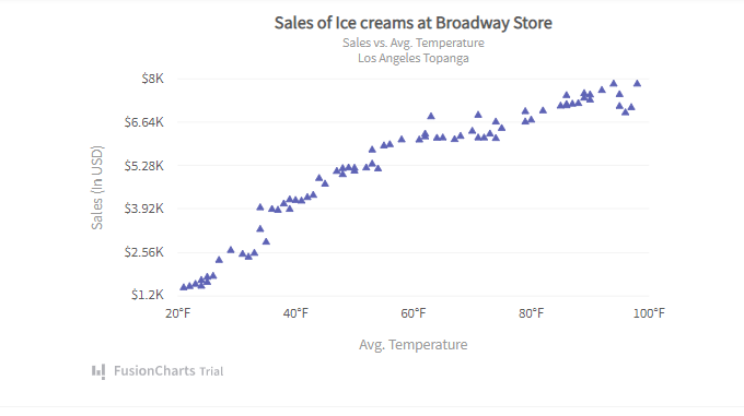
A scatter plot or scatter chart consists of dots that represent values for two different variables. When you need to compare two numeric variables or show the relationship between variables, use scatter charts.
Gantt Chart
Project managers use gantt charts to plan and schedule different activities, tasks, and events. It consists of bars representing different tasks or activities and a time scale. The length and position of the bars show the start date, end date, and duration of the activities.
Bubble Charts
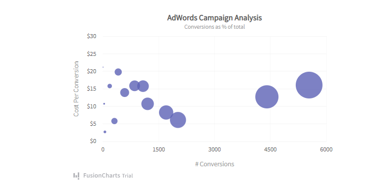
A bubble chart, also called a bubble plot, is similar to a scatter chart, but it shows the relation between three numeric variables. Each bubble in a bubble chart represents a single data point.
Population Pyramids
A population pyramid is a visualization that shows the distribution of a given population by gender and age during a particular period. A population pyramid that doesn’t have a classic shape might show an irregularity in a given population.
Spider Charts
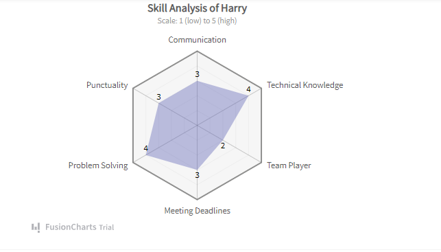
Spider charts, also known as radar charts, are used to represent multidimensional and multivariate data in a 2D chart. A spider chart is also called web charts or star charts.
Stock Charts
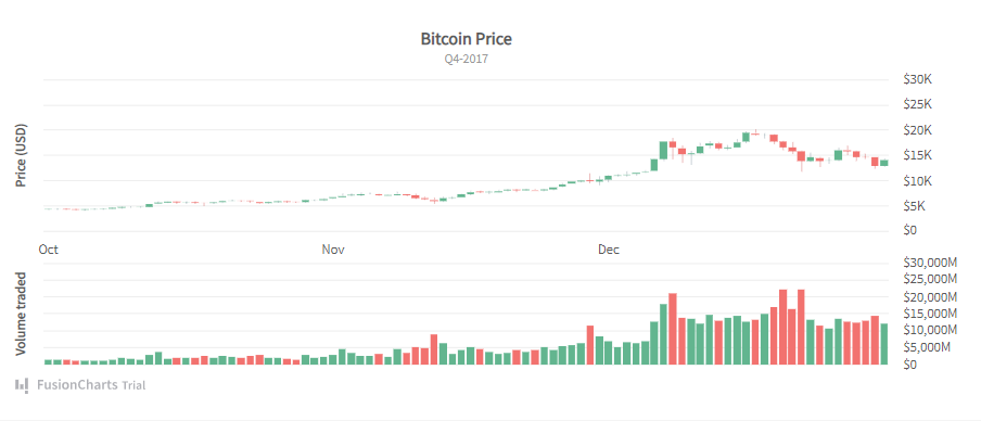
A stock chart is a chart that we can use to display the price of a stock during a particular time to make crucial buying and selling decisions. We can also use these charts to track and compare multiple stocks at the same time.
Flow Charts
A flow chart is a type of diagram or visualization that shows a process or workflow. It consists of different shapes representing different steps in a process, and arrows that connect the shapes. There are different types of flow diagrams, such as workflow diagrams, process flow diagrams, data flow diagrams, and decision flows.
Control Charts
A control chart, also called a shewhart chart or process behavior chart, is widely used for quality control processes. A control chart typically consists of points plotted on a 2D chart. It helps us understand how a process changes over time.
Waterfall Charts
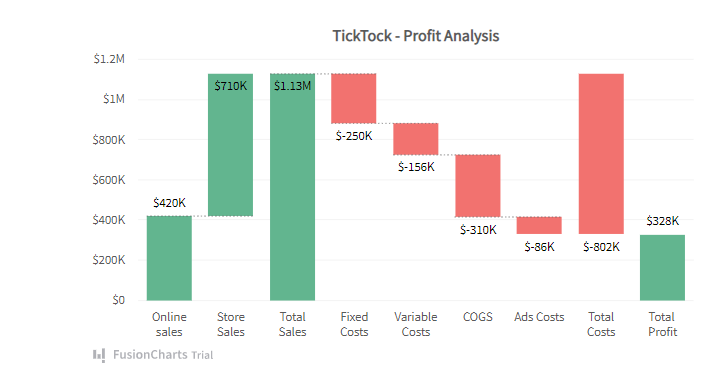
Waterfall charts are like column charts that show how an initial value is impacted by negative and positive values. It consists of several columns with different colors, and is also sometimes called a cascade chart.
Hierarchy Diagrams
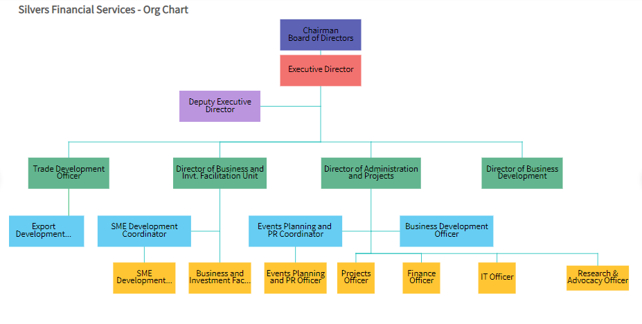
A hierarchy diagram is a type of organizational chart used to show the breakdown of the entire organization from top to bottom. For example, in a typical hierarchy diagram, the CEO is at the top, then there are presidents, then vice presidents, and so on.
Trellis Plots
A trellis plot consists of multiple smaller plots or graphs arranged in a grid. Each plot in the grid represents a different item or condition, but all the plots have common scales. Trellis plots make it easy to interpret complex data.
Function Plots
Sometimes statisticians and engineers need to plot the results of an equation, which can be done through function plots. The graph of a function is the set of all ordered pairs whose coordinates satisfy the mathematical equation.
Circuit Diagrams
A circuit diagram, also called an electrical diagram, is the graphical representation of an electric circuit and its components. It is made using different symbols and meanings to represent the components of the circuit.
Tree Diagrams
Tree diagrams allow us to show combinations of multiple events or outcomes of events. The diagram starts with one item that consists of two or more branches, each of these branches is further divided into two or more branches, and so on. These diagrams are mostly used in probability.
Sunburst Charts
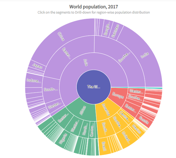
A sunburst chart allows us to represent hierarchical data in circular form. It consists of several circles where the innermost circle represents the top of the hierarchy.
Stacked Area Charts
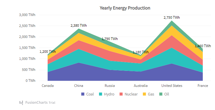
A stacked area chart is an extended form of a simple area chart, but it consists of multiple area series stacked on top of each other. These charts are helpful in comparing several variables changing over an interval of time.
Are You Looking To Create Different Types Of Charts And Graphs For Your Web Apps?
If you’re looking for a data visualization tool to make different types of charts and graphs for your web apps, FusionCharts is the right choice. FusionCharts is a leading JavaScript charting library that offers 100+ different types of charts and graphs. These include bar charts, pie charts, donut charts, line charts, area charts, organization charts, and many more. Additionally, it comes with over 2000 choropleth maps, as well as several business dashboards. FusionCharts also allows you to customize you to make interactive charts and customize them.
Start using FusionCharts and try its exciting features today!