In today’s fast-paced world, businesses collect data all the time. One way to make more sense of this data is to visualize it using charts and graphs, such as a bar chart, stacked bar chart, line chart, etc. Visualizing data allows businesses to compare different data sets, track key performance indicators, understand trends and patterns, and make critical strategic decisions and plans accordingly. Today, there are several different charts and graphs for different use cases. For instance, a scatter chart can be used to compare different numeric values, a sunburst chart to represent hierarchical data, etc. However, one of the most used chart types is bar charts. Businesses and individuals worldwide use different types of bar charts, such as standard bar charts, grouped bar charts, and stacked bar charts, to visualize non-time series data and gain valuable insights.
While bar charts are pretty common, many people get confused when it comes to stacked bar charts. So, in this article, we’ll discuss a stacked bar chart in detail.
But before we discuss a stacked bar chart, let’s first briefly discuss what a bar chart is.
Table of Contents
What Is A Bar Chart?
A bar chart is a data visualization consisting of rectangles of different heights. These graphs are helpful when you want to visualize categorical variables. Bar charts provide an easy-to-understand way to summarize large data sets and identify trends and patterns.
You can use a bar chart to:
- Compare different categories/variables of your data set
- Identify the items in your data with the highest frequency
- Analyze changes in your data over time
There are different types of bar graphs, such as column charts, grouped bar charts, and stacked bar charts. A grouped bar chart and stacked bar chart can be vertical or horizontal.
Are you looking to create a bar chart in Excel? Check out this article.
What Is A Stacked Bar Chart?
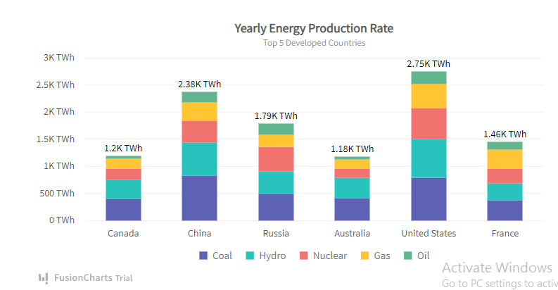
A stacked bar chart is a variation of a bar chart used to represent information about sub-groups of different categories and compare parts of a whole. In this chart type, several bars are stacked on top of each other. In other words, each bar representing a total amount is divided into several parts (representing sub-groups.) The height of each bar demonstrates how much each sub-groups contributes to the total. For instance, you can use a stacked bar chart to analyze the number of sales of an organization from different regions in a year.
Stacked bar charts can also be used to identify changes in datasets over time. For instance, a stacked bar chart is often used to see the increases and decreases of investments’ value in a stock portfolio.
Equivalent sub-groups or sections of each bar should have the same color to make it easy for viewers to understand and interpret the chart.
What Are The Variations Of A Stacked Bar Chart
Depending on your preference, you can select a horizontal stacked bar chart or a vertical one. Variations of the stacked bar chart are as follows:
Horizontal Stacked Bar Charts
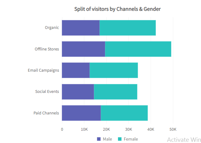
In a horizontal stacked bar chart, the bars are drawn along the y-axis/oriented horizontally. The vertical axis consists of the bars representing data categories and their sub-groups, while the horizontal axis represents the numeric values. These are mostly used when there are several total values because the width of the device’s screen is limited.
Vertical Stacked Bar Charts
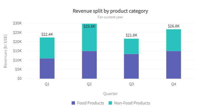
A vertical stacked chart also called a stacked column chart, is a chart where the bars are drawn along the x-axis (vertically from down to top.) The horizontal axis represents the data categories and their sub-groups, while the vertical axis represents the numerical values.
Percentage Stacked Bar Charts
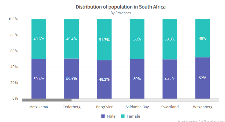
Another variation of the stacked bar chart is the percentage stacked bar chart. In this type of chart, the length or height of each bar is the same, but the sub-groups or sections are represented as percentages of the bar instead of absolute values. You may find it challenging to analyze the category totals in a percentage chart, but sub-groups percentage comparisons are more straightforward.
When To Use A Stacked Bar Chart?
There are limited stacked bar charts use cases. The purpose of these charts is to compare the numerical values of different categories or variables.
- Stacked charts are typically used when:
- Your data have different categories, and each category further has several sub-groups or sub-sections
- You want to plot numeric values
- You want to compare parts of a whole or identify and compare changes in a dataset over time
What Are The Best Practices for Stacked Charts?
Scale Consistency
Like any chart, the axis of a stacked chart should start at zero. To make flawless charts, you also need to ensure the scale is even and consistent.
Labeling
When you create stacked bar charts, it’s essential to label them properly. Doing so makes them easy to understand and interpret. You should give the chart a title and label the axis, bars, and sub-bars.
Avoid Negative Values
A stacked chart can’t represent negative values correctly on the same bar because the negative values would offset the positive ones. However, if your dataset has consistent negative and positive values, you can plot them on the same chart using two axes.
Consider Category Levels
In a stacked chart, it’s essential to consider the order of categories. You also need to ensure the order of categories is consistent across all the bars. Typically, the order of categories/variables is from largest to smallest, and the most important value is placed at the bottom.
Use Colors Correctly
Using the right colors for charts is very important as they make it easy to communicate critical results. You can choose the color palette for your charts, depending on the data. For instance, you can use a sequential palette when your variables are continuous, such as age groups. Similarly, depending on your data type, you can use a qualitative or diverging palette.
What Are The Advantages of Stacked Charts?
The advantages of stacked bar charts are as follows:
Easy to Identify Changes In Dataset
A stacked graph makes it super easy to see the total changes in a variable. For instance, a stacked chart can clearly show a company’s total sales in a given year.
Easy to Compare Parts Of A Whole
When looking at a stacked bar graph, it’s incredibly easy to compare how much each sub-group contributes to the primary category.
Save Space
Stacked charts can be helpful in business reports where you need to display multiple charts, as these charts take less space than various individual chats.
Are You Looking To Create Stacked Bar Charts For Your Web App?

If you’re looking to create Javascript stacked charts for your web app, FusionCharts is the right choice. FusionCharts is a leading JavaScript charting library that offers over 100 different types of charts and graphs. These include bar charts, column charts, pie charts, area charts, line charts, and many more. It also comes with 2,000+ choropleth maps covering countries and cities.
Head over to FusionCharts and try its exciting features today!