
Data visualization is one of the first steps towards understanding raw or pre-processed data. It is the best way to leverage your data’s full potential. With effective data visualization (and dashboards), you can maximize returns, cut losses, understand current trends, and most importantly, make future decisions. Overall, a good data visualization tool is particularly indispensable for executives, managers, and CEOs.
FusionCharts is the ultimate charting library. It is trusted by over 800,000 developers across 28,000 companies. FusionCharts has a client base that includes Intel, HP, Microsoft, Nokia, and Lenovo as well as Cisco, and more.
FusionCharts is a JavaScript charting and graphing library. It helps you create stunning and spectacular charts, graphs, gauges, and maps.
Let’s take a look at some important aspects of data presentation to help you understand why you should focus on improving your charts. We will also show you how you can prepare more effective data presentations in FusionCharts. In general, a few basic principles will go a long way towards making the most of your data. These include some engaging and beautiful charts, graphs, and business dashboards. FusionCharts empowers you to achieve meaningful insights, increase business revenue, track key metrics and, most importantly, make informed decisions.
Table of Contents
1. Are Dashboards Effective and Insightful?
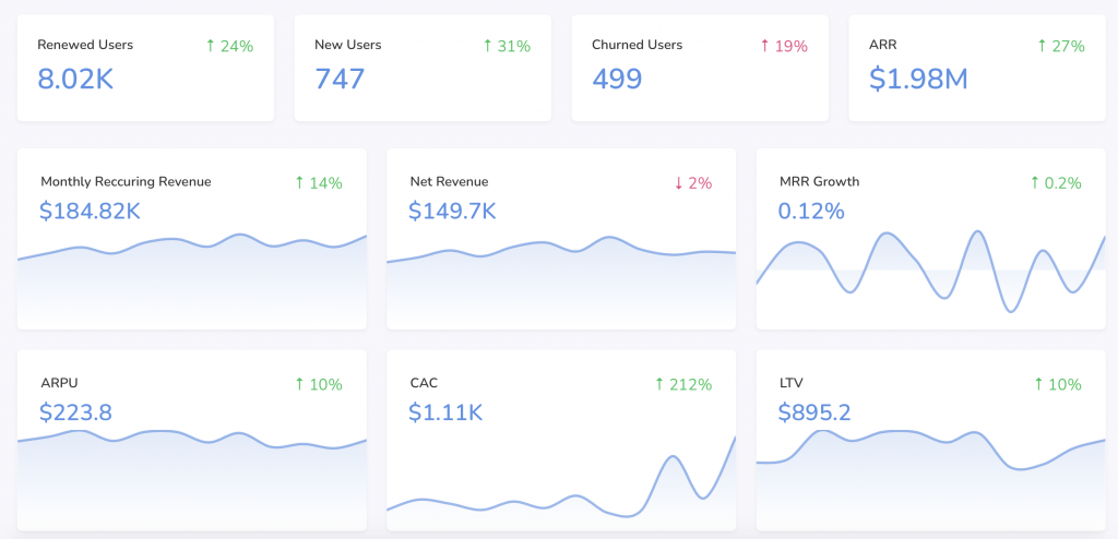
A dashboard presents information that is meaningful and informative. Dashboards are also dynamic entities. They allow your users to track your critical parameters and identify deviations in your data. FusionCharts helps you choose the right dashboard for the right task. There is a wide range of dashboards to choose from. These include analytical dashboards, strategic dashboards, and operational dashboards as well as sales dashboards, and more. To learn more about building effective and insightful dashboards, check out our white paper on creating dashboards that yield insight.
2. What Are The Most Relevant Chart Components That Present The Most Useful Information?
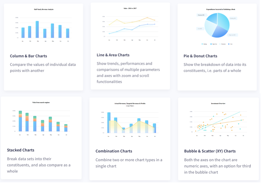
FusionCharts offers 100+ charts graphs and gauges. It gives you the freedom to choose the most relevant chart component for your application. This is important. When you design applications for data visualization, you need to expose long-term trends and short-term fluctuations. The key to a successful application is to select the best chart or graph for your data. This includes having the right reporting capabilities as well as supporting the right platform, device, or browser. To learn more about this, check out our white paper on choosing the right charting component for your product.
3. Is Real-Time Data Visualizations A Game Changer?
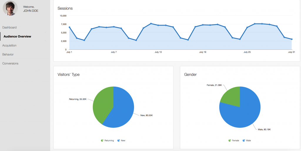
The field of real-time analytics is a game-changer. Real-time analytics gives companies a competitive edge over their competition. But real-time analytics need to operate in real time. Whether it is a sales dashboard, an analytic dashboard, or a performance dashboard, it needs to be dynamic. This means instant updates to allow users to track all fluctuations in your data. With FusionCharts you can create dynamic dashboards that update automatically using real-time charts or data streaming charts. Read the ultimate guide to real-time data visualization for more information.
4. Can I Use Drill-Downs To Maximize Business Information?
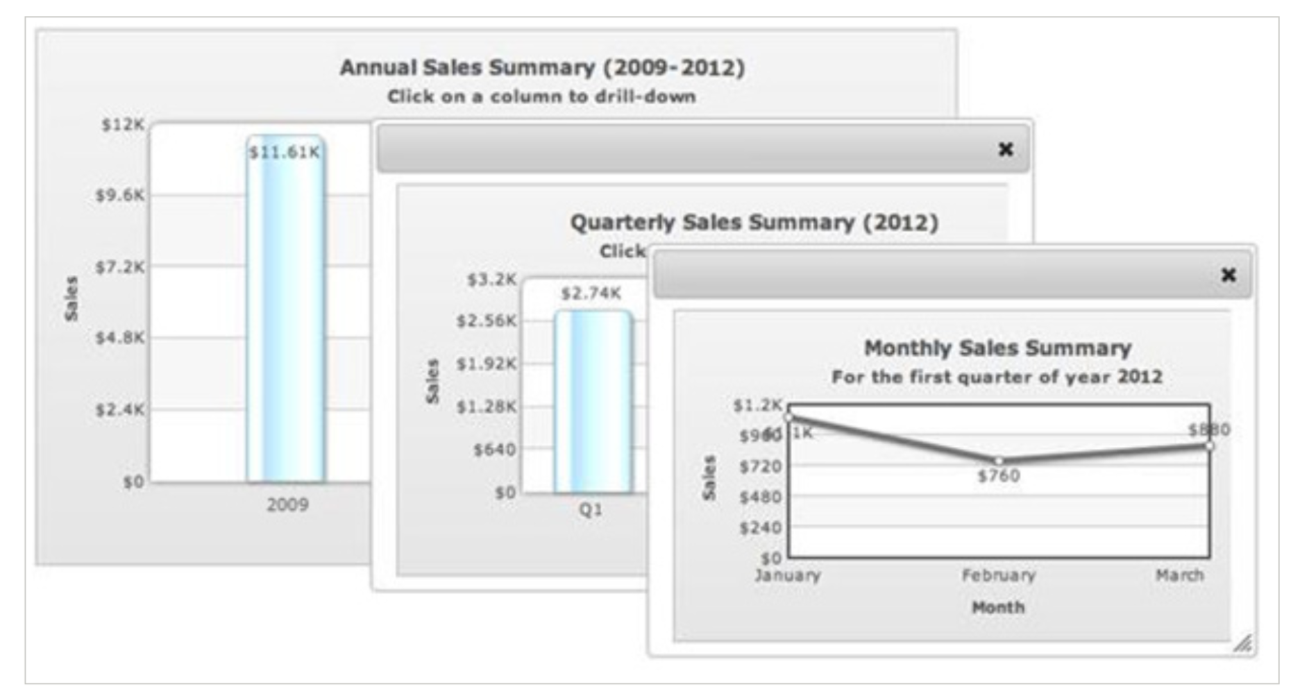
You can take your charts and dashboards to the next level by adding drill-downs to your charts. With FusionCharts you can use a single data source and incorporate any level of drill-down. FusionCharts also allows users to open descendent charts when a data point on the parent is clicked. Finally, if you want, you can display data at the finest level of granularity. Check out our white paper on how to create an intuitive drill-down interface for more information.
5. How Does Exporting Charts Disseminate Information?
FusionCharts comes with the awesome ability exporting charts and dashboards to PDF, JPEG, SVG, or other formats. You can also make the most of this data visualization library by exporting various snapshots of data to formats you can easily share by email. This way you can easily share key information with several users at the same time.
6. How Can I Transform Data Into Actionable Information?

Following charting guidelines and best practices helps you improve your charts and take your dashboards to entirely new levels. Dashboards present insights that help businesses make informed decisions. Because of this, simple principles such as descriptive charts, data ordering, slanted labels, tooltips, adding context and drill-downs improve the user experience and increase your chart’s usability. FusionCharts offers all these features to make your dashboards meaningful as well as powerful. Read more details and the 6 tips to increase the usability of your reports and dashboards.
How Do I Sign Up For FusionCharts?
FusionCharts comes with hundreds of features for beautiful, meaningful, and powerful data presentation. In addition, dashboards built with FusionCharts empower executives, managers, and CEOs to gain key insights, track important metrics and make educated decisions. Finally, with over 100+ charts, graphs, and gauges and 2000+ choropleth maps, FusionCharts is the first choice of a data visualization tool for developers and data scientists.
Click this link and explore more of FusionCharts features and download its free trial today.


