
Today, most businesses and organizations, both small and large, rely on financial dashboards to track and monitor important performance indicators. They use dashboards to keep an eye on the company’s progress. These dashboards provide a single, comprehensive view of data from various departments and sectors of an organization. As a result, managers, CEOs, and other executives can gain key insights into data, locate weak areas and make important strategic decisions.
If you want to build a financial dashboard for your organization, we have the perfect data visualization library for you. FusionCharts is a beautiful data visualization library that offers an out-of-the-box solution for your dashboards. We have compiled together a list of 10 valuable tips to help you build an awesome financial dashboard using the FusionCharts library and provide your end-users with a great data visualization experience.
Table of Contents
Tip 1: Which Tool is Best for Creating Beautiful Financial Dashboards?
FusionCharts is the best library for creating beautiful and stunning financial dashboards. It offers a wide variety of charts, gauges, and choropleth maps to choose from. The FusionCharts library offers more than 100 charts and includes more than 2000 data-driven maps that you can use to build your financial dashboard. As an example of financial dashboards, you can look at the following:
- Marketing Dashboard
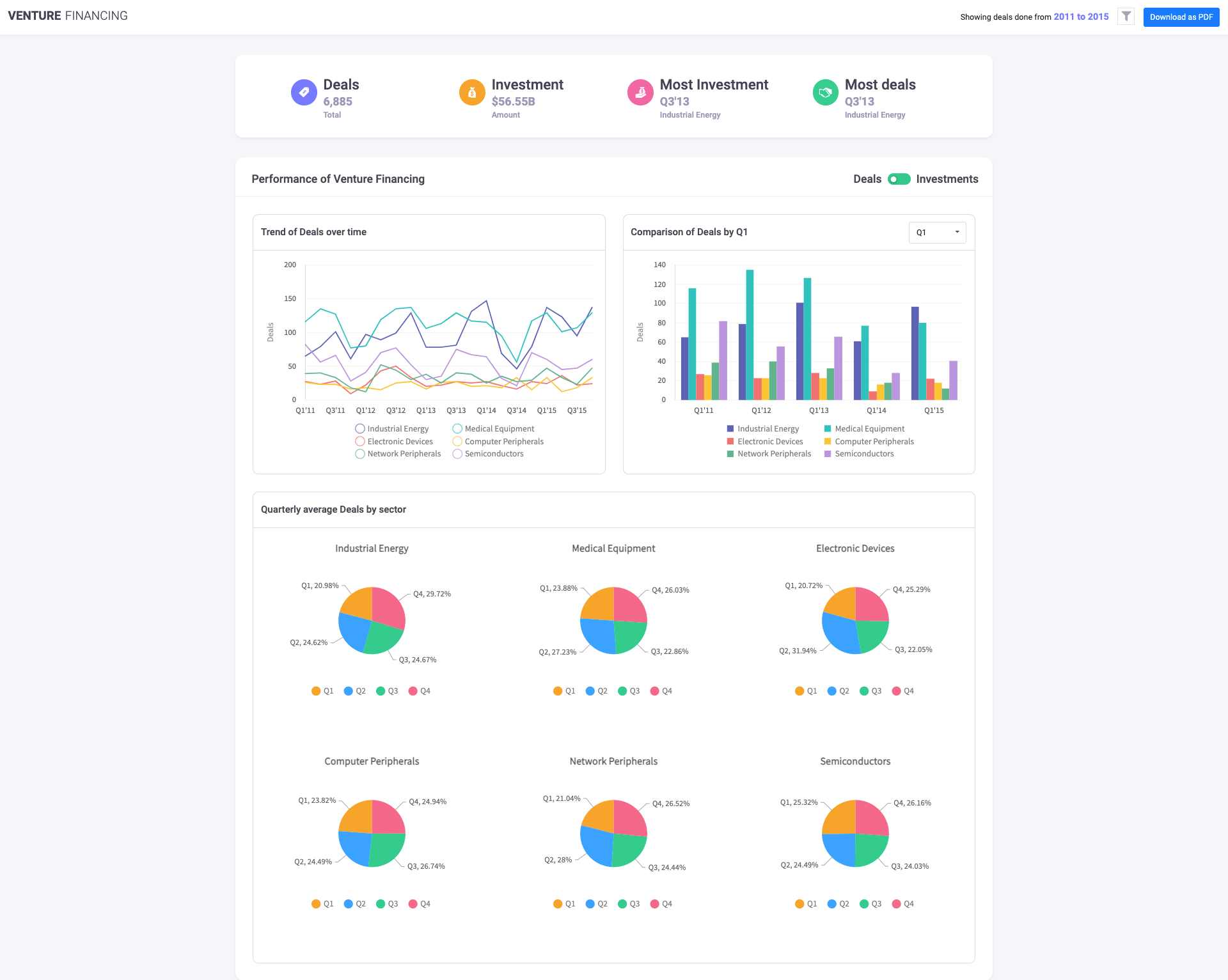
- Venture Financing Dashboard
- Sales Performance Dashboard
- Wealth Management Dashboard
- Business Operation Monitoring Dashboard
- Investment Portfolio Dashboard
- Sales Management Dashboard
Tip 2: What Can I Customize on the Financial Dashboard?
The FusionCharts Suite gives you the freedom to customize the different visualizations on your financial dashboard in any way you desire. Whether it’s a functional or a visual feature, you can configure it in your chart by adding layers through annotations, changing attributes, or using different events and their corresponding APIs. Examples of customizing different features include:
- Add your custom titles, labels, axis labels, and more
- Display numbers in global or European format and allow users to switch from one format to another
- Add different types of annotations to your charts on the financial dashboard
- Choose to arrange all charts on the financial dashboard row-wise or column-wise in a clean and organized manner
- Customize legends
Tip 3: Which Components Should I Add in the Financial Dashboard?
Your financial dashboard should include all the key performance indicators or KPIs. The rule of the thumb is to have a separate graph for each important parameter while placing related metrics next to each other in different charts. All values and data series that require comparison should be placed on the same chart. You should place all the meaningful summaries and aggregate values at the top of the dashboard. Hence, net sales value, net profits, quarterly or yearly numbers should be displayed prominently on the dashboard.
With the FusionCharts library, you can define multiple data sources for your financial dashboard. As a result, you can easily build a financial dashboard with a clean and simple design so that multiple components do not appear cluttered or confusing.
Tip 4: What is an Interactive Legend and Should I Use it?
Interactive legends in your charts and graphs add more value to your financial dashboards and FusionCharts fully supports them. With an interactive legend, you have several options such as show/hide, fade in/fade out or slice in/slice out a data plot or a data series. If your data visualization consists of multiple data series, an interactive legend in FusionCharts allows users to focus on one part or one portion of data without any distractions. If users desire, they can also switch off the interactive legend feature with a button click.
Tip 5: How Do I Update the Dashboard in Real-time?
All the data visualizations on your financial dashboards should be live and dynamic. FusionCharts fully supports real-time charts, also called data streaming charts. These charts update themselves automatically after every user-specified interval without requiring any page refreshes. This enables users to stay up to date with any changes in key performance metrics or parameters.
Tip 6: How Should Multiple Users Collaborate on a Financial Dashboard?
When multiple stakeholders are involved, a financial dashboard should allow all of them to collaborate, work together and share ideas. In FusionCharts there is a special collaborative editing feature. Any manager or executive looking at the dashboard can comment on a data point or graph while perusing the data. There is no need for phone calls or emails. This feature turns a financial dashboard into a social media-like platform, where users can collaborate and carry out focused discussions and share opinions.
Tip 7: Which Platform Should the Financial Dashboard Run On?
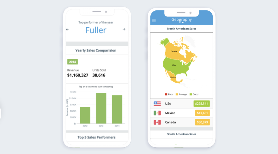
Your financial dashboard should run on all types of platforms and all types of devices. Any manager, executive, or CEO should have access to the dashboard anytime anywhere. It should be accessible via desktop computers and laptops in the office and on a mobile phone when the personnel are away from their desk or even at home. The beauty of FusionCharts is that it is optimized to run on all types of devices running on all types of platforms. Whether you are a mac user or own a Windows machine, FusionCharts will run seamlessly on both. You also won’t notice any difference between mobile devices and tablets. All graphs and charts adjust themselves for optimized viewing on smaller screens.
Tip 8: Should I Add Drill-Downs to a Financial Dashboard?
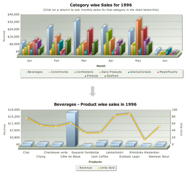
Yes, absolutely. Drill-downs enable users to look at the finer details in graphs or charts. FusionCharts’ special drill-down feature also allows every data point to act as a hotspot. In addition, you can fully customize its behavior. So, depending upon your requirements, you can choose to open a new window with a descendant chart when a data point is clicked. You can also use tooltips to display contextual information or open a URL in a browser. With a single data source, there is no limit on how many levels of drill-downs you add to your chart.
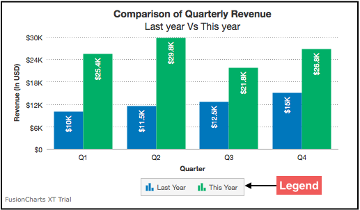
Tip 9: Should I Add a Trend Comparison Component to My Financial Dashboard?
A financial dashboard must empower users to analyze and compare financial trends as well as provide meaningful insights into the data. If done right, it can help data analysts make future predictions and empower decision-makers to make good strategic decisions. With the FusionCharts trend comparison component, you can also easily add trend lines to your data visualizations and more value to your charts.
Tip 10: Is There a Quick Method of Creating a Powerful Financial Dashboard?
There certainly is, provided you use FusionCharts! This is because FusionCharts’ team of experts has built all types of financial dashboards. These include sales management, investment portfolio, or even marketing opportunity charts. Whatever you need, you can find a dashboard similar to your requirements on our FusionCharts’ dashboards portal. In addition, all the dashboards are open source. That means you can download the code, customize it, and have a powerful financial dashboard ready in no time.
How Do I Sign Up for FusionCharts?
With FusionCharts you can quickly and effortlessly build a beautiful and powerful financial dashboard for any use case. There are ready-to-use solutions for Javascript, React, Angular, Vue.js, React Native, Ruby on Rails, Django, and more.
Don’t miss out on the world’s best data visualization library. Download FusionCharts and start building a financial dashboard that makes the most of your data.


