Enterprise dashboards bring intrinsic value to day-to-day operations and future decision-making for firms. These dashboards employ data visualization techniques to summarize vast amounts of data and present it clearly and understandably. Dashboard creation is not an easy task if you don’t know where to begin.
Dashboards [1] help all leaders, managers, and CEOs monitor and track day-to-day operations, analyze current trends, and estimate future values so that they may make informed and intelligent decisions — and this is where FusionCharts comes in.
FusionCharts is a superb charting and plotting library in terms of data display, efficiency, simplicity of use, and rich data visualizations. It substantially enhances the data visualization experience for you and your company, which makes dashboard creation easier than ever!
Table of Contents
Resources That will Make You a Champion at Dashboard Creation
Here are the resources offered by FusionCharts that can make you a champion at dashboard creation:
-
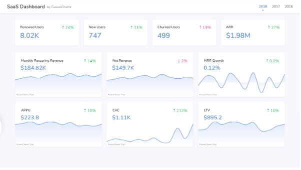
SaaS Dashboard
The SaaS dashboard by FusionCharts assists SaaS companies in tracking and monitoring crucial KPIs. The viewer has access to a complete picture of indicators related to users, revenue, cost, and growth. The use of simple KPIs and visualizations simplifies understanding who the average user of the SaaS product is.
-
Asset Distribution Dashboard
The Asset Distribution dashboard by FusionCharts allows you to track asset distribution by state, location, top advisors, time, and product. Other indicators that could be measured based on the data include sales, income, new net income, etc. The results can be compared over a month, quarter, or year.
-
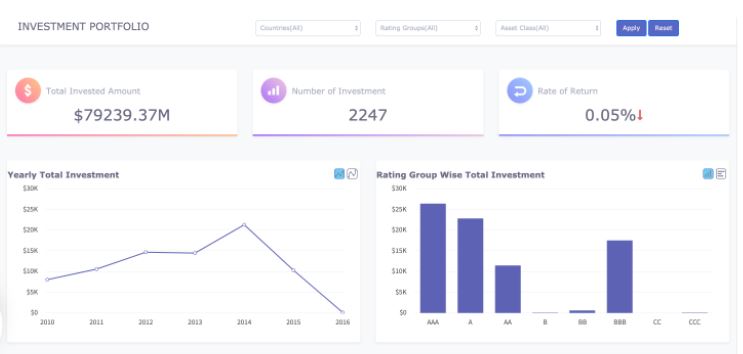
Investment Portfolio Dashboard
The easy-to-use Investment Portfolio dashboard by FusionCharts can help you quickly assess the rate of return, asset distribution, as well as portfolio risk associated with your investment decisions. Some crucial, readily available features include annual investment trend measurements, asset class allocation, and investment specialization in various countries.
-
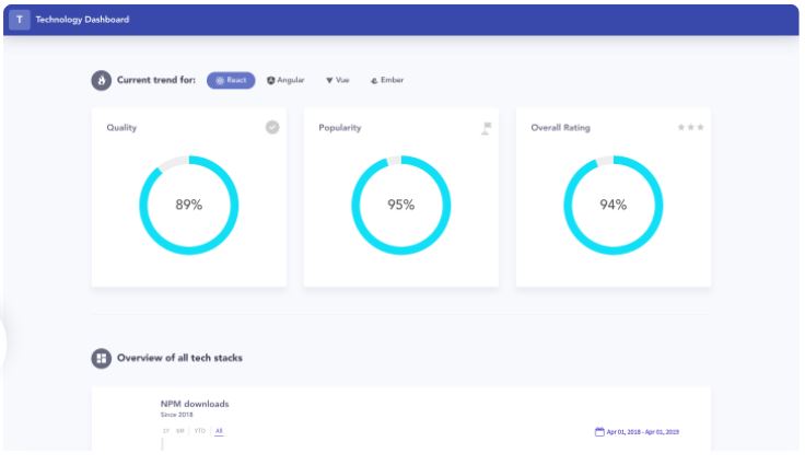
Technology Dashboard
The Technology dashboard by FusionCharts displays the reliability, accessibility, and overall evaluation of major technologies such as React, Angular, Vue, and Ember. It can be utilized to compare and contrast the daily distribution counts from NPM, the rating system, and the number of contributions on GitHub.
-
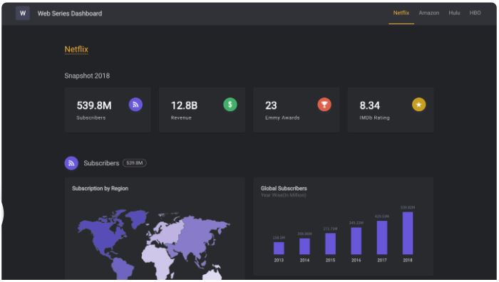
Web Series Dashboard
The Web Series dashboard by FusionCharts displays the performance of a web series in terms of subscribers, income, IMDb rating, and Emmy awards across various platforms such as Netflix, Amazon, Hulu, and HBO.
So the dashboard shows the worldwide subscriber distribution by area, year, demography and awards won, and revenue over time. Each platform’s ratings of web series per genre can also be visualized using this dashboard.
-
Shipment Analysis Dashboard
With FusionCharts’ Shipment Analysis dashboard, you can get a 360-degree perspective of your delivery performance to make better decisions. This dashboard can be used to track, analyze, and comprehend a shipper’s monthly, quarterly, and semi-annual performance.
You may use this dashboard to see how shipments are doing across geographies, receive an overview of shipping delays, and better understand your most critical customers.
-
Sales Opportunities Dashboard
An organization’s sales and marketing activities might be more focused if they have a thorough awareness of the available opportunities. The Sales Opportunities dashboard by FusionCharts motivates us to investigate the opportunities available to each sales executive based on their location, industry, opportunity value, and win rate.
You can concentrate on a specific period and investigate the possibilities for gathering critical data and making well-informed judgments.
-
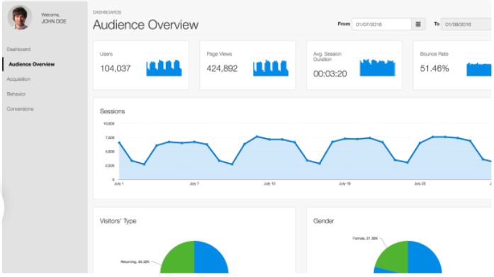
Google Analytics Dashboard
Do you want a comprehensive dashboard where you can see all of your website’s crucial performance-related information at a glance? Try out FusionCharts’ Google Analytics dashboard!
The dashboard offers vital statistics at your fingertips, from visitor profiles to traffic volume for a certain period.
-
Smart Weather Dashboard
With FusionCharts’ Smart Weather dashboard, you can get an overview of all the weather-related information designed for localized data monitoring and can be studied by cities or even specific sub-regions.
With our Celsius/Fahrenheit toggle, stick to worldwide standards and keep an eye on allowable thresholds to keep air quality in check. Integrating the dashboard inside larger broad products like day planners, automated driving, and navigation tools keeps consumers informed.
-
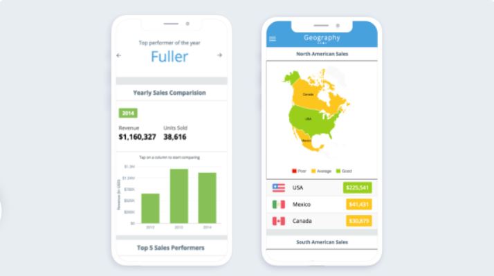
Sales Performance Mobile Dashboard
With FusionCharts’ Mobile Sales dashboard, you can see sales performance on the move, with simple column charts for easy comprehension and analysis. Quickly scan vital numbers from the “Summary” section of the dashboard, which highlights the top product, executive, city, and country.
With our mobile-friendly design, you can capture all the information you need and take it with you.
-
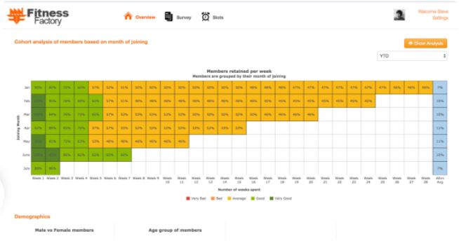
Membership Tracking Dashboard
With FusionCharts’ Members Retention dashboard, you can track foot traffic and activity in your pool, gym, spa, salon, yoga center, or other service-based business.
The dashboard measures gym memberships, typical membership terms (months, years, or longer), occupational demographics that are most prevalent, and other key indicators. Understanding who to target and when to pitch will help you improve your marketing strategies.
-
Sales Management Dashboard
With FusionCharts’ Sales Management dashboard, you can access crucial sales data, identify high-sales regions, and find information about the best sales teams.
This dashboard can help you analyze what’s working and what isn’t, monitor employee performance, analyze sales locations individually to gain insights, and understand where you need to ramp up efforts.
-
Sales and Collaboration Dashboard
With FusionCharts’ Sales and Collaboration dashboard, you can make business collaboration easier by incorporating the simplicity and engagement of social media into workplace dialogues.
Keep up to date with built-in notifications and comment on performance right from the dashboard. Leave the days of complex spreadsheets and cleverly phrased emails in the past because that’s where they belong.
-
Venture Capital Investment Dashboard
The Venture Capital Investment dashboard by FusionCharts provides you with the latest venture capital trends. It shows a high-level overview of agreements and investments in various areas and compares them over time.
The dashboard also displays sector-specific trends within a given timeframe, both quarterly and yearly. It also includes a list of transactions and investments from the previous quarter. The dashboard aids you in making an informed decision by recognizing any patterns or irregularities in your assets.
-
Monitoring Business Operations Dashboard
Use FusionCharts’ Company Monitor to keep track of operational metrics across your organization for different departments (sales, HR, etc.).
To boost earnings and reduce operational expenses, you can use data on topline and bottom-line indicators. So to defeat your opponents at their own game, you can track competition-based metrics.
The Bottom Line
As the best library for creating effective dashboards, FusionCharts is the first choice of over 28,000 clients in 118 countries. With FusionCharts’ interactive and dynamic charts, rich documentation, standardized API, and cross-browser support, your next amazing dashboard creation venture can start right now!
So, what are you waiting for? Sign up for your free trial to start getting better at dashboard creation today!
[1] https://docs.microsoft.com/en-us/power-bi/create-reports/service-dashboards


