
Are you an Angular developer at cross-roads, trying to decide which charting library to use? Do you want your users to get the best data browsing and visualization experience? Are you looking for an interactive and responsive charting library? If you answered yes to any of these questions, then we have all the right answers for you.
In this guide, we have compiled together a list of 5 recommended tools to build an Angular chart. Continue reading to find out why FusionCharts is the best charting and data visualization library in the market today.
Table of Contents
1. What is The Angular Wrapper for Google Charts?
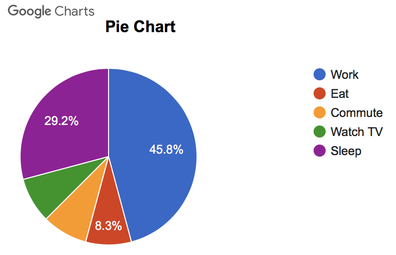
Angular-Google-Charts is an Angular wrapper for the Google Charts library. You can install this wrapper with npm by using:
npm install angular-google-chartsNext, you can import the GoogleChartsModule from the angular-google-charts library in your app.module.ts file, and you are good to go.
Google charts provides users with a rich suite of interactive graphs and charts along with data tools. The charts are interactive, based on HTML 5/SVG technology and can be easily displayed in web browsers as well as mobile devices. Many of these charts are also zoomable and pannable. There is a choice of histograms, bar charts, area charts, line charts and more.
2. What is the Highcharts Solution for Angular Chart?
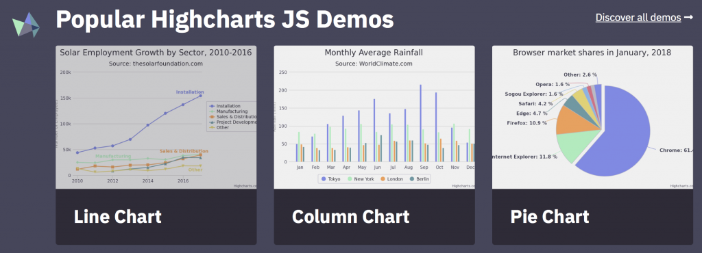
If you are familiar with Highcharts, then you can install highcharts-angular, the official minimal Angular wrapper for Highcharts library. You can download this wrapper using npm as:
npm install highcharts-angular --saveNext, you need to import HighchartsChartModule from the highcharts-angular library in your app.module.ts file, and you are all set.
The Highcharts library has been developed using Javascript and TypeScript. Highcharts works with all types of back-end databases or server stacks. The charts and graphs are responsive, interactive and accessible, and are easy to configure or customize using Javascript or CSS.
3. What is the Native AngularJS Directives for Chart.js?
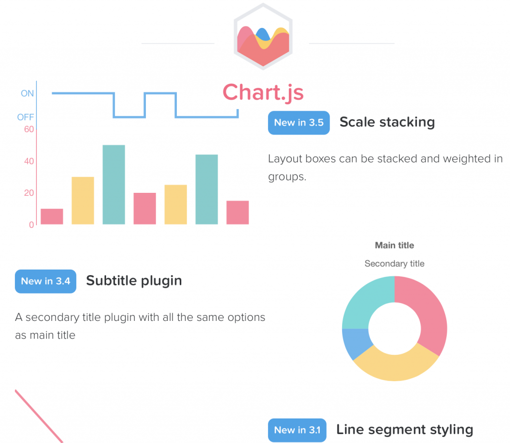
The `angular-chart.js` is a set of native Angular JS directives for Char.js. You can install it using npm by typing:
npm install angular-chart.js --saveIn your page you can include all the dependencies through the following lines of code:
https://node_modules/chart.js/Chart.min.js
https://node_modules/angular-chart.js/dist/angular-chart.min.js
and next declare the chart.js dependency:
angular.module('myModule', ['chart.js']);Now you can add a chart.js data visualization in your Angular project. Chart.js is an open source community maintained project. You can easily incorporate 8 different types of charts including bar charts, line charts, radar charts, pie charts, bubble charts, and more in your project. You can even create mixed bar and line charts and produce advanced animations.
4. What is Syncfusion Angular Chart?
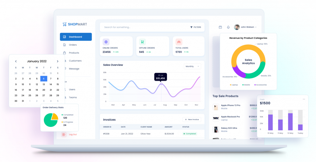
You can install Syncfusion’s Angular charting component using npm by typing:
npm install @syncfusion/ej2-angular-charts --saveNext you can import ChartModulefrom the @syncfusion/ej2-angular-chartspackage, and you are ready to start adding Syncfusion’s charts in your Angular project. You can choose from different types of charts including line charts, pie charts, bar charts, scatter charts and more. These charts are interactive and responsive, and allow zooming, panning, drill-down and other features.
5. Why is FusionCharts The Winner for Creating Angular Chart?
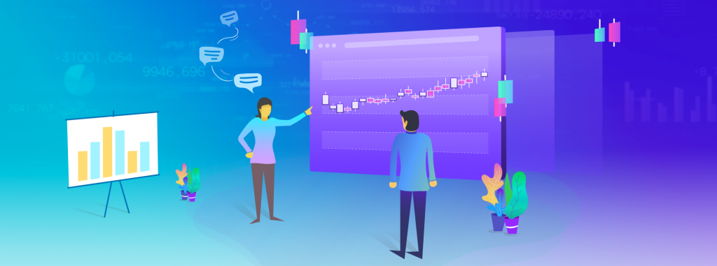
It’s time to reveal our most recommended library for creating Angular charts; and that library is FusionCharts! FusionCharts is the best Javascript library for creating different types of data visualizations. You can easily include FusionCharts’ graphs, gauges, charts and maps in your Angular project. All you have to do is install the angular-fusioncharts component using npm as follows:
npm install fusioncharts angular-fusioncharts --saveNext you can import the FusionChartsModule from the angular-fusionchartslibrary in your app.module.ts file as:
import { FusionChartsModule } from "angular-fusioncharts";Now you are good to go and you can include various FusionCharts graphs, gauges and maps in your Angular project. For more details, you can visit how to create stunning charts with Angular.
Does FusionCharts Have a Large Variety of Charts?
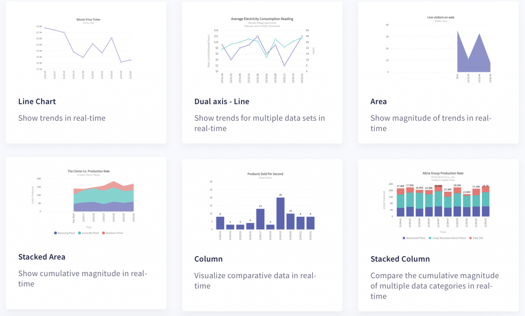
The Angular component for FusionCharts allows you to create all types of data visualizations. While other charting libraries allow you to include the most basic graphs and charts, FusionCharts comes with added options to include advanced and specialized charts too. There are explore 100+ charts and 2000+ maps to choose from. You can make Marimekko charts to depict market shares, Pareto charts that combine line charts and column charts, Funnel and pyramid charts to plot streamlined data, and Sunburst charts for hierarchical data. Moreover, FusionCharts supports 3D charts as well as real-time charts that live stream data.
Is the FusionCharts Angular Chart Customizable?
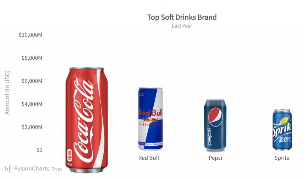
Yes, absolutely! Customizability is a very important part of any data visualization tool. While off-the-shelf solutions are available and easy to use, they may not be sufficient to cater to every need of a project. With FusionCharts, everything is configurable. You can define your own chart titles, sub-titles, axis labels, color schemes and styles. Moreover, you can customize themes, change the size of visualizations, add annotations, configure tooltips and much more.
Does FusionCharts Offer An Interactive and Responsive Angular Chart?
Again yes! The Angular chart you create with FusionCharts library at the back-end, is both interactive and responsive. You can pan, zoom and scale the chart. You have the option to use interactive legends, customized tooltips and even add drill-downs. With the drill-down feature, each data point acts like a hot spot. Clicking it can open a new descendant chart in a window or display additional information in the same window.
Can FusionCharts Handle Large Amounts of Data?
Indeed yes! FusionCharts has been optimized to handle millions and millions of data points. You can seamlessly scroll through these points. FusionCharts has built-in functionality like time navigator, date range selectors, and tooltips with crosslines to help users understand the trends in data.
How Do I Make the Most of My Data Using FusionCharts?
Opt for FusionCharts and take your data visualization experience to a whole new level. Once you use FusionCharts, you’ll forget Google Charts, HighCharts, Chart.js or any other charting tool. With high quality performance, millions of data handling capabilities, beautiful presentations, great variety of charts, FusionCharts is the best option out there.
So what are you waiting for? Head out there and make the most of your data now. Sign up for FusionCharts today!


