As the data volume is getting bigger exponentially, more companies are moving towards business dashboards. They save time, enhance the business process, and drive decision-making. However, designing and developing business dashboards is tricky. Many designers make critical mistakes, which can limit the effectiveness significantly. They are not aware of important things that must be maintained.
In this post, you will find 7 things that you must know while designing and developing business dashboards. By keeping them in mind, you can avoid making key mistakes. Now, let’s dive in.
Table of Contents
What is a business dashboard?
A business dashboard is an information management tool that provides a visual summary of key performance indicators (KPIs). It enables you to understand important and complex data quickly. Also, it helps you to uncover valuable market insights and make informed business decisions timely.
What are 7 Must-Know Things About Business Dashboard?
Does Grouping Similar Metrics Makes Your Business Dashboard More Attractive?
Grouping similar metrics can help the users find the information quickly. Also, it makes the business dashboard look more attractive.
You can group information into different factors, including campaign, product, brand, region, and team. Also, you can group metrics logically for different executives. For example, the metrics for a CMO would include conversion rates. On the other hand, CFO will need the gross profit margin percentage.
Make sure to give groups titles. It will help the user spot them easily.
Can Clear Labels Make Your Business Dashboard More Comprehendible?
Clear labels are very important for your business dashboard. They describe each of the metrics. By making them unambiguous, you can help the users understand information quickly.
The labels need to be self-explanatory. You need to keep them short and avoid cluttering up the dashboard. You can use abbreviations like, “5w”, instead of “5 weeks.” Also, you should use shorter definitions for metrics if the users are familiar with them. It will help you to free up a lot of space.
Another way of freeing up space can be using labels as headings effectively. For example, you may have the same metric for different timeframes, like revenue generated today and revenue generated this month. By putting them all under a heading, called “Revenue Generated,” you can avoid repetition and free up space. It will make the dashboard look more attractive.
What Is A Simple Design Essential for Grasping Information Quickly?
The role of a business dashboard is to make complex information easily understandable. Adding too much data can make it very difficult to grasp quickly. That’s why you should include only the most relevant information on the dashboard homepage.
You should present relevant information on a single card. Don’t use a lot of columns, as it will confuse the user. Make sure to remove all the irrelevant information. It will enable you to reduce the clutter. So, the business dashboard will look clean and simple. As a result, the user will be able to grasp key information quickly.
Do Misused Colors Cause Distraction?
When used correctly, colors can make the life of the audience a lot easier. It enables you to identify trends at a glance. So, you don’t have to examine every data point. However, if you use colors inappropriately, it can cause a major distraction. The audience will miss key points of the business. It will make your dashboard a complete failure.
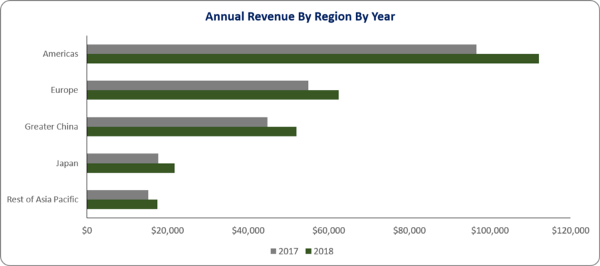
Here is an example of a dashboard chart that misuses color:
As you can see, the chart has become very difficult to understand due to the inappropriate use of color. you cannot read some of the numbers at the first glance. You have to spend more time figuring them out. What will happen if you remove the extra color?
The chart looks much better after removing the extra colors. You can understand all the information at the first glance. So, it will clearly benefit the businesses to understand key information quickly.
Is Proper Hierarchy Essential for Scanning Information Easily?
Visual hierarchy refers to how the user processes the data on the screen. It is an important factor in dashboard design, as it determines the order of information the people will scan through. Dashboards need to be easy to scan.
While designing dashboards for businesses, you have to use size and position effectively to focus on the most important information. You can put the most crucial metric in the top left corner. This is where the eyes of the users are naturally drawn first. Also, you shouldn’t be afraid to leave a gap. It’s better to have empty space rather than fill it with something bigger.
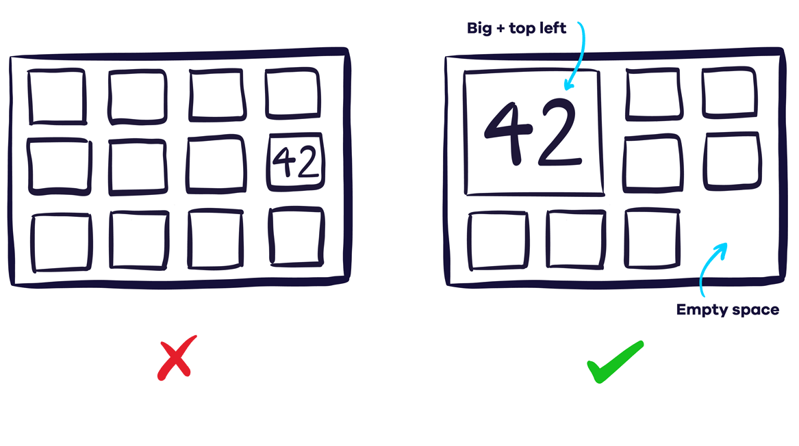
By using consistent sizes and defining clear relationships, you can create effective patterns and flows to help the users to scan the dashboard information easily.
Does Choosing the Right Visualization Type Makes Things Easier for the Users?
It’s very important to choose the right type of visualization. Otherwise, everything will become difficult to comprehend. The users will become very confused.
If you are comparing values, a column or bar chart would be the best option for you. Using pie charts with too many slices can make everything very confusing. Let’s take a look at this example:
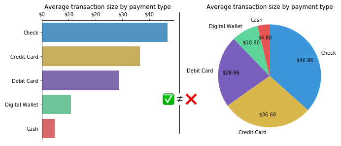
As you can see, the pie chart makes it very difficult for the user to comprehend the information. But if you use the bar chart, anyone can understand the data quickly. So, choosing the right chart type is essential for conveying the message effectively.
Does Not Giving Numbers Any Context Makes Business Dashboard Meaningless?
Context is essential for helping the viewers understand whether the number is good or bad. Without it, the data is meaningless.
For example, one of the charts on the business dashboard shows the conversion rate of the website. It helps you to understand the percentage of site visitors purchasing your product. The chart reveals that the conversion rate is 15%. Is it low or high? Can it be better? Without any context, the number is meaningless.
How can you add context? One of the best ways to do is to include past data. By comparing them with the present information, the users can easily understand how well they are doing. Also, you can include previous highs and lows, average, target, and current progress. Let’s take a look at this example:
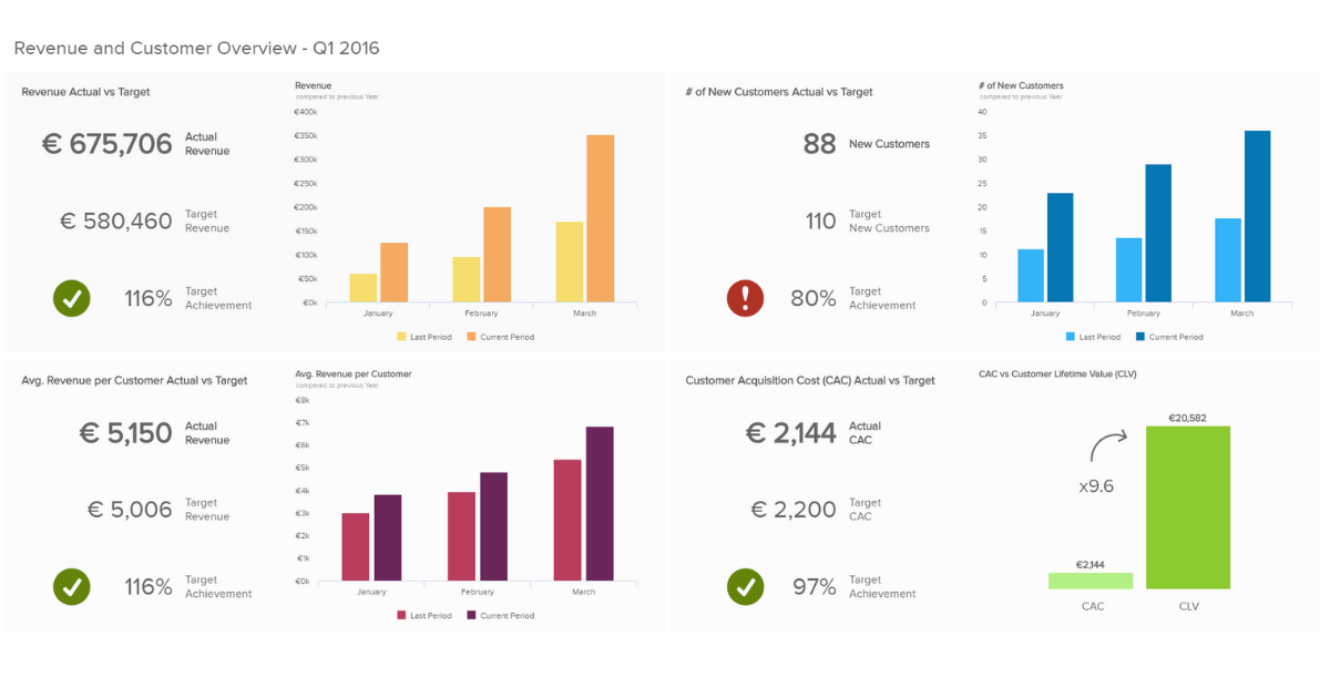
As you can see, the dashboard shows different information, including target achievement, actual revenue, target revenue, etc. If the target is achieved, it displays a tick mark with green background. If it’s not achieved, it alerts the user with an exclamation mark with red background.
Should I maintain the 7 things while designing the business dashboard?
An effective business dashboard should be visually balanced, straightforward, and user-friendly, It needs to be tailored towards the goal of the company. It must produce visualizations that will enhance data analysis efforts exponentially. So, the users can understand the key information easily and quickly. By maintaining the 6 things discussed in this post, you can create effective business dashboards and help the companies to reach their goal.