Every day, businesses get more data than ever before. Looking at endless rows and columns in a spreadsheet makes it hard to find important patterns. Data visualization tools help everyone, from business leaders to developers, quickly understand complex information.
These tools turn complicated numbers into clear charts, graphs, dashboards, maps, and reports. Instead of searching through endless data, you can spot trends and insights right away. Whether you want to track business performance in real time or add interactive analytics to your website, these tools help teams make decisions faster and with more confidence.
Today, companies use business intelligence platforms like Tableau and Power BI, as well as JavaScript libraries such as FusionCharts, Chart.js, and D3.js, to bring their data to life. In this guide, we will explain what data visualization tools are, look at the different types, highlight key features, and help you find the best option for your next project.
Table of Contents
Key Takeaways
- Data visualization tools help transform raw data into interactive charts, dashboards, and reports that make insights easier to understand.
- Business intelligence platforms are ideal for reporting and analytics, while charting libraries provide developers with greater customization and embedding flexibility.
- Features like real-time updates, mobile responsiveness, API integrations, and scalability are essential when choosing a visualization platform.
- Popular tools such as FusionCharts, Tableau, Power BI, and D3.js serve different business and development needs.
- AI-powered analytics, predictive dashboards, and embedded analytics are shaping the future of data visualization.
What Are Data Visualization Tools?
They are software platforms or libraries that transform raw data into visual formats. Instead of analyzing large spreadsheets manually, users can quickly understand trends, patterns, and insights through visual representations.
Modern data visualization software supports many types of visuals, including:
- Bar charts
- Line graphs
- Pie charts
- Scatter plots
- Geographic maps
- Interactive dashboards
- Heatmaps
- KPI and metric widgets
- Real-time monitoring panels
Modern data visualization software also supports interactive analytics features like filtering, drill-downs, and real-time updates. These features make it easier to explore data dynamically. Businesses use these tools to improve decision-making, monitor performance, and create clearer reports.
Beyond analytics, data visualization tools also help with storytelling by presenting complex information in a simple and engaging way for both technical and non-technical audiences.
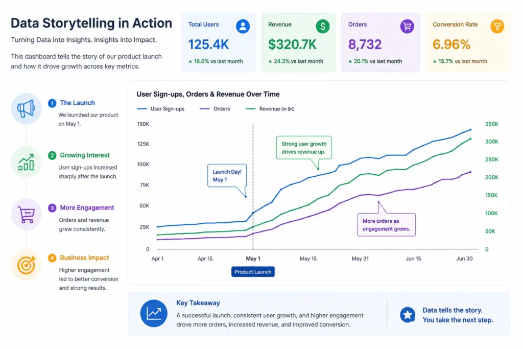
Why Data Visualization Matters
Data visualization helps businesses understand complex information faster and make better decisions. Instead of analyzing large spreadsheets manually, teams can quickly identify trends, patterns, and performance insights through interactive charts and dashboards.
Faster Decision-Making
Visual dashboards make it easier to monitor KPIs, sales performance, customer behavior, and operational metrics in real time. For example, finance teams can instantly track revenue trends and cash flow without reviewing lengthy reports manually.
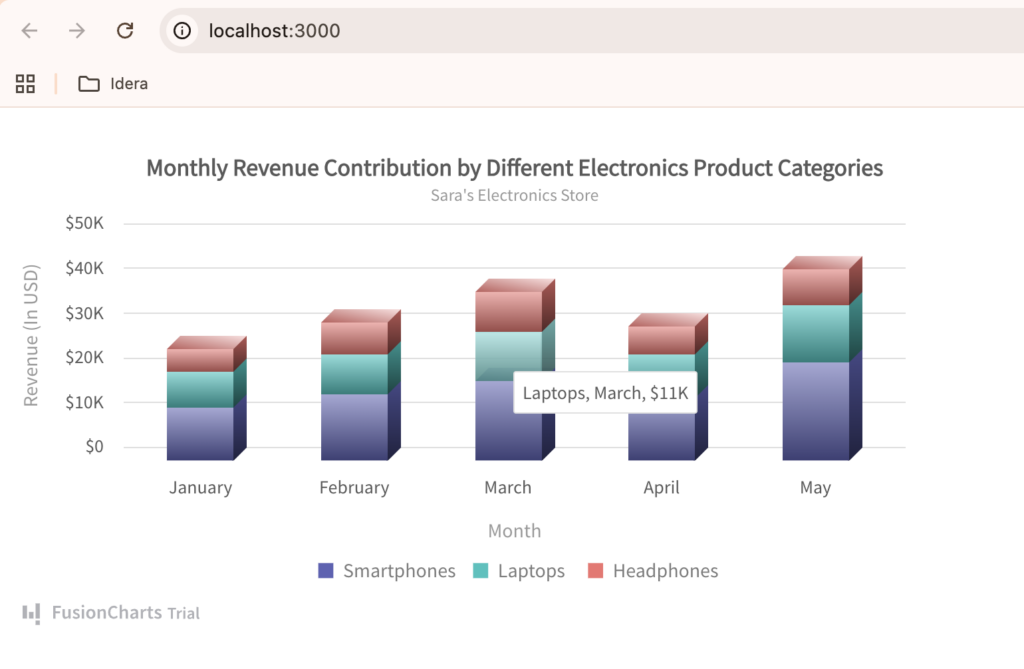
Easier Pattern Recognition
Charts and graphs help users identify patterns, correlations, and anomalies that may be difficult to notice in raw datasets. In healthcare, visualization tools can help track patient trends, disease outbreaks, or treatment effectiveness more efficiently.
Better Business Intelligence
Modern business intelligence tools combine analytics and visualization to provide deeper operational insights. Companies use BI dashboards to measure productivity, forecast growth, and optimize business strategies.
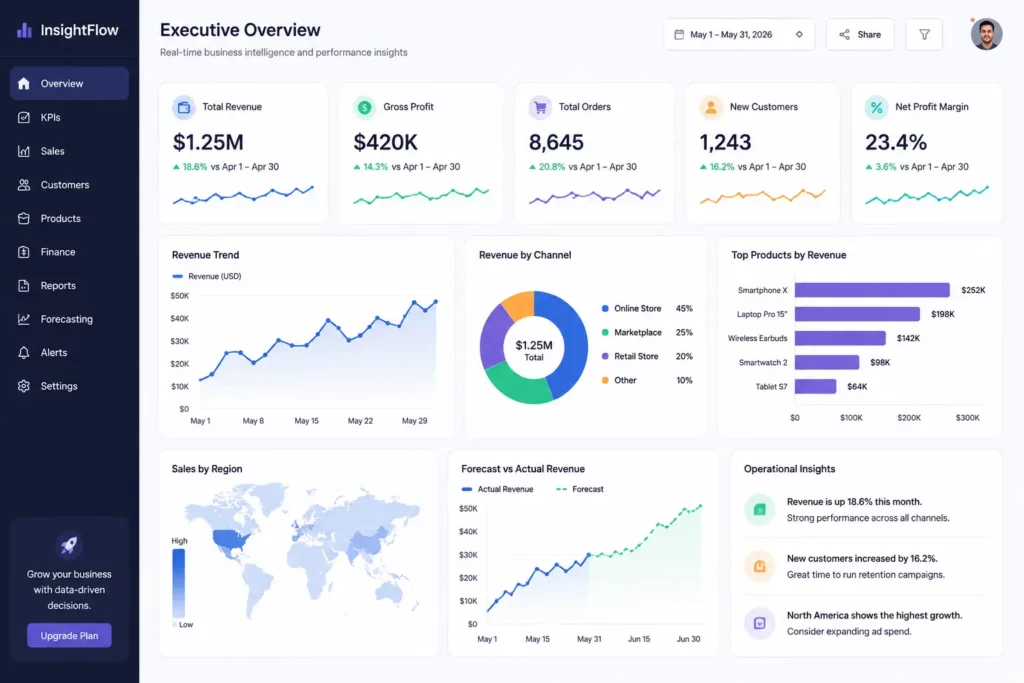
Improved Reporting
Data visualization software makes reports more engaging and easier to understand for both technical and non-technical audiences. eCommerce companies, for example, often use dashboard visualization tools to present sales performance, inventory levels, and customer trends visually.
Real-Time Monitoring
Many modern platforms support real-time dashboards that update automatically as new data arrives. SaaS companies frequently use interactive dashboards to monitor server performance, user activity, and application health in real time.
Enhanced Customer Insights
Visualization tools also help businesses better understand customer behavior. Manufacturing companies can analyze supply chain performance, while retailers can identify purchasing trends and customer preferences through interactive analytics dashboards.
What Are the Types of Data Visualization Tools?
Data visualization tools come in different forms depending on the use case, technical requirements, and target users. Some platforms focus on business reporting and analytics, while others are designed for developers building interactive dashboards and web applications.
Business Intelligence Platforms
Business intelligence (BI) platforms are designed primarily for business users, analysts, and executives. Tools such as Tableau, Microsoft Power BI, and Looker Studio provide drag-and-drop dashboards, reporting features, and built-in analytics capabilities.
These platforms help organizations analyze business performance, generate reports, and monitor KPIs without requiring extensive coding knowledge. They are commonly used for financial reporting, sales analytics, marketing dashboards, and operational monitoring.
JavaScript Charting Libraries
JavaScript charting libraries are developer-focused tools used to create interactive charts and dashboards inside web applications. Popular examples include FusionCharts, Chart.js, D3.js, and Apache ECharts.
Unlike traditional BI tools, charting libraries offer greater customization and flexibility for developers. They are widely used for embedded analytics, SaaS dashboards, real-time monitoring systems, and interactive data visualization experiences within React, Angular, Vue, and other web applications.
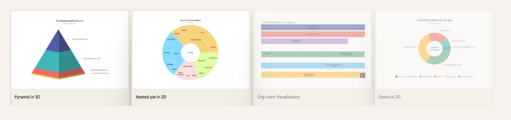
Open-Source Visualization Tools
Open-source visualization tools are popular among developers and startups because they offer flexibility and lower costs. Popular examples include Chart.js, D3.js, and Apache ECharts. Many open-source libraries can be customized extensively and integrated into various applications without expensive licensing fees.
However, these tools often require stronger technical knowledge and additional development effort for implementation, maintenance, and advanced customization.
Enterprise Visualization Platforms
Enterprise visualization platforms are built for large organizations that require scalability, governance, security, and integration with enterprise systems. Popular examples include Tableau, Microsoft Power BI, Qlik Sense, and Looker. These solutions often support advanced analytics workflows, role-based access control, large-scale reporting, and cloud or on-premise deployments.
Enterprise-grade platforms are commonly used in industries such as finance, healthcare, manufacturing, and telecommunications, where handling large datasets and maintaining data security are critical requirements.
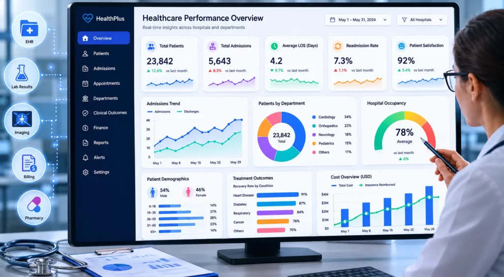
What Are the Key Features to Look for in Data Visualization Tools?
Choosing the right data visualization tool depends on your business goals, technical requirements, and the type of analytics experience you want to create. While some platforms focus on business reporting, others prioritize developer flexibility and embedded analytics. Here are some of the most important features to consider.
Interactive Charts
Modern visualization tools should support interactive charts that allow users to hover, filter, zoom, and drill down into data. Interactive experiences make dashboards more engaging and help users explore insights dynamically.
Dashboard Support
A good platform should provide flexible dashboard creation capabilities for combining multiple charts, KPIs, tables, and widgets into a single interface. Dashboards help teams monitor performance and make faster decisions.
Real-Time Updates
Many businesses now rely on real-time dashboards for monitoring live data streams, application performance, customer activity, and operational metrics. Real-time update support is especially important for SaaS, finance, and logistics platforms.
Explore more about JavaScript real-time charts.
Mobile Responsiveness
Visualization dashboards should work smoothly across desktops, tablets, and smartphones. Responsive design ensures charts remain readable and interactive on smaller screens.
Exporting Options
Many organizations need to export charts and reports as PDFs, images, CSVs, or Excel files for presentations, reporting, and collaboration purposes.
Data Source Integrations
Strong integration support allows platforms to connect with databases, APIs, cloud services, CRMs, spreadsheets, and analytics platforms. Seamless data connectivity simplifies reporting workflows.
API Availability
Developer-focused platforms should provide APIs and SDKs that make integration easier. APIs allow teams to automate dashboards, customize visualizations, and embed analytics into applications.
Embedding Support
Embedded analytics has become increasingly important for SaaS applications and customer portals. Visualization tools should support secure embedding within websites, applications, and internal systems.
Performance with Large Datasets
Some tools struggle when handling large or real-time datasets. Enterprise-grade platforms should support scalable rendering and optimized performance for complex analytics workloads.
Accessibility
Accessibility features such as keyboard navigation, screen reader compatibility, and color contrast support help ensure dashboards are usable for all users.
Collaboration Features
Many business intelligence tools include sharing, commenting, and collaborative reporting features that help teams work together more efficiently.
Customization
Customization options allow businesses and developers to match dashboards with their branding, workflows, and user experience requirements. Developer-focused charting libraries often provide greater design flexibility.
AI-Powered Analytics
Modern data visualization software increasingly includes AI-powered analytics features such as automated insights, predictive forecasting, anomaly detection, and natural language querying to help users uncover trends faster.
What Are the Best Data Visualization Tools in 2026?
The best data visualization tool depends on your goals, technical requirements, and target users. Some platforms focus on business intelligence and reporting, while others are designed for developers building interactive dashboards and embedded analytics experiences. Below are some of the leading data visualization tools and platforms in 2026.
FusionCharts
FusionCharts is a developer-focused JavaScript charting library designed for building interactive dashboards, enterprise reporting systems, and embedded analytics applications. It offers a large collection of chart types, real-time updates, responsive dashboards, and integrations with frameworks like React, Angular, and Vue.
Tableau
Tableau is one of the most popular business intelligence platforms for data exploration and dashboard reporting. It provides drag-and-drop analytics tools, advanced visualizations, and strong enterprise reporting capabilities for business users and analysts.
Microsoft Power BI
Power BI is Microsoft’s analytics and business intelligence platform that integrates closely with Excel, Azure, and Microsoft’s ecosystem. It is widely used for KPI monitoring, business reporting, and enterprise dashboards.
D3.js
D3.js is a highly flexible open-source JavaScript library for creating fully customized data visualizations. Developers often use D3.js for advanced, interactive, and highly tailored web visualizations.
Chart.js
Chart.js is a lightweight open-source charting library that makes it easy to create responsive charts with minimal setup. It is commonly used for smaller dashboards, prototypes, and simple web analytics projects.
Apache ECharts
Apache ECharts is an open-source visualization library known for interactive charts, maps, and real-time analytics capabilities. It supports large datasets and complex dashboard applications.
Highcharts
Highcharts is a widely used charting library for business dashboards and enterprise reporting. It offers polished chart designs, accessibility support, and advanced interactive features.
Data Studio
Data Studio is Google’s free dashboard and reporting platform that connects easily with Google Analytics, BigQuery, and other Google services. It is popular for marketing analytics and reporting dashboards.
Qlik Sense
Qlik Sense is an enterprise analytics platform focused on self-service business intelligence and interactive data exploration. It is commonly used for large-scale reporting and enterprise analytics workflows.
Datawrapper
Datawrapper is a simple visualization platform widely used by journalists, publishers, and media organizations to create charts, maps, and infographics quickly without coding.
RAWGraphs
RAWGraphs is an open-source visualization framework that helps users create custom charts and uncommon visualization types from spreadsheet-style data sources.
For a more detailed comparison of features, pricing, use cases, and pros and cons, explore our complete guide to the best data visualization tools:
Top Data Visualization Tools for 2026 (Free & Paid Compared)
BI Tools vs Charting Libraries: What Are the Similarities and Differences?
Business intelligence (BI) tools and charting libraries both help organizations visualize and analyze data. But they are designed for different users and use cases.
BI platforms mainly focus on reporting, analytics, and dashboard creation for business users. And charting libraries are developer-focused tools used to build interactive visualizations inside web applications and SaaS platforms.
The table below highlights the key similarities and differences between these two types of data visualization tools.
| Feature | BI Tools | Charting Libraries |
|---|---|---|
| Primary Users | Business users, analysts, executives | Developers, SaaS teams, engineers |
| Ease of Use | Beginner-friendly drag-and-drop interfaces | Requires coding knowledge |
| Developer Flexibility | Limited customization | Highly customizable |
| Customization | Moderate | Extensive |
| Dashboard Creation | Built-in dashboard support | Requires custom dashboard development |
| Analytics Features | Advanced reporting and business analytics | Visualization-focused |
| Real-Time Support | Available in many enterprise platforms | Strong support for real-time dashboards |
| Embedding Support | Often limited or premium-only | Designed for embedded analytics |
| API Availability | Varies by platform | Extensive APIs and SDKs |
| Performance with Large Datasets | Strong enterprise support | Depends on implementation and rendering |
| Scalability | Enterprise-grade scalability | Highly scalable with proper architecture |
| Learning Curve | Easier for non-technical users | Steeper for beginners |
| Cost | Often subscription-based | Open-source and commercial options available |
| Best Use Cases | Business reporting and analytics | Web apps, SaaS dashboards, embedded analytics |
Popular BI tools include Tableau, Microsoft Power BI, and Qlik Sense. Popular charting libraries include FusionCharts, D3.js, Chart.js, and Apache ECharts.
In many modern organizations, both types of tools are often used together. Business intelligence platforms help internal teams analyze company performance. Charting libraries power interactive customer-facing dashboards and embedded analytics experiences.
How to Choose the Right Data Visualization Tool
The best data visualization tool depends on your business size, technical requirements, budget, and the type of analytics experience you want to create. Some platforms are designed for business reporting, while others are built for developers creating embedded dashboards and interactive applications.
For Startups
Startups often need cost-effective and easy-to-implement solutions. Lightweight charting libraries and free BI tools can help small teams build dashboards quickly without large infrastructure costs. Open-source tools such as Chart.js and Apache ECharts are popular choices for startups with developer resources.
For Enterprises
Large organizations typically require enterprise-grade scalability, governance, security, and integration support. Platforms such as Tableau, Microsoft Power BI, and Qlik Sense are commonly used for enterprise reporting and advanced analytics workflows.
For Developers
Developers usually prioritize customization, APIs, framework compatibility, and embedding capabilities. JavaScript charting libraries like FusionCharts, D3.js, and Highcharts offer greater flexibility for building custom visual experiences inside web applications.
For Embedded Analytics
If you need to embed dashboards inside SaaS platforms or customer portals, choose tools with strong embedding support, responsive design, and API integrations. Developer-focused charting libraries are often better suited for embedded analytics use cases.
For Real-Time Dashboards
Industries such as finance, logistics, cybersecurity, and SaaS frequently rely on real-time analytics. In these cases, prioritize platforms that support live data streaming, fast rendering performance, and scalable dashboard architectures.
For Reporting Teams
Reporting teams often benefit from drag-and-drop BI tools that simplify dashboard creation and report sharing. Platforms like Power BI and Looker Studio help teams create visual reports without extensive coding knowledge.
For Non-Technical Users
Non-technical users usually prefer tools with intuitive interfaces, prebuilt templates, and minimal setup requirements. Business intelligence platforms are generally easier for non-developers to learn compared to developer-focused charting libraries.
Before selecting a platform, it’s important to evaluate your data sources, scalability needs, customization requirements, and long-term analytics goals. In many cases, organizations use both BI tools and charting libraries together to support internal reporting and customer-facing analytics experiences.
What Are the Common Challenges in Data Visualization?
Even the most advanced data visualization tools can become ineffective if dashboards are poorly designed or difficult to use. Businesses and developers often face several technical and usability challenges when building modern analytics experiences.
Here are the most common challenges in Data Visualization:
- Choosing the wrong chart type can make data difficult to understand and reduce clarity.
- Overloaded dashboards with too many charts, KPIs, and filters can overwhelm users.
- Large datasets and real-time analytics may cause dashboard performance and rendering issues.
- Misleading visuals, such as incorrect scaling or distorted proportions, can create inaccurate interpretations.
- Poor accessibility support can make dashboards difficult to use for some users.
- Integrating dashboards with databases, APIs, and third-party platforms can be technically complex.
- Some dashboards are not optimized for mobile devices, reducing usability on smaller screens.
- Maintaining consistency across multiple reports and dashboards can become challenging in large organizations.
What Are the Future Trends in Data Visualization?
Data visualization is evolving rapidly as AI, automation, and real-time analytics continue to reshape how businesses interact with data. Modern platforms are becoming more intelligent, interactive, and user-friendly due to the following emerging trends.
- AI-assisted analytics will help users automatically discover trends, anomalies, and insights.
- Natural language querying will allow users to ask questions and receive visual answers instantly.
- Predictive dashboards will combine historical data with forecasting and machine learning models.
- Real-time streaming analytics will become more important for industries that rely on live monitoring.
- Embedded analytics will continue growing as SaaS platforms integrate dashboards directly into applications.
- Interactive storytelling will help businesses communicate insights more clearly through guided visual experiences.
- Generative AI dashboards may automatically create reports, recommend charts, and summarize insights.
- More platforms will focus on accessibility, collaboration, and mobile-first dashboard experiences.
- Cloud-native analytics platforms will improve scalability and remote collaboration capabilities.
Conclusion
Choosing the right data visualization tool depends on your business goals, technical requirements, and the type of analytics experience you want to create. While business intelligence platforms focus on reporting and enterprise analytics, charting libraries provide developers with greater flexibility for building interactive dashboards and embedded analytics applications.
As organizations continue working with larger datasets and real-time insights, scalability, performance, and user experience have become more important than ever. Modern businesses need visualization tools that are not only powerful, but also interactive, responsive, and easy to integrate.
If you’re looking for a developer-friendly solution for creating interactive charts, dashboards, and embedded analytics experiences, explore FusionCharts and its wide range of data visualization capabilities.
FAQs
What are data visualization tools?
Data visualization tools are software platforms or libraries that convert raw data into visual formats such as charts, graphs, dashboards, maps, and reports to make insights easier to understand.
What is the best data visualization tool?
The best data visualization tool depends on your needs. Platforms like Tableau and Microsoft Power BI are popular for business analytics, while FusionCharts and D3.js are widely used for web applications and embedded analytics.
Which data visualization tools are free?
Popular free data visualization tools include Chart.js, D3.js, Apache ECharts, RAWGraphs, and Looker Studio. Some popular
What is the difference between BI tools and charting libraries?
BI tools focus on reporting, dashboards, and business analytics for non-technical users, while charting libraries are developer-focused tools used to build custom interactive visualizations and embedded analytics applications.
Which tools are best for dashboards?
Tools like Tableau, Power BI, and FusionCharts are commonly used for creating interactive dashboards and reporting systems.
Are JavaScript charting libraries better for web apps?
Yes. JavaScript charting libraries are often better suited for web applications because they offer greater customization, developer flexibility, and embedding support.
What are the best tools for real-time dashboards?
Popular tools for real-time dashboards include FusionCharts, Apache ECharts, Highcharts, and enterprise BI platforms with live data support.
Which data visualization tools support large datasets?
Enterprise-grade platforms such as Tableau, Qlik Sense, Power BI, and scalable charting libraries like FusionCharts and Apache ECharts can efficiently handle large datasets and complex dashboards.