
As a data enthusiast, I understand the importance of interpreting information effectively. That’s why a line graph is a valuable data visualization tool. With their simple representation of data over time, line graphs provide insights into trends and patterns crucial for decision-making. In this blog, I’ll take you through different line graph examples from various industries to help you understand the power of this type of data visualization.
From sales data to complex comparisons, I’ll showcase how a line graph can communicate information effectively. Join me in exploring the world of line graphs and improving your data visualization skills!
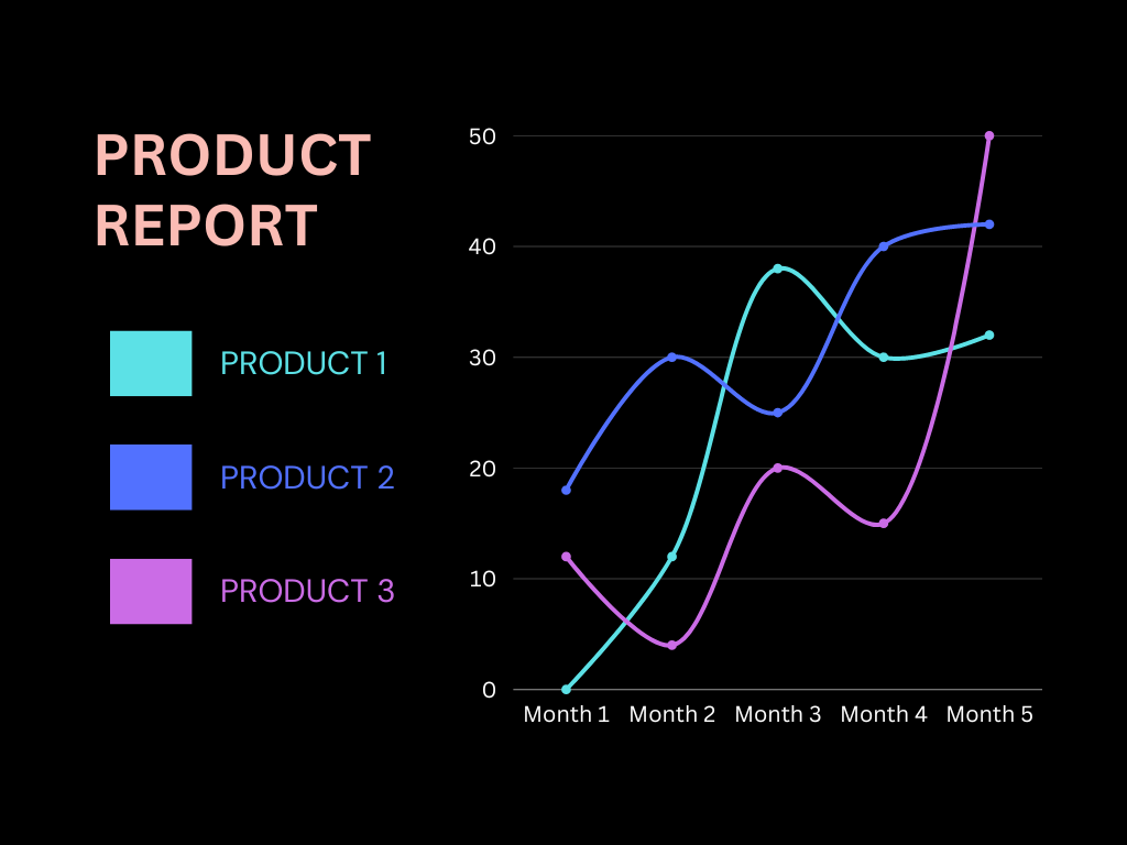
Table of Contents
Why are Graphs useful when interpreting data?
In this section, you’ll learn why are graphs useful when interpreting data because they provide a clear visual representation, making it easier to spot trends and patterns. They simplify complex information, aid in comparative analysis, and help in decision-making by conveying data more effectively than text. Graphs are crucial for communicating insights to a broad audience, making them an invaluable tool for data analysis.
What Is A Line Graph?
Diagrams known as line graphs display alterations and tendencies in data over a specific time frame. It happens by connecting each data point with lines. These graphs provide a helpful visual representation of patterns and shifts.
What Is The Purpose Of Line Graphs In Data Visualization?
Line graphs are particularly beneficial in illustrating information with a time-based aspect, such as data gathered over a period. Furthermore, they can display similarities or differences between multiple factors.
A major benefit of line graphs is the ease of comparing data points, as the lines connecting these points clearly show any fluctuations and changes over time. Now, the question is why and when to use a line chart. They can also be utilized to display information that spans a wide range, as the lines can effectively accommodate the scope of this data.
Let’s check out the types of line graphs.
What Are The Types Of Line Graphs?
There are three main types of line graphs. Despite having the same fundamental concepts, each type is best suited for specific situations depending on its unique characteristics.
Simple Line Graph
If you’re new to data visualization, simple line graphs are a great place to start. They consist of two axes and a line connecting the data points, making it easy to understand changes in one variable over time or comparisons between different variables.
For instance, if you’re thinking about when to use a line chart, you could use a simple line graph to show the fluctuations in temperature over a week or to compare the sales of two products at the end of each quarter. Simple line graphs are a clear and straightforward way to present information and are valuable in your data analysis toolkit.

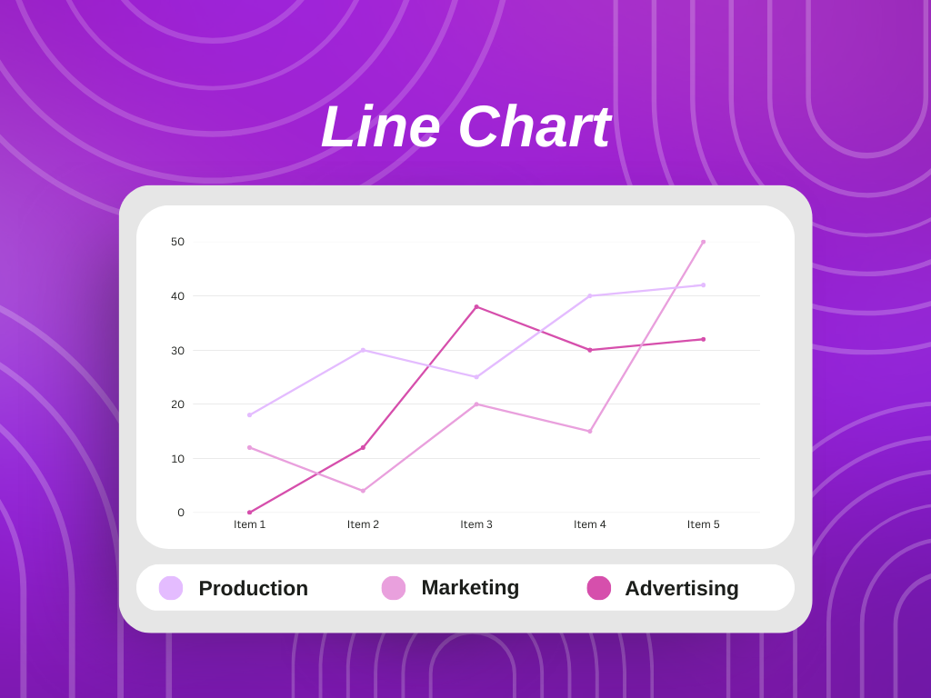
Multiple Line Graph
Multiple line charts are a step up from simple line graphs on the same axis. They allow you to compare multiple variables over time. Instead of just one line, you have multiple lines on the same graph, each representing a different variable. For instance, you could use a multiple-line graph to compare the average temperature in two cities over a week.
Multiple line graph shows you how to easily see how the variables relate to each other and identify trends and patterns. This type of graph is an effective way to communicate complex information clearly and concisely.

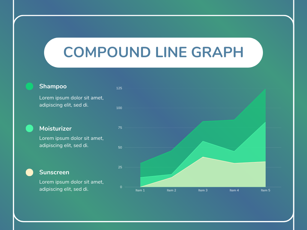
Compound Line Graph
Compound line graph represents the comparison capabilities of multiple line graphs to the next level by adding a third dimension. In addition to the x and y axes, a third axis represents a third variable.
For example, you could use a compound line graph to compare the sales of three different products over time, considering the impact of an email marketing campaign on each product’s sales.
With this type of graph, you can easily see the relationships between all three variables and how they interact. Compound line graphs are an excellent tool for presenting complex information in an easily understandable format.
What Are the Parts of a Line Graph?
Now you’re aware, when to use a line chart. So, it’s time to explore its parts. There are several components that we must use when drawing a line graph. Let’s explore them.
Data
The most crucial aspect of creating a line graph is having ample data. Before proceeding to make a line graph, it is important to gather and input significant data. This data is typically organized in a two-column table corresponding to the y and x-axes. You may also add labels to draw attention to specific data sets.
Plot
Next, you will require graph paper or a plotting tool to plot the values. If you are a business professional or tech-savvy individual, you may use an online tool to create your line graph.
Labeling Each Axis
Labeling each axis in a line graph is an important step in creating a clear and effective visual representation of your data. The labeling process involves assigning a label to each axis that accurately describes the data plotted on that axis.
For example, you might label the x-axis as “Time” and the y-axis as “Revenue.” Labeling each axis ensures that the audience can quickly understand the presented data and the relationships between different variables. According to communication statistics, this step is crucial for effective data visualization and communication.
Legend
A legend in a line graph is a key that provides additional information about the data being displayed on the graph. The legend typically includes symbols, colors, or patterns corresponding to each line on the graph. This allows the audience to identify and distinguish between the presented data sets easily.
Title
The title of a line graph is a brief phrase or sentence that provides an overall description of the data being presented. The title is typically placed at the top of the graph and should be clear and concise, giving the audience an immediate understanding of the message.
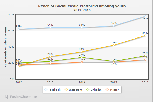
What Are The Types Of Data That Are Represented Using Line Graphs With FusionCharts?
FusionCharts, a popular data visualization tool and countering the question why are graphs useful when interpreting data , can be used to create line graphs to represent a variety of data types, including:
Time-Series Data
This includes data collected over time, such as stock prices, weather patterns, or sales trends.
Comparative Data
This includes data that compares multiple variables, such as the sales of different products or the growth of different countries.
Data Showing Changes Over Time Or Across Categories
This includes data representing a continuous range, such as temperature, humidity, or wind speed.
FusionCharts allows you to customize your line graphs with a wide range of options, including color and style, axis labeling, and data markers, to ensure that your data is clearly presented and easily understood by your audience.
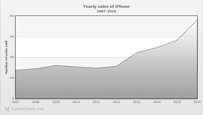
What Are Line Graph Examples For Visualizing Time-Series Data With FusionCharts?
Line graph examples for displaying time-series data are given below:
Stock Prices:
They show the changes in stock prices for a specific company or the stock market over time.
Weather Patterns
They show the changes in temperature, humidity, or other weather-related data over time.
Population Trends
These line graphs help us to show the population changes in an area over a specific time interval.
Sales Data
These line graphs help us show the changes in sales of a specific product or across an entire company over time.
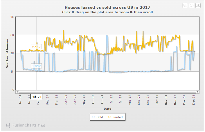
Traffic Data
It helps us visualize the changes in traffic flow over time, such as the number of visitors to a website or the number of passengers on a train.
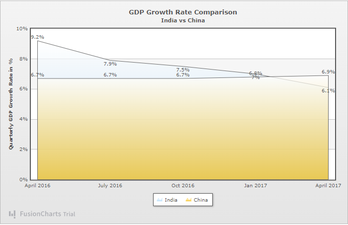
What Are Line Graph Examples For Comparing Trends With FusionCharts?
Here are some line graph examples that help us compare trends with FusionCharts.
Sales Data For Multiple Products
Line graphs are useful for comparing different products’ sales performance over time. This type of visualization can assist businesses in determining which products are thriving and which might require additional assistance.
Comparison of Temperature And Humidity
A line graph is useful for showcasing the correlation between temperature and humidity over a given period. This type of visualization helps comprehend how these two variables interact and how they may impact each other.
Comparison of Stock Performance:
Thinking why are graphs useful when interpreting data? Well, line graphs are a great way to compare the trends and patterns of multiple stocks over a specified period. This visualization can assist investors in making informed decisions by allowing them to identify the performance of various stocks over time.

Comparison of Sports Team Performance
We can also compare the performance of different sports teams over a specific time period. It can help us understand the performance of our teams and figure out any trends or patterns.

What Are Line Graph Examples For Illustrating Changes Over Time With FusionCharts?
Here are some line plot examples to illustrate changes over time by using FusionCharts.
Unemployment Rates
We can figure out the changes in the job market by graphing unemployment rates through a line graph.
Changes In School Test Scores
We can track the progress of an individual student or a class by graphing school test scores. It can help us focus on improvement areas for that particular individual or class.
Changes In Product Demand
A line graph can also help us visualize the demand for a product in the market. It can help us, the manufacturers of products, to improve the products or make important decisions.
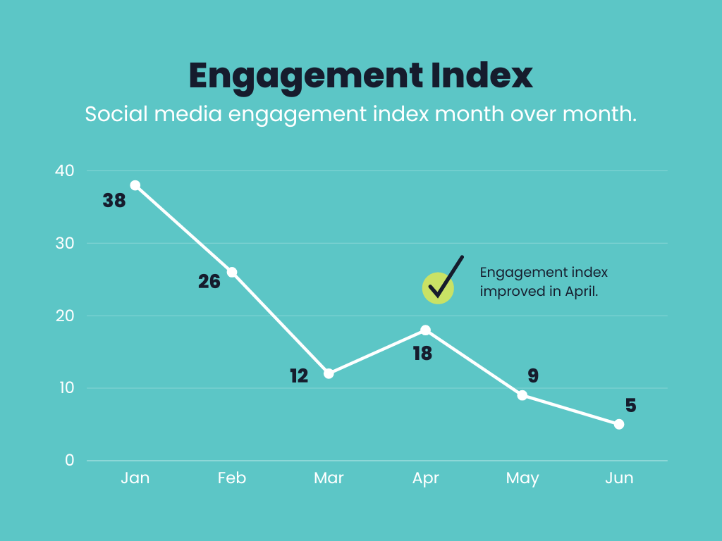
Changes In Social Media Engagement
As we know that social media engagement is important for business owners. Plotting it on a line graph allows businesses to determine their content performance.
Let’s check out some best practices to create a line graph.
What Are The Best Practices For Creating Effective Line Graph Examples?
Here are some best practices that we listed for creating effective line graph examples.
Choose The Appropriate Data
Line graphs are most appropriate for representing data that exhibits a recognizable trend or pattern over time or across various categories. On the other hand, it’s not recommended to use line graphs to display data that doesn’t demonstrate a clear trend or pattern.
Use Clear, Concise Labels
If you want to help your audience understand the data, you must use clear labels.
Use a Consistent Scale
Maintaining a consistent scale on the y-axis of your line graph is crucial. This enables your audience to compare the data points precisely and perceive the trends or patterns more clearly.
Use a Clear And Legible Font
Ensure that you use a font that is easy to read and clear on your line graph. This will facilitate your audience’s ability to comprehend the presented data easily.
Use Appropriate Data Markers
Consider incorporating data markers on your line graph to aid your audience in locating specific data points with ease.
Use A Clear And Descriptive Title
Make sure to use a title for your line graph that is clear and descriptive and accurately represents the data being displayed.
Line Graph Examples: Explore More With FusionCharts
Line graphs examples are a great tool for visualizing trends and patterns in data. By using clear labels, a consistent scale, a legible font, data markers, and a descriptive title, you can effectively communicate your data to your audience. Experiment with these elements to find the best line graph for your data visualization needs.
Line Graph Examples: FAQs
What Is an Example of a Line Graph?
An example of a line graph could represent a company’s stock price over time, with the x-axis representing the time and the y-axis representing the stock price.
How Do You Make a Line Graph Example?
- Prepare the data
- Select the data
- Create the line graph
- Customize the line graph
- Analyze the data
What Is a Line Graph Used For?
It helps us track changes over a specific pattern.
What Are the 3 Types of Line Graphs?
- Simple line charts
- Multiple line graph
- Compound line graph
What do line graphs help you see about your data?
Line graphs help you see trends and patterns in your data over time or across categories. They make it easier to interpret data and understand relationships between variables.
How Do You Make a Line Graph Example?
Below listed are ways to make line plot examples:
- Prepare the data
- Select the data
- Create the line graph
- Customize the line graph
- Analyze the data
How can line graphs help in decision-making?
Line graphs can help in decision-making by visually representing data trends and patterns. They make it easier to compare data sets, identify relationships between variables, and forecast future outcomes based on past data, helping individuals and organizations make informed decisions.
Transform Your Data Visualization with FusionCharts
Experience a new level of data visualization with FusionCharts. Our advanced tools empower you to create dynamic and engaging graphs and charts that transform complex data into clear, actionable insights.