
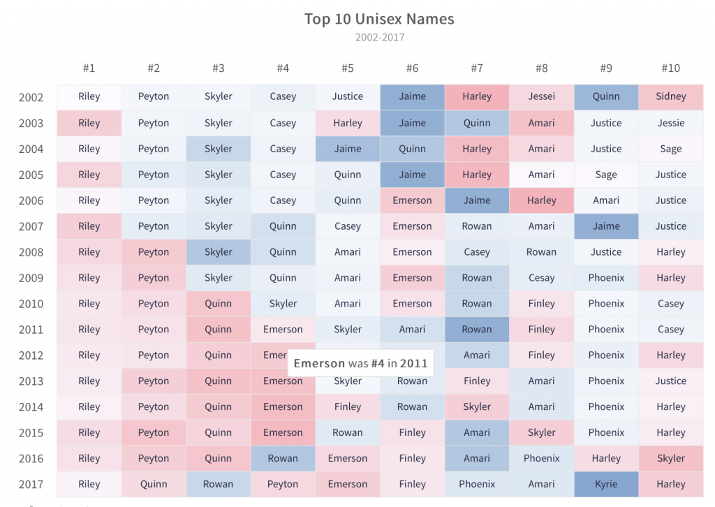
Historical data and statistics are the best basis for making future decisions and plans. However, data comes in the form of millions of raw numbers, which can be difficult to make sense of. That is where data visualization tools come to the rescue by presenting these numbers in a manner that is easy to interpret. They show data by plotting it on a graph or chart. They also present location-based data using data-driven maps or employ gauges to illustrate specialized data.
We have compiled a beginner’s guide to data visualization tools. It has answers to some of the most frequently asked questions about data presentation. Read on for some compelling reasons why FusionCharts should be your choice for a data visualization tool.
Table of Contents
What is a Data Visualization Tool?
Data in the form of numbers in a spreadsheet is hard to interpret. A data visualization tool presents and illustrates data in the form of charts or graphs. This, in turn, makes it easier to understand. Simply put, a data visualization tool displays raw input data points or summaries of data in an effective manner.
The most helpful data visualization tool is FusionCharts. It can process millions of data points efficiently. It also provides rich visual information summaries in a meaningful interface. Visualizations are not only apt representations of your data, they are also aesthetically pleasing and engaging.
What is the Importance of a Data Visualization Tool?
In the context of businesses, whether large or small, a data visualization tool illustrates key performance indicators (KPIs) and other metrics. Data Visualization tools help analysts, managers, and executives understand current trends within different departments. They enable your decision makers enables to allocate resources and plan future strategies. Your managers and CEO can also track sales, profits, individual executive performance, and more, keeping them up to date on an hourly, weekly, monthly, or yearly basis. Great data means great decisions.
How Does a Data Visualization Tool Present Data?
There are different ways in which you can illustrate your data. Let’s take a look at some possible modes of presentation.
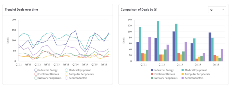
What are Line and Area Charts?
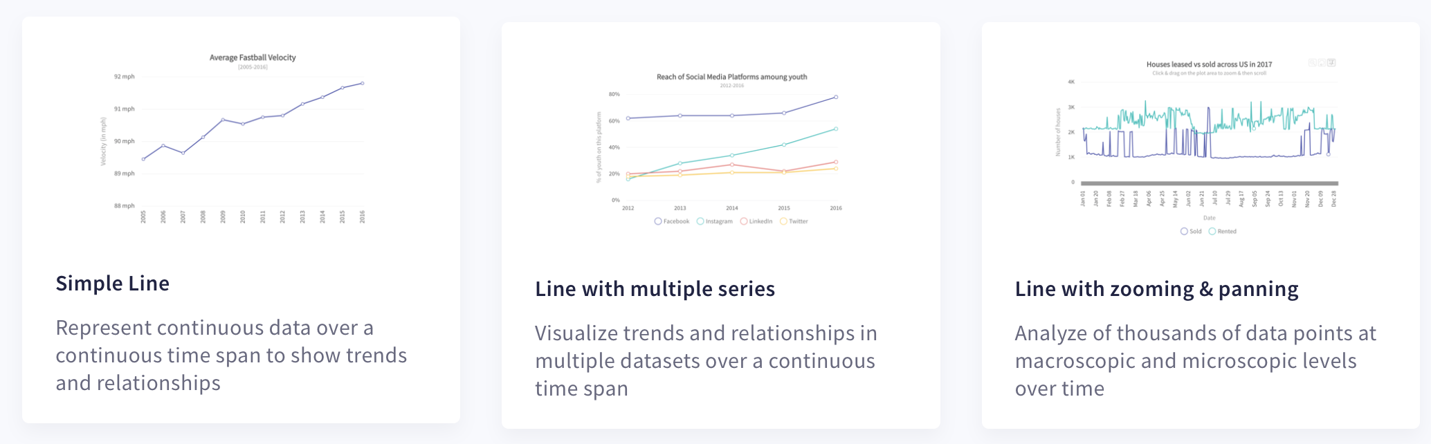
Line graphs and area charts represent the changing values of a variable over time or with respect to another variable.
What are Column and Bar Charts?
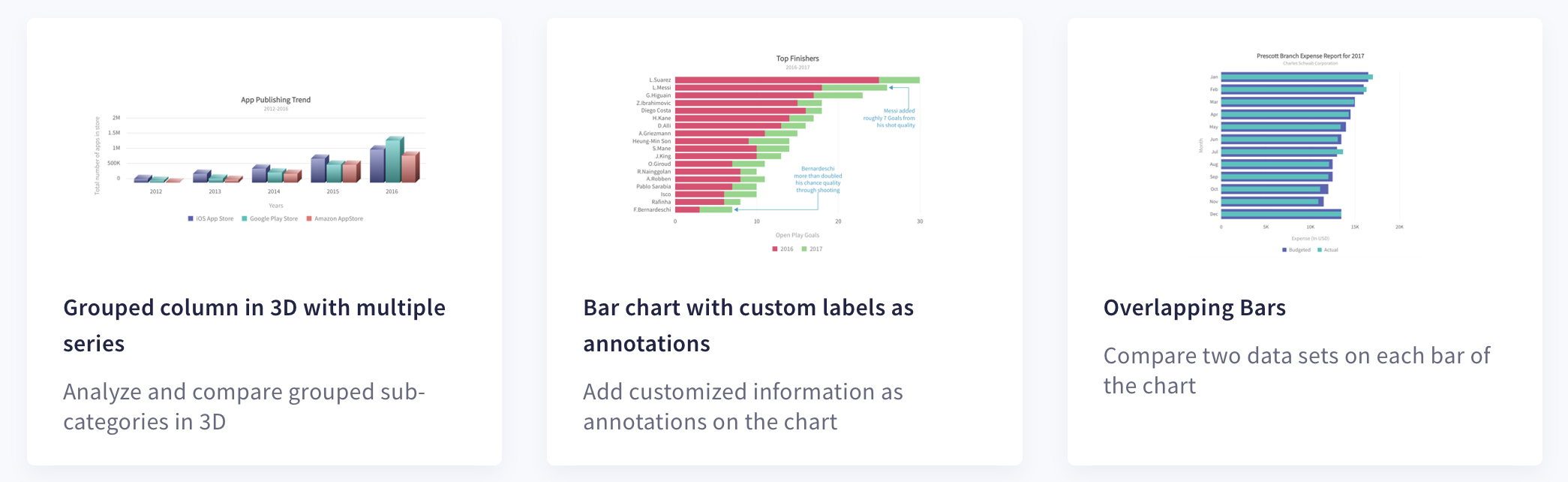
Column charts compare data values from similar categories or show how data values vary over time. Bar charts normally represent quantitative information with horizontal bars whose length represents the numerical value. They are also ideal for comparing data values.
What are Bubble and Scatter Charts?
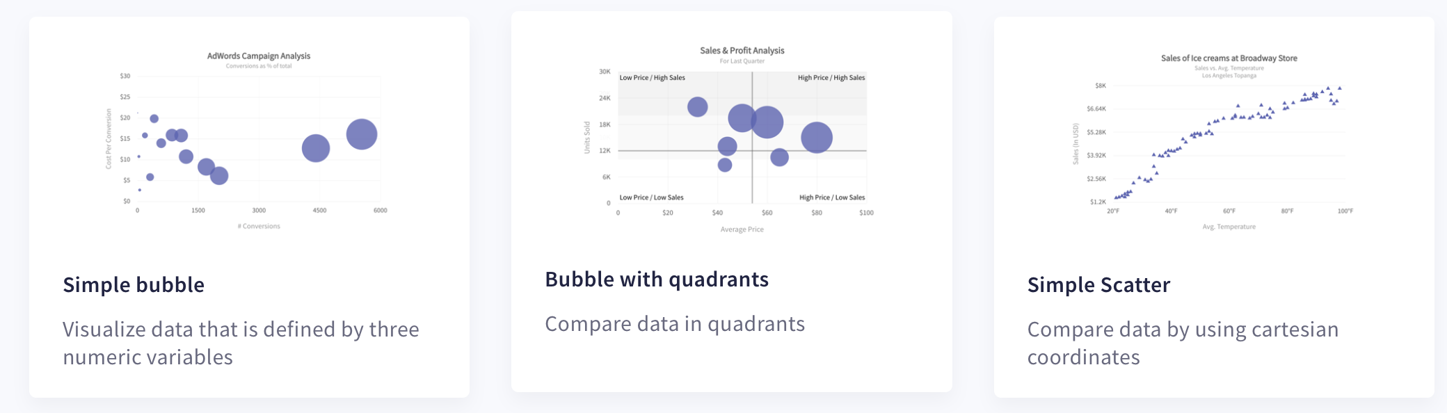
Bubble and scatter charts plot data using cartesian coordinates. A bubble chart shows the relationship between three numeric variables and a scatter chart depicts two variables. Both types of charts are useful for studying and analyzing the effect of one variable on another.
What are Pie and Doughnut Charts?
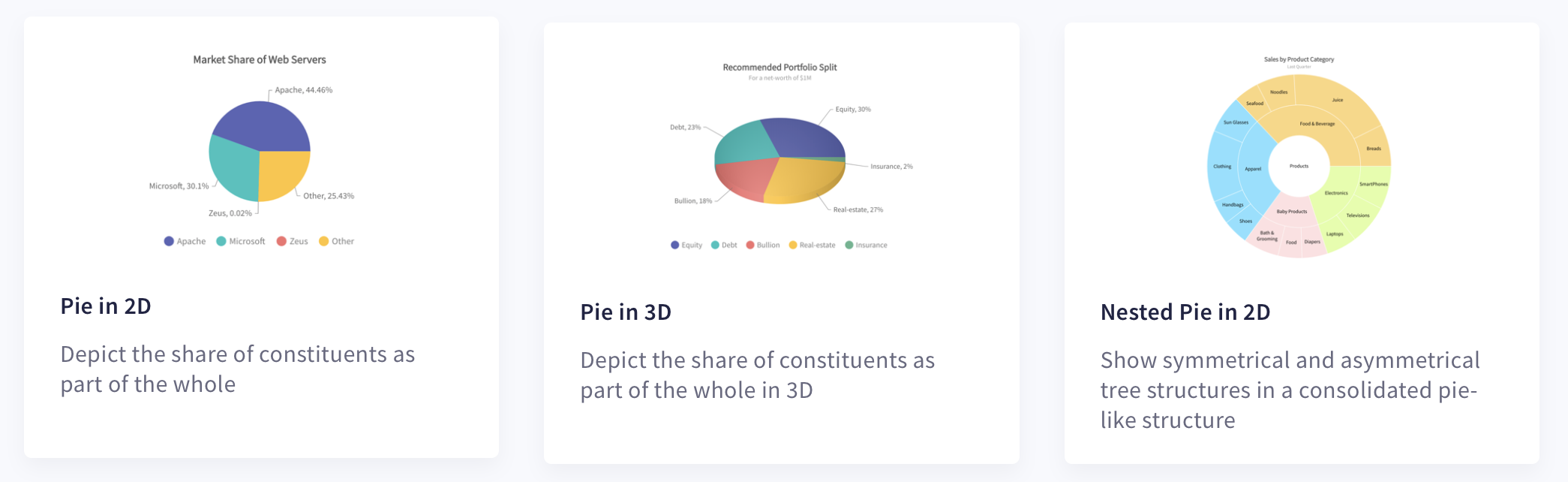
A pie chart depicts data as a circle with different sectors representing the proportion of different constituents. Similarly, a doughnut chart resembles a pie chart but has an empty center, usually used to provide useful information about the graph’s content.
Are there Other Specialized Charts?
While many data visualization tools usually include only very simple and commonly used charts, FusionCharts also provides many domain-specific and specialized charts. These include the following:
- Heat maps: 2D grid of simple or complex information depicted via different shades of different colors.
- Marimekko charts: A 2D stacked chart normally used to represent market shares.
- Chord diagrams: A circular arrangement representing interrelationships between various items of interest.
- Radar and spider charts: 2D illustration of multiple quantitive variables
You can explore a more detailed list of charts here.
What are the Important Features of a Good Data Visualization Tool?
Here are a few answers related to some important features of a good data visualization tool:
Should a Graph or Chart be Customizable?
Yes, everything in a chart or graph should be customizable. For example, FusionCharts allows you to customize everything in your chart. This includes chart colors, axis labels, tick labels, and font colors as well as title, text, and more.
What is a Data Streaming Chart?
In FusionCharts, a data streaming chart is a real-time, self-updating chart. They update automatically by fetching data from the server. Most importantly, they do not require any explicit page refreshes.
Which Data Visualization Tool Allows Integration in My Software App?
Data visualizations created via FusionCharts can be easily integrated into your software app. This means FusionCharts supports annything you develop using your choice of programming language. FusionCharts covers all tech-stacks including Vue.js, Angular, and React, as well as Django, and more.
On Which Platform Should the Tool Run?
Your data visualization should be accessible from anywhere at any time. This means your executives and managers should be able to look at the graphs and charts in their offices using desktops or laptops. They can also use their tablets or mobile phone for a quick review, up-to-date review of key performance metrics and indicators. FusionCharts is optimized to run on laptops, desktops, and all mobile devices, especially those running iOS and Android.
Should the Tool be Interactive?
Yes, your data visualization tool should be interactive and responsive. It should not be another static visual entity. For example, FusionCharts allows all types of user interactions. This includes zooming and panning, as well as scaling. It also allows you to capture user events and write handlers for all of them. You can define your own customized behavior for mouse events, keyboard events, data update events, chart refresh events, and more.
Which Data Visualization Tool is the Best?
FusionCharts is the best data visualization tool out there. As a testament to its popularity, its client base includes over 800,000 developers across 28,000 companies. These include Oracle, IBM, Dell, Infosys, and Adobe as well as Apple, and more. Because of its beautiful presentations, aesthetic interfaces, easy-to-use APIs, interactive charts, real-time updating, and customizable graphs, FusionCharts is the first choice for many developers and successful businesses.
Leverage FusionCharts to make the most of your data and sign up for a free trial today!


