
While data can be worth a lot today, a visual representation of said data is worth even more. Let’s face it, data, in itself, can get boring and difficult to understand. However, displaying values on a map can turn even the most complex geographical dataset into what’s visually appealing and easy to understand. Thanks to Microsoft Excel, with a few button clicks and navigations, you can quickly create any map, including a states map. In this article, you’ll learn how to create a US map in Excel.
But before we dive into creating a states map, let’s define a US map chart.
Table of Contents
What Is A US Map Chart?
A US map chart is a geographical data visualization tool. It provides organizations with US regional data types with the means to visualize spatial relationships. Using a US map chart, you can map specific metrics to different regions in the US.
Map charts have specific use cases and require geographical data types. Geographical data types are datasets that include geographical regions, for example, states, postal codes, and countries. One such use case of this data type is to compare categories across different locations.
Tip: Projecting your maps’ actual size
50 US States Map Creation
To create a US map that includes its 50 states, you’ll need a US map template you can manipulate according to your goals. Here’s a US map made of Excel shape icons from Spreadsheet Guru.
Representing the 50 states as shape icons makes it easy to customize the US map template. You can include colors, borders, chart title, map labels, data labels, and whatever design you want to visualize, just as you would customize Excel’s native insert shapes.
Map Setup
Before leveraging the US map template above, let’s define its formatting and features.
- Group Name: The shape icons have a group name set to “UnitedStates.”
- Individual Name: Each shape icon is set to a corresponding state name using the following naming method: “State_two-letter abbreviation.” For example, “state_CA” for the shape icon that represents the state of California.
- Border: All shapes, bar those representing Alaska and Hawaii, have a 0.25 white border.
Tip: Map creation with JS
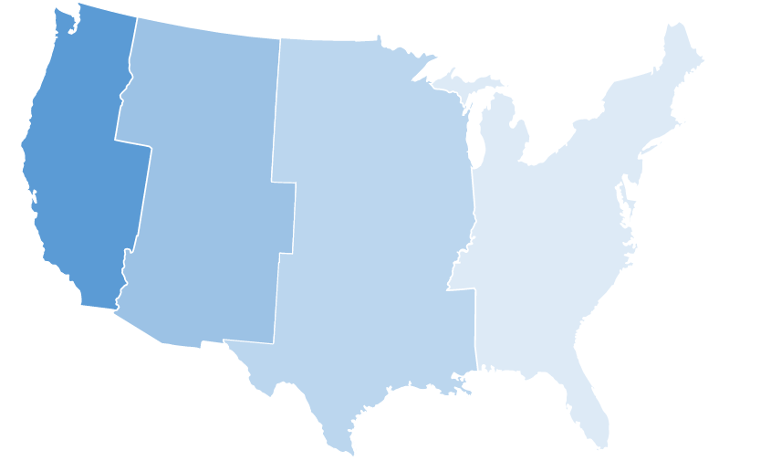
Regional Graphics Of The US
For many use cases, viewing the entire US map with all 50 states is irrelevant. For example, if your datasets include only data from a specific region, you want to represent only that region. Showing the entire US map with data points in one secluded region can make it difficult for your audience to understand.
Spreadsheet Guru also provides custom regional shapes.
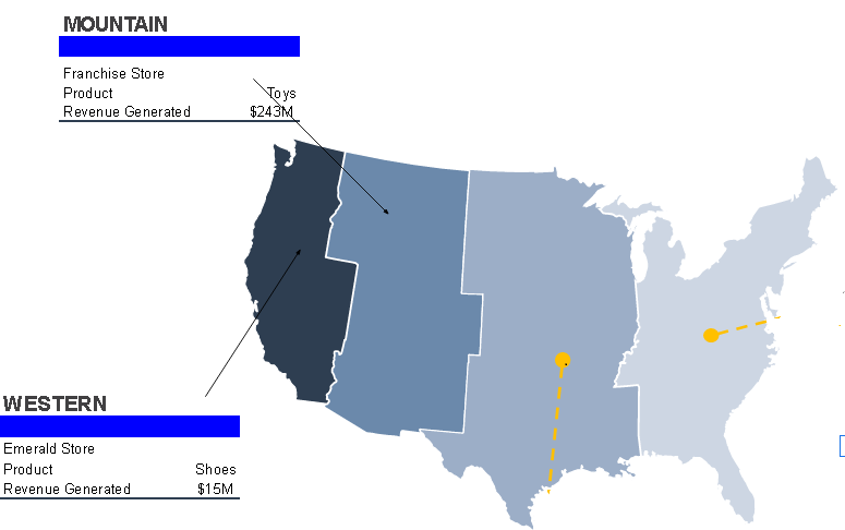
Infographic Charts Creation Of The US Map In Excel
Since our US map templates are fully customizable, we can get really creative with infographics. Let’s create one using the steps below.
Creation Process
We’ll create an infographic using the regional shape templates as a backdrop. Since we already have our regional shapes, we only need to customize and include ranges to create our infographic.
Customized Lines
The lines of the example below have the following features:
- Weight = 2.25 pt
- Dash = Square Dots
- Circular End Point
Ranging The Map
- Choose an Excel range, then copy it
- Choose the destination cell location
- Toggle the Paste Menu, and select Linked Picture from the drop-down menu
- Move your linked picture to the desired spot
US Map Dashboard In Excel
Map dashboards are essential data visualization tools for representing data in a more appealing and easy-to-understand manner. Using a few lines of Visual Basic code, we can create interactive Excel dashboards. Our Excel map chart template offers many dashboard opportunities, such as highlighting regions and hiding specific data.
Let’s look at one such example.
VBA Code Automation
To highlight states, we need an Excel table that users can interact with. Since the shape icons have names with state abbreviations, we can easily create a table that maps the shape icons to the real states.
Next, we add a data visualization list that triggers a highlight color on and off when users select “Yes” or delete the “Yes” value.
Here’s a sample code from Spreadsheet Guru that does this:
Sub UpdateStateGraphic()

'PURPOSE: Update Highlighting Within United States Map Chart

'SOURCE: www.thespreadsheetguru.com

Dim shpUnitedStates As Shape

Dim shpHighlight As Shape

Dim tblStates As ListObject

Dim cell As Range

Dim HighlightColor As Long

//'Determine Highlight Color

  Set shpHighlight = ActiveSheet.Shapes("HighlightColor")

  HighlightColor = shpHighlight.Fill.ForeColor.RGB

//'Reset All States

  Set shpUnitedStates = ActiveSheet.Shapes("UnitedStates")

  shpUnitedStates.Fill.ForeColor.RGB = RGB(208, 206, 206)

//'Loop through each row in the table and color states that are flagged

  Set tblStates = ActiveSheet.ListObjects("Table_States")

  For Each cell In tblStates.DataBodyRange.Columns(4).Cells

    If cell.Value = "Yes" Then

      ActiveSheet.Shapes(cell.Offset(0, -1).Value).Fill.ForeColor.RGB = HighlightColor

    End If

  Next cell

End Sub
Limitations Of US Map In Excel
While creating a US map in Excel can be as easy as downloading templates and customizing accordingly, Excel’s built-in map features aren’t completely comprehensive.
For starters, Excel map charts cannot plot low-level details like longitude/latitude and street address mapping. It also does not support multi-dimensional detail. So, you can only have one-dimensional map charts.
Also, to add new map data, you need to connect to the Bing map service. Therefore, you need an internet connection.
Conclusion
With business agility increasingly a prerequisite for success, quickly understanding and interpreting data is crucial. Creating a US map in Excel is one way to visualize geographical datasets, thus making it easy for users to understand and interpret data.
However, Excel charts’ features are limited. For more extensive and limitless map chart features, check out FusionCharts mapping lists.