Table of Contents
Introduction
A world map is the visual presentation of the world consisting of different countries, continents, and oceans. It essentially shows us the location, shape, and size of countries and continents, and the distance between different places. But did you know the world map we studied in geography wasn’t an accurate depiction of the real size of countries’ maps? Those classroom maps were based on the famous Mercator projection, a 16th-century map projection that distorted the size of certain countries and continents depending on their distance from the equator. Fortunately, today, accurate, true-size maps are available, such as world maps, state maps, and more.
Understanding True Size of Countries
To generate an accurate, true-size map, we must know the actual sizes of all the countries around the world. However, the image of countries is mainly based on the Mercator projection, which isn’t accurate.
For example, many people believe that Norway and Chile are of the same size because the map they are familiar with shows this. In reality, Chile is about two times larger than Norway. Similarly, it’s a common perception that Sweden is larger than Spain when actually Spain is larger.
Factors Affecting Map Scale and True Size Representation
The world map (based on the Mercator projection) that most of us are familiar with is a 2D (two-dimensional) representation of the globe. But we all know the earth is 3D and isn’t flat. When we represent a 3D world on a two-dimensional map, there will be some inherent issues, such as the incorrect size of countries and continents, and distortion of angles of longitude and latitude lines.
Mercator Projection
Flemish cartographer Gerardus Mercator developed the Mercator map or projection in 1569. It was designed to help with accurate navigation, and it rightly served its purpose. However, the downside of the Mercator map was that it significantly distorted the real size of countries compared depending on their distance from the equator. The further a place was from the equator, the bigger it appeared on the Mercator map.
For example, in a Mercator projection map, Africa and Greenland have the same size. In reality, Africa is about 14 times bigger than Greenland. Similarly, Canada, Russia, and North America appear larger than they actually are. Hence, the Mercator projection map wasn’t an accurate true size map.
Most online mapping apps use Mercator projection. That’s why many people don’t know the true size of countries and relative areas of oceans and continents.
Authagraph Projection – Accurate True Size Map
Over time, people realized and started questioning the inaccuracy of the Mercator projection. This led to the invention of a new map projection called Authagraph projection. Japanese architect Hajime Narukawa created the Authagraph projection in 1999, and also won the Good Design Award in 2016 for this innovation.
This map represents the relative size of countries and land area much more accurately than Mercator maps. It also reduces shape distortion and avoids dead ends. This allows us to visualize the world by expanding the map in any direction. As a result, you can center the map on any area of the world, depending on what you want to learn. For example, you can center the map on the Pacific Ocean, Europe, or any other continent.
While the Authagraph isn’t a 100% accurate true size map, it’s still one of the best ways to represent the world in a 2D flat map. Unfortunately, the Authagraph map is currently a proprietary model, so we don’t have its equations. As a result, it’s pretty difficult to reproduce it and use it for different purposes.
Map Projection – Key Points
- If we use a tool for a long period of time without questioning its accuracy and efficiency, it becomes the standard tool. For example, the Mercator projection has become the standard for creating most world maps.
- Using a tool to navigate without knowing its flaws can heavily cost us.
- We should constantly assess and improve our tools to make them as accurate as possible for the purpose we’re using them for.
How To Sketch And Code An Accurate True Size Map?
You might need to create a JavaScript world map, states map, or countries map, to represent or analyze location-specific data. However, creating an accurate true size map requires thorough planning and numerous sketches. The best tools for sketching are vibrant pens and bright paper.
When sketching the map compare country sizes, it’s best to use a tool like ‘The True Size of’ to accurately compare plot the real size of countries relative to each other. This tool allows you to add a country’s outline to the map, which then resizes automatically to make up for the Mercator projection.
Once you are satisfied with the sketch, open your code editor and create a JavaScript map.
What Is The Best Tool For Creating JavaScript Maps?
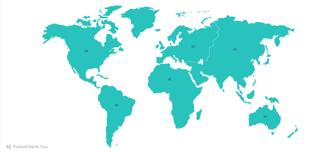
FusionCharts

The best way to generate a beautiful JavaScript map is to use FusionCharts. FusionCharts comes with a JavaScript API for creating interactive charts and the real size of countries on a map. FusionCharts charting library is a powerful data visualization tool that comes with over 100 different charts, such as bar, pie, area, line, donut charts, and heat maps. It also offers more than 2000 map templates covering continents, countries, cities, and regions.
You can use FusionChart’s maps to plot critical geographical data, such as population by state, revenue by regions, survey and election results. FusionCharts also allows you to add markers on the map to pinpoint important places like flight routes and office locations. It supports React, jQuery, and many other major frameworks.
Some key maps of FusionCharts include:
World And Continents
- World
- World with countries
- World with Antarctica
- World 8 regions
- North America
- Central America
- Europe
- And more!
USA Regions
- USA – All regions
- Central region
- Northeast region
- Northwest region
- USA – States
- And many more!
GMaps
GMaps simplifies Google Maps integration with its user-friendly interface. Beyond basic mapping, it offers advanced features like polylines for routes, customizable menu controls, and HTML element embedding.
GMaps seamlessly integrates with JSON formatted data, allowing for seamless integration with various applications, such as Foursquare. This ensures your map looks excellent and serves as a functional component within your broader application ecosystem.
Mapael
jQuery Mapael empowers you to craft best map projection enriched with interactive elements. Effortlessly designate regions on your map with distinct colors and add informative tooltips. Plus, event handlers like click or hover can be incorporated to enhance user engagement.
Built with SEO in mind, jQuery Mapael ensures search engine visibility by providing alternate content for non-JavaScript crawlers. This ensures your maps remain accessible and informative to all users, regardless of their browsing capabilities.
KartoGraph
Kartograph stands out as the ultimate tool for creating dynamic JavaScript maps. It comprises Kartograph. ph and Kartograph.js files and generates SVG maps effortlessly, ensuring compatibility even with older browsers like IE7. Leveraging jQuery and Raphael, Kartograph offers seamless map generation and interactivity. With Kartograph, you can easily manipulate DOM elements, handle data efficiently, and incorporate CSS animations. Plus, its comprehensive documentation and API references streamline project execution.
DataMaps
DataMaps is a robust JavaScript library for visualizing geographic data on interactive maps. With DataMaps, developers can effortlessly plot data points, choropleth maps, and bubble maps, enhancing data analysis and visualization. Additionally, browser and plugin testing availability ensures smooth and reliable functionality, further enhancing the user experience.
GeoComplete
GeoComplete enriches the user experience by providing autocomplete functionality for geographic data input fields. By seamlessly integrating with mapping APIs, GeoComplete simplifies location-based searches, saving users time and effort. This tool is invaluable for applicationsrequiring precise location information on the real size of countries and enhancing user engagement.
jHere
jHere offers a seamless solution for integrating interactive maps into web applications. Leveraging powerful mapping APIs, jHere enables developers to create dynamic maps with customizable markers, overlays, and geolocation features.Its user-friendly interface and thorough documentation make it a top choice for applications requiring advanced mapping capabilities.
Leaflet
The Leaflet is a lightweight, flexible JavaScript library for creating elegant and responsive maps. With Leaflet, developers can easily add interactive maps to websites and applications with customizable markers, layers, and controls. Its simplicity and versatility make it a top choice among developers seeking to integrate maps seamlessly into their projects.
jVectorMap
jVectorMap empowers developers to design beautiful and real size of countries vector maps that are scalable and fully customizable. With support for various best map projection and data formats, jVectorMap offers flexibility for creating stunning visualizations tailored to specific requirements. Its compatibility with popular web technologies and extensive documentation make it a valuable tool for projects demanding high-quality vector mapping capabilities.
CesiumJS
CesiumJS revolutionizes mapping with its powerful 3D visualization capabilities. Ideal for creating immersive geospatial applications, CesiumJS enables developers to visualize terrain, buildings, and other geographic features in stunning detail. Its support for WebGL and compatibility with various data formats make it a preferred choice for projects requiring advanced 3D mapping functionalities. CesiumJS opens up endless possibilities for creating interactive and immersive mapping experiences.
Final Thoughts
Most world maps are based on Mercator projection, which was designed for navigation. While a Mercator map is great for navigation, when the projection was used to create a map that included the whole world, it didn’t accurately show the real size of countries. For instance, on a Mercator map, Europe appears much larger than it actually is when compared to South America. A best map projection is Authagraph projection, but it’s still a proprietary model.
Ready to create beautiful JavaScript charts and maps? Sign up for FusionCharts and try its exciting features today!
Do JavaScript Charting libraries allow you to build maps?
Yes, JavaScript Charting libraries like FusionCharts, Leaflet, and Google Maps JavaScript API allow you to build interactive maps for web applications. These libraries provide various functionalities for creating and customizing maps, adding markers, layers, and overlays, as well as handling user interactions like zooming and panning.
How to create a world map in JavaScript?
To create a world map in JavaScript, you can use a library like FusionCharts or Leaflet, jHere, etc. These libraries provide functions to render maps and add interactive features. Here are the steps on how to create one:
- Choose a library (e.g. FusionCharts).
- Create an HTML element to hold the map.
- Use the library’s functions to load and display the map data.
- Customize the map with colors, markers, and other features as needed.
Read more about:
How To Create Maps With My JavaScript Charting Library?
Is map useful in JavaScript?
Yes, the ‘Map’ object in JavaScript is very useful. It allows you to store key-value pairs and retrieve the values based on their keys efficiently. Unlike regular objects, ‘Map’ keys can be any value, including functions, objects, and primitives. This makes ‘Map’ a versatile tool for various data storage and manipulation tasks. –>


