
There are two main types of charts for technical analysis. They are the logarithmic chart and linear chart. Both of them are widely used in the data visualization tool. They offer several key benefits. However, which is the best option? In this post on logarithmic vs linear charts, you will find the detailed answer.
Table of Contents
What Is A Logarithmic Chart?
A logarithmic chart refers to a chart that shows visual moves for relative changes. It is also known as the log scale. It uses the logarithmic scale to compactly display numerical data over a wide range of values. Here is an example:
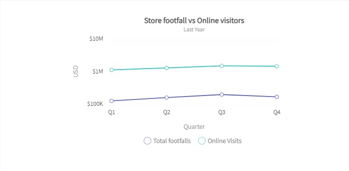
The above example shows a logarithmic scale. It displays price scales for different quarters. It has visualized changes in relative values. Hence, you can easily understand the change in price scales in different quarters.
When Logarithmic Scale Can Be Used?
You should use a logarithmic scale in the following scenarios:
- The data has a wide range of values. And you cannot efficiently reduce the axis or chart to a more manageable size with linear values.
- The data may contain exponential laws, like the Richter scale.
What Are The Advantages Of Logarithmic Charts?
Logarithmic charts offer several amazing benefits. Let’s take a look at them:
Trends are Easier to See
Logarithmic charts show a true reflection of what is actually happening. It provides a more accurate representation than linear charts once you draw trend lines on the chart. Hence, it’s easier for you to see the right trends.
Long-Term Perspectives
It’s quite normal for values to change over the long term. Because the situations or other factors vary from time to time. That’s why you need a form of visualization to see the long-term perspective. This is where the logarithmic chart comes into play. Despite huge periods of change and growth on the scale, it allows you to easily see the long-term perspectives. You cannot conveniently display the same change on a linear scale. Therefore, it’s not suitable for visualizing the long-term price scale.
Keep in mind that the price scale is equal with linear charts. Therefore, a move from $100 to $150 is the same as a change from $200 to $250.
The per unit distribution is $50. However, there is a percentage difference. When you move from $100 to $150, you make a 40% shift. Then you make a 22% approximate move from $200 to $250.
That’s why you shouldn’t visualize large price movements in linear charts. Instead, you should use the logarithmic chart, as it focuses on the percentage of the movement. It’s one of the most important factors to keep in mind while thinking about logarithmic vs linear charts.
Read: The Most Common Mistakes People Make with Charts
Wider Range of Data
A linear scale is equally spread out. It uses an equal value between price points. That’s why there are a few outliers. They can squeeze all the other data together. As a result, it will be very difficult for you to clearly see them. You can solve this problem by using a logarithmic scale. It allows you to easily see the individual data points. Therefore, it is more suitable for displaying a wider range of data than the linear scale. It’s another important factor for logarithmic vs linear charts.
Data Representation
You can easily represent the data in a logarithmic chart using FusionCharts. It’s one of the most comprehensive JavaScript charting libraries. It allows you to effortlessly visualize data.
Read: Graph Maker – Expectations vs. Reality
Here is an example of a logarithmic chart created with FusionCharts:
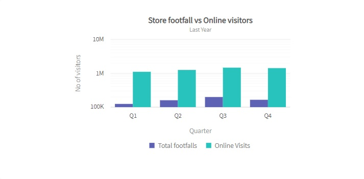
As you can see, the above example shows a log column 2D chart. It compares the store footfalls with the online visits for one year.
To create this chart, you have to follow these steps:
1. Go to your HTML file. Add these lines:
<html>
<head>
	<title>My first chart using FusionCharts Suite XT</title>
	https://cdn.fusioncharts.com/fusioncharts/latest/fusioncharts.js
	https://cdn.fusioncharts.com/fusioncharts/latest/themes/fusioncharts.theme.fusion.js
	<script type="text/javascript">
		FusionCharts.ready(function(){
			var chartObj = new FusionCharts({
    type: 'logmscolumn2d',
    renderAt: 'chart-container',
    width: '500',
    height: '350',
    dataFormat: 'json',
    dataSource: {
        "chart": {
            "theme": "fusion",
            "caption": "Store footfall vs Online visitors ",
            "subCaption": "Last Year",
            "xAxisName": "Quarter",
            "yAxisName": "No of visitors",
            "showXAxisLine": "1",
            "axisLineAlpha": "10"
        },
        "categories": [{
            "category": [{
                "label": "Q1"
            }, {
                "label": "Q2"
            }, {
                "label": "Q3"
            }, {
                "label": "Q4"
            }]
        }],
        "dataset": [{
            "seriesname": "Total footfalls",
            "data": [{
                "value": "126734"
            }, {
                "value": "159851"
            }, {
                "value": "197393"
            }, {
                "value": "168560"
            }, {
                "value": "199428"
            }]
        }, {
            "seriesname": "Online Visits",
            "data": [{
                "value": "1126059"
            }, {
                "value": "1292145"
            }, {
                "value": "1496849"
            }, {
                "value": "1460249"
            }, {
                "value": "1083962"
            }]
        }]
    }
}
);
			chartObj.render();
		});
	</script>
	</head>
	<body>
		<div id="chart-container">FusionCharts XT will load here!</div>
	</body>
</html>
2. Open your JSON file. Then insert these lines:
{
    "chart": {
        "theme": "fusion",
        "caption": "Store footfall vs Online visitors ",
        "subCaption": "Last Year",
        "xAxisName": "Quarter",
        "yAxisName": "No of visitors",
        "showXAxisLine": "1",
        "axisLineAlpha": "10"
    },
    "categories": [
        {
            "category": [
                {
                    "label": "Q1"
                },
                {
                    "label": "Q2"
                },
                {
                    "label": "Q3"
                },
                {
                    "label": "Q4"
                }
            ]
        }
    ],
    "dataset": [
        {
            "seriesname": "Total footfalls",
            "data": [
                {
                    "value": "126734"
                },
                {
                    "value": "159851"
                },
                {
                    "value": "197393"
                },
                {
                    "value": "168560"
                },
                {
                    "value": "199428"
                }
            ]
        },
        {
            "seriesname": "Online Visits",
            "data": [
                {
                    "value": "1126059"
                },
                {
                    "value": "1292145"
                },
                {
                    "value": "1496849"
                },
                {
                    "value": "1460249"
                },
                {
                    "value": "1083962"
                }
            ]
        }
    ]
}
3. Finally, go to your XML file. Insert this code:
<chart theme="fusion" caption="Store footfall vs Online visitors " subcaption="Last Year" xaxisname="Quarter" yaxisname="No of visitors" showxaxisline="1" axislinealpha="10">
    <categories>
        <category label="Q1" />
        <category label="Q2" />
        <category label="Q3" />
        <category label="Q4" />
    </categories>
    <dataset seriesname="Total footfalls">
        <set value="126734" />
        <set value="159851" />
        <set value="197393" />
        <set value="168560" />
        <set value="199428" />
    </dataset>
    <dataset seriesname="Online Visits">
        <set value="1126059" />
        <set value="1292145" />
        <set value="1496849" />
        <set value="1460249" />
        <set value="1083962" />
    </dataset>
</chart>
What Is A Linear Chart?
A linear chart is a graphical display of information that changes continuously over time. It is a straight line drawn on a plane connecting the points plotted on x and y coordinates. It shows the same distance between the values on the y-axis.
Here is an example of a linear chart:
What Are The Advantages Of Linear Charts?
Easy To Understand
Linear charts provide an easy analysis of data. It allows you to quickly determine the range and minimum/maximum values. Also, it lets you quickly identify gaps or clusters. Hence, you can easily understand changes over a certain period.
Make Decisions Faster
Linear charts are helpful to show small changes that are difficult to measure in other graphs. It allows you to quickly get key insights. As a result, you can make important business decisions faster.
Short Distance Accuracy
Linear charts connect data points using a short-distance line. Hence, it can accurately display changes that happen at regular intervals.
Linear Scale For Day Traders
Linear charts support the linear price scale. Hence, it is suitable for analyzing data points that are moving within a short time frame. It makes the linear charts a great choice for visualizing data of intraday trading sessions.
Read: A Beginner’s Guide To Charts
Data Representation
The linear chart represents an asset’s price history using a single, continuous line. FusionCharts makes it very easy for you to visualize it. The whole process takes just a few minutes. Here is an example of a linear chart created with FusionCharts:
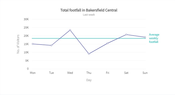
The linear chart shows a visual representation of the weekly number of visitors at Bakersfield Central. To create it, you have to follow these steps:
1. Go to your HTML file. Add this code:
<html>
<head>
	<title>My first chart using FusionCharts Suite XT</title>
	https://cdn.fusioncharts.com/fusioncharts/latest/fusioncharts.js
	https://cdn.fusioncharts.com/fusioncharts/latest/themes/fusioncharts.theme.fusion.js
	<script type="text/javascript">
		FusionCharts.ready(function(){
			var chartObj = new FusionCharts({
    type: 'line',
    renderAt: 'chart-container',
    width: '680',
    height: '390',
    dataFormat: 'json',
    dataSource: {
        "chart": {
            "theme": "fusion",
            "caption": "Total footfall in Bakersfield Central",
            "subCaption": "Last week",
            "xAxisName": "Day",
            "yAxisName": "No. of Visitors",
            "lineThickness": "2"
        },
        "data": [{
                "label": "Mon",
                "value": "15123"
            },
            {
                "label": "Tue",
                "value": "14233"
            },
            {
                "label": "Wed",
                "value": "23507"
            },
            {
                "label": "Thu",
                "value": "9110"
            },
            {
                "label": "Fri",
                "value": "15529"
            },
            {
                "label": "Sat",
                "value": "20803"
            },
            {
                "label": "Sun",
                "value": "19202"
            }
        ],
        "trendlines": [{
            "line": [{
                "startvalue": "18500",
                "color": "#29C3BE",
                "displayvalue": "Average{br}weekly{br}footfall",
                "valueOnRight": "1",
                "thickness": "2"
            }]
        }]
    }
});
			chartObj.render();
		});
	</script>
	</head>
	<body>
		<div id="chart-container">FusionCharts XT will load here!</div>
	</body>
</html>
2. Then open your JSON file. Insert these lines:
{
    "chart": {
        "theme": "fusion",
        "caption": "Total footfall in Bakersfield Central",
        "subCaption": "Last week",
        "xAxisName": "Day",
        "yAxisName": "No. of Visitors",
        "lineThickness": "2"
    },
    "data": [
        {
            "label": "Mon",
            "value": "15123"
        },
        {
            "label": "Tue",
            "value": "14233"
        },
        {
            "label": "Wed",
            "value": "23507"
        },
        {
            "label": "Thu",
            "value": "9110"
        },
        {
            "label": "Fri",
            "value": "15529"
        },
        {
            "label": "Sat",
            "value": "20803"
        },
        {
            "label": "Sun",
            "value": "19202"
        }
    ],
    "trendlines": [
        {
            "line": [
                {
                    "startvalue": "18500",
                    "color": "#29C3BE",
                    "displayvalue": "Average{br}weekly{br}footfall",
                    "valueOnRight": "1",
                    "thickness": "2"
                }
            ]
        }
    ]
}
3. Finally, go to your XML file. Add this code:
<chart theme="fusion" caption="Total footfall in Bakersfield Central" subcaption="Last week" xaxisname="Day" yaxisname="No. of Visitors" linethickness="2">
    <set label="Mon" value="15123" />
    <set label="Tue" value="14233" />
    <set label="Wed" value="23507" />
    <set label="Thu" value="9110" />
    <set label="Fri" value="15529" />
    <set label="Sat" value="20803" />
    <set label="Sun" value="19202" />
    <trendlines>
        <line startvalue="18500" color="#29C3BE" displayvalue="Average{br}weekly{br}footfall" valueonright="1" thickness="2" />
    </trendlines>
</chart>
Linear vs Logarithmic Chart – Which Price Scale Should I Use?
If you are working on rapidly changing data covering a short time frame, the linear scale will be the right choice for you. However, for less severe data changes, you should use the logarithmic scale.
Linear vs Logarithmic Chart – Which Is The Best One?
There is no direct answer to this question. Because it depends on several factors, such as data volatility and time frame.
However, the logarithmic chart is more popular than the linear chart. Almost all charting platforms default to the logarithmic scale, because its units maintain an equal distance in percentage terms. It makes logarithmic charts easier for analyzing the data.
But it doesn’t make the linear chart less useful. It is ideal for visualizing data that frequently changes over a short period.
At the end of the day, the scenario and associated factors will determine the right chart for your project.
Should I Use FusionCharts For Creating Charts In 2022?
FusionCharts is a powerful data visualization library. It allows you to effortlessly create a variety of charts, including linear and logarithmic. Also, it is very easy to use. You just need to add a few lines of code to make beautiful data visualizations. Besides, FusionCharts provides comprehensive documentation. It explains everything in detail. It can make your life a lot easier. Therefore, you should definitely consider using FusionCharts for creating charts in 2022 and beyond.