
Business dashboards are like automobile dashboards — they give you the information you need to make decisions. Of course, data dashboards are more complex. They track key data points, and trends, as well as metrics related to your business process and systems. Business dashboards use data visualization techniques to help managers track key performance metrics, understand current trends, and empower decision-makers to plan future strategies.
When it comes to data visualization and beautiful dashboards, there is a charting and graphing library that stands out in terms of ease of use, efficiency, and beautiful presentations. That library is FusionCharts. You can build beautiful, interactive, and real-time data dashboard in minutes using the FusionCharts library.
We have put together an introductory guide to dashboards that will help you decide which FusionCharts dashboard is best for your business and how to make the most out of your data.
Table of Contents
What is a Business Dashboard?
A business dashboard is a visual and meaningful presentation of data. Data is presented via charts, graphs, gauges, or maps to help users make sense out of numbers. A dashboard usually consists of more than one mode of presentation. For example, you can use a bar chart may be used to show sales in different cities. You can supplement that with a line graph showing how sales fluctuate on a weekly basis. These graphs can also be augmented by adding a map of locations and their corresponding sales revenues.
There are different types of dashboards for data analysis, presentation, and visualization. Read on to find out about different types of dashboards. The list is not exhaustive. You can also check out a more complete list of beautiful dashboards built using FusionCharts for web and mobile.
What are Analytics Dashboards?
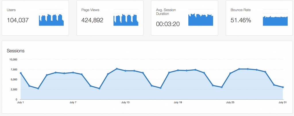
Analytics dashboards extract key information from large volumes of data. They present summaries of data to help you study long-term and past and present trends. For instance, This dashboard tracks important performance-related website statistics:
Google Analytics Dashboard
What are Real-time Monitoring Dashboards?
Real-time monitoring dashboards allow executives and managers to track key performance indicators in real-time for day-to-day business and operations. These dashboards normally update very frequently and allow users to analyze fluctuations on the fly. Here are a few real-time monitoring dashboards:
Business Operation Monitoring Dashboard
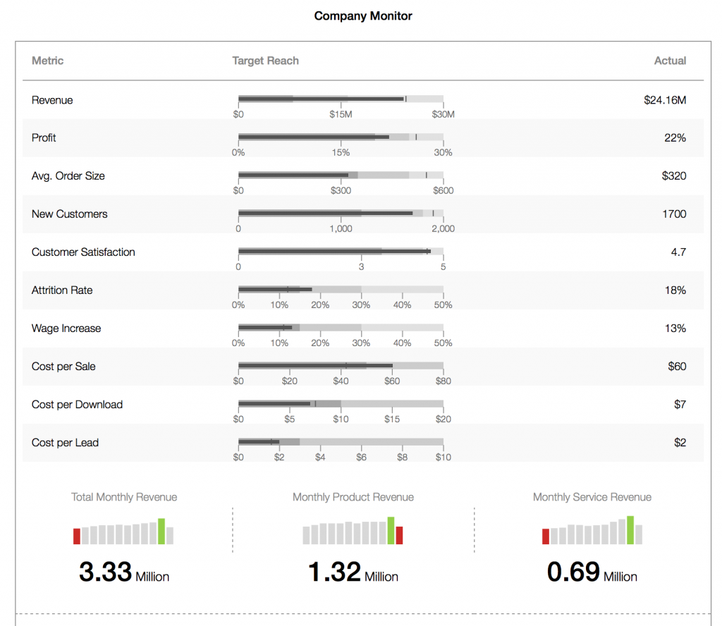
This is a compact company monitoring dashboard that enables users to track functional metrics related to various departments. These departments include Sales, HR, and more. The dashboard helps you beat your competitors by tracking competition-based metrics.
Energy monitoring dashboard
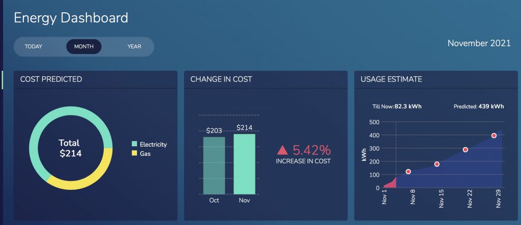
In addition to sakes data, here is a dashboard that lets you monitor your energy use and break down your gas and electricity costs. You can limit your overheads by identifying problem expenditures.
Wealth management dashboard
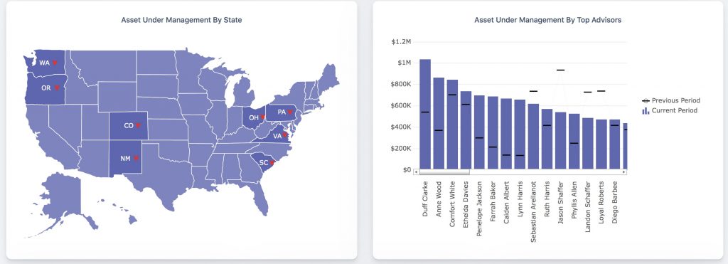
A wealth management dashboard helps you track your financial assets as well as other metrics like sales, revenue, new net money, and more.
What are Social Media Dashboards?
Social media dashboards collect data from social media platforms and present it in a useful and meaningful format. Take a look at this FusionCharts real-time twitter hashtag tracker.
Real-time Twitter hashtag tracker
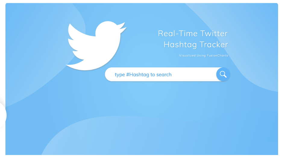
This dashboard lets you see tweets, retweets, active hours, and active regions. The dashboard illustrates trends and posts as well as shows you what news is going viral and which of your posts could use a boost.
What is a Sales Dashboard?
Just as the name suggests, a sales dashboard helps you track and monitor your sales data. You can track important metrics like your best and worst selling products, cities with highest and lowest sales as well as your highest-performing salespersons, and more. Take a look at these examples:
Sales Performance Dashboard (Mobile)
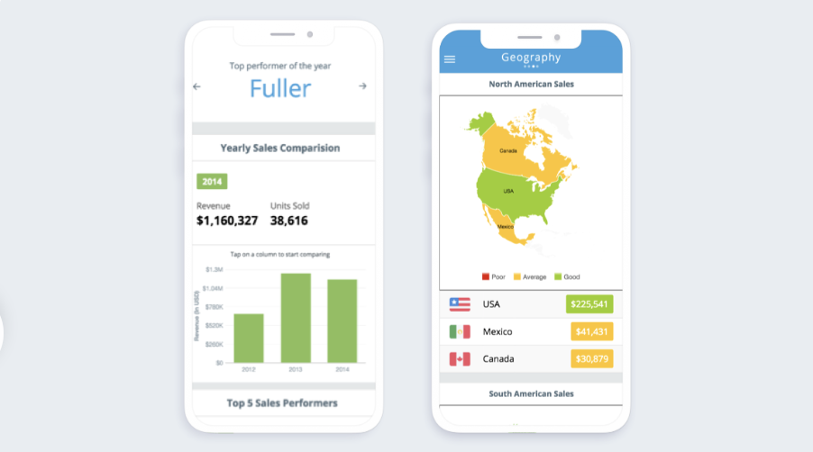
A dashboard tailored for mobile phones allows users to look at summaries showcasing best selling products, best performing cities, and countries along with executives with maximum performance.
Sales Management dashboard
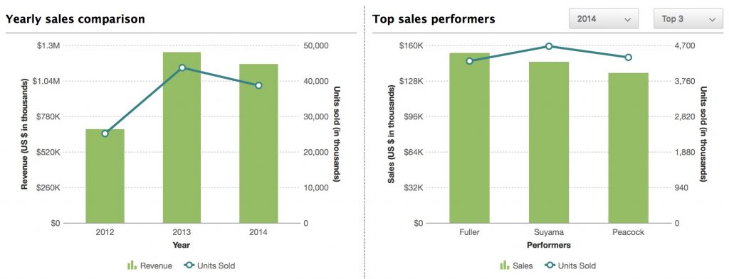
Summaries of multiple datasets present a holistic view of a company’s performance. Executives and managers can also view finer details of best performing sales executives, products, and locations.
Online Retail Dashboard
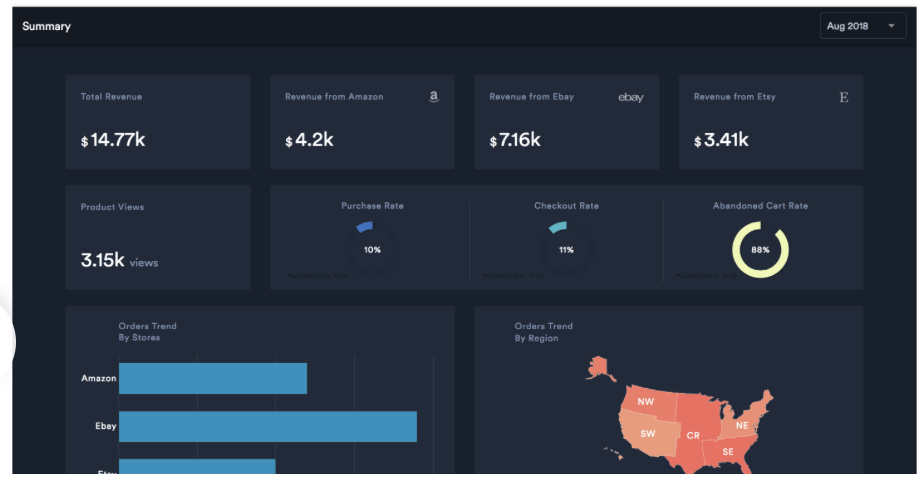
This dashboard shows the monthly performance of an online store by displaying key indicators such as product views, product sales, checkout rate, abandoned cart, and more.
What is a Marketing Dashboard?
Marketing dashboards help executives and CEOs set goals and monitor progress towards each goal. With FusionCharts you can also build a marketing dashboard.
Marketing Dashboard
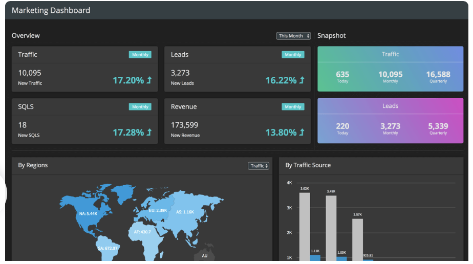
This dashboard helps you visualize the outcome of your marketing efforts, set goals, and view your progress in achieving that goal.
What is a Collaboration Dashboard?
A collaboration dashboard presents data and also acts as a social media platform. Here, users can review and comment on past progress and current trends right on the dashboard. An example is the sales and collaboration dashboard.
Sales and Collaboration Dashboard
Sales and collaboration dashboards not only present sales information, but they also allow users to collaborate by commenting on performance and getting notifications when others make comments.
Can I Build a Dashboard Based Upon Data Stories?
With an awesome tool like FusionCharts, you can build dashboards that narrate entire data stories. Here are a few examples; click the links to get more information:
- Gasoline Prices around the World
- World’s Top Cities for People and Planet
- Summers are Getting Hotter
- Unemployment Rate in the USA
- Performance of Tech IPOs
- Clean Water Access around the World
How Do I Build My Own Dashboard?
With FusionCharts, building your own dashboards is easy and quick. FusionCharts offers a wide range of beautiful and stunning dashboards to choose from. Just pick your favorite dashboard, download its source code and customize it to your needs.
Where Can I Learn More About FusionCharts?
FusionCharts is a complete and comprehensive charting and graphing library for building awesome and spectacular dashboards that not only update data in real-time but are also interactive and responsive. No wonder, FusionCharts is trusted by over 800,000 developers in over 28,000 countries. Its customer base includes many big multinational companies including Apple, IBM, Intel, Yahoo, Adobe, and more.
Wait no more. Make the most of your data by exploring more FusionCharts features and signing up for a free trial.


