Table of Contents
Key takeaways
- Bar charts are great for comparing categories and trends.
- Use vertical, horizontal, or stacked bars based on your data.
- Keep charts clear with labels and consistent formatting.
- FusionCharts makes bar charts interactive and easy to use.
Bar chart definition and how to interpret
A bar chart uses rectangular bars to display data values, with each bar representing a category sized by its value. It effectively compares separate categories, helping users quickly identify data distribution and understand the bar chart purpose in visualizing categorical data.How to interpret the bar chart?
Interpreting a bar chart is not difficult. With just a basic understanding, you can easily read the data in the bar chart. Here is how to do it:- Compare bar heights or lengths—taller or longer bars represent higher values.
- Check axis labels to understand what’s being compared
- Note the units of measurement, and look for patterns or clusters.
What are the benefits of bar chart?
Bar charts are among the most popular visualization tools for categorical data because they offer a clear presentation of this information. Here are some bar chart benefits mentioned below:- Clarity: The advantages of using a bar chart include easy interpretation, clear category comparisons, and versatility across various industries, such as sales and education.
- Flexibility: They support both individual and grouped data, allowing customization with colors, labels, and interactivity, which helps you quickly spot trends and outliers.
- Accessibility: Bar charts are also simple to create with many available tools, making them an effective option for presenting data clearly and efficiently.
Common uses cases and bar chart proposes
AI for data visualization can revolutionize documentation by tailoring it to individual user needs. Imagine a documentation system that understands your specific context and delivers information precisely when you need it. It can also help users better understand complex insights through real-world examples, like bar chart uses in performance tracking and category comparison.Comparing Categories
One of the most common uses of bar charts is to compare different categories of data. Whether you’re analyzing sales performance across product lines or understanding website traffic sources, bar charts provide a clear view of how each category stacks up against the others. This is an effective example of bar chart data visualization, allowing users to quickly interpret the data in a visual format.Example Use Cases:
- Sales Performance: You might use a bar chart to compare sales figures across different products in your catalog. Each bar would represent a product, making it easy to spot the top performers and identify those needing attention.
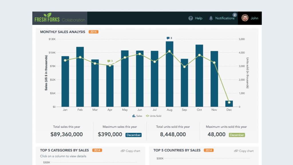 https://www.fusioncharts.com/dashboards/sales-and-collaboration-dashboard
- Website traffic analysis often uses bars for channels like direct visits, organic search, and social media to spot top sources. Bar charts are also useful in finance, marketing, and project management. Stacked charts show breakdowns by product and region, while grouped charts compare sub-categories. Avoid overcrowding, and review bar chart examples to choose the right variation
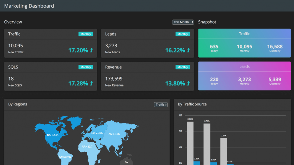 https://www.fusioncharts.com/dashboards/marketing-dashboard
Tracking Trends Over Time
While line charts are often the go-to for visualizing trends over time, bar charts can be just as effective, especially when comparing discrete time intervals. A bar chart with time periods on the x-axis and data values on the y-axis is perfect for displaying how metrics like monthly revenue, user sign-ups, or website traffic fluctuate over time. Among the many bar chart uses, tracking trends across consistent time segments is one of the most practical and insightful.Best Practices for Visualizing Time Trends:
- Use consistent time intervals (e.g., months, quarters, years) to maintain clarity.
- Ensure labels for dates or periods are easy to read and positioned appropriately.
Identifying Distributions and Outliers
Bar charts can also be used to explore the distribution of data and pinpoint outliers—data points that significantly differ from the rest. For instance, you can use a bar chart to represent the frequency distribution of data points across categories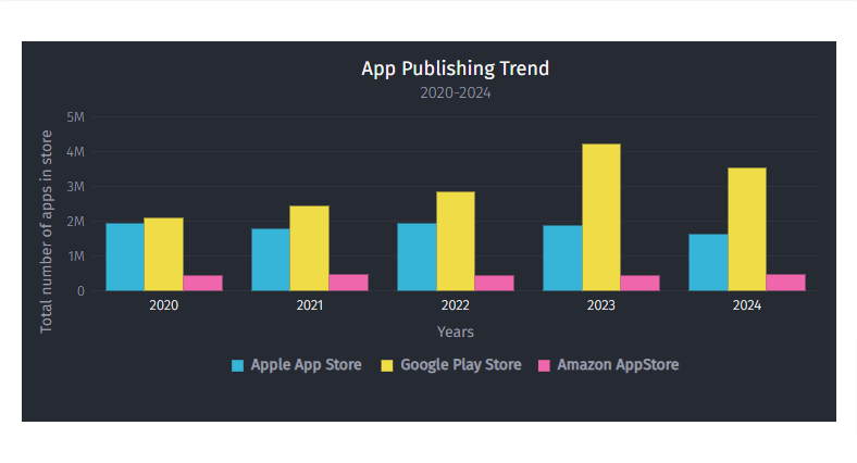 https://www.fusioncharts.com/
Identifying such outliers quickly can lead to actionable insights, such as addressing customer complaints or revising marketing strategies. One of the uses of bar chart is to effectively highlight these outliers, making them easy to spot for better decision-making.
https://www.fusioncharts.com/
Identifying such outliers quickly can lead to actionable insights, such as addressing customer complaints or revising marketing strategies. One of the uses of bar chart is to effectively highlight these outliers, making them easy to spot for better decision-making.
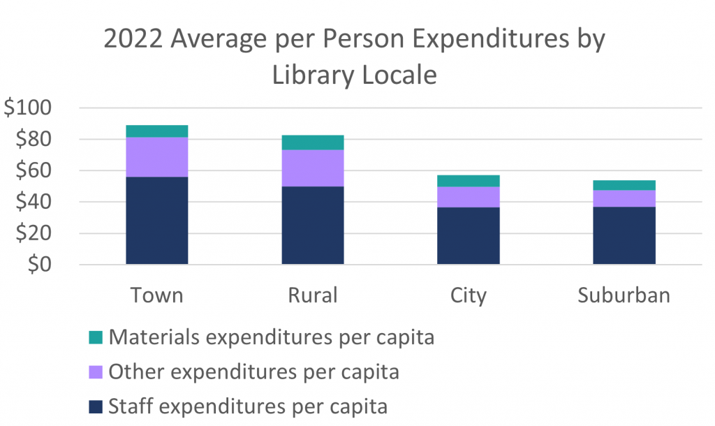
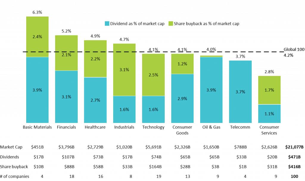
Part-to-Whole Relationships
Understanding how different components contribute to a whole is another key use of bar charts. Stacked bar charts are particularly effective in visualizing part-to-whole relationships, where each segment of the bar represents a component of the total. Following bar chart best practices, such as consistent segment ordering and clear legends, ensures accurate interpretation of part-to-whole insights.Example Use Cases:
- Budget Allocation: You might use a stacked bar chart to break down a budget by department (e.g., marketing, production, R&D) to see how each segment contributes to the total budget.
 https://www.lrs.org/2023/09/22/stacking-bar-charts-to-breakdown-budgets/
 - Market Share Analysis: Another example could be visualizing the market share distribution of different players in an industry
 https://www.lrs.org/2023/09/22/stacking-bar-charts-to-breakdown-budgets/
When using stacked bar charts, ensure the segments are well-labeled and color-coded to prevent confusion. Clear labeling makes it easier for viewers to grasp the relationship between parts and the whole. Bar chart uses also extend to project tracking, customer segmentation, and survey results visualization, making them ideal for both business and academic purposes.
https://www.lrs.org/2023/09/22/stacking-bar-charts-to-breakdown-budgets/
When using stacked bar charts, ensure the segments are well-labeled and color-coded to prevent confusion. Clear labeling makes it easier for viewers to grasp the relationship between parts and the whole. Bar chart uses also extend to project tracking, customer segmentation, and survey results visualization, making them ideal for both business and academic purposes.
Integration with FusionCharts
Take your 3D bar charts to the next level with FusionCharts, a powerful JavaScript charting library. It offers highly customizable, interactive bar charts with features like tooltips, drill-downs, and real-time updates. FusionCharts supports simple and multi-series charts, making it suitable for various use cases. Learn more about comparing different chart types like bar graphs and pie charts, and how to create bar graphs on Google Docs.- Enhance your charts with:
- Data labels for clarity without clutter
- Interactive legends for filtering grouped or stacked bars
- Drill-downs to explore detailed data