
If you have a business, you must know the importance of a stacked bar chart. We need to generate multiple reports on a daily basis. Graphs and charts demonstrate a business’s success, growth, and areas of improvement. A stacked bar chart is capable of doing all these activities and even more than that. We will learn about the bar chart example here.
Stacked bar charts are gaining popularity and can be seen everywhere. However, most people misunderstand and misuse the stacked bar chart. In this guide, we will learn about the stacked bar chart example, its uses, misuses, etc. Moreover, we will also explain how to create stacked bar charts through four simple steps.
Let’s dig into this amazing concept.

Table of Contents
What Is A Stacked Bar Chart?
First of all, we must know that it is not a standard bar chart. As we know, a single bar chart represents a single variable. However, a stacked bar chart gives us a representation of two categorical variables. The primary variable or first variable can be seen along the entire bar length.
On the other hand, stacks are used to represent the second variable in each categorical bar.
Let’s take an example. We have total monthly organic visits and levels for the search engines such as Google, Yahoo, and others.
We can display the total organic visits in a standard bar chart. However, we could use a stacked bar chart to get a sense of the breakdown by the search engine.
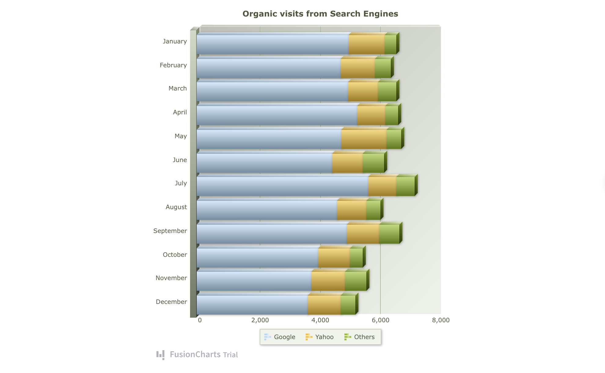
A stacked bar chart can help us to represent individual contributions. As a result, we get two categorical variables; search engine and month.
When To Use A Stacked Bar Chart?
In simple words, we use a stacked bar chart to determine trends across a particular time period. We can see the four most common uses of a stacked bar chart below:
Business budget representation in the form of spending vs saving.
Determination of vehicle performance in the form of mileage vs performance.
Economy representation in the form of supply and demand.
Representation of marketing (spending vs results)
Comparison of small aspects and full data visualization can be performed using a stacked bar chart. It is interesting to note that a stacked bar chart accurately represents our data. Due to higher accuracy, stacked bar charts are popular.

A small range of scenarios exists when we use the stacked bar charts. We compare the decomposition of each bar and the numeric values of a categorical variable. The chart should have the following things:
Numeric values
One or two categorical variables.
Regular date intervals
Stacked bar charts are ideal for showing the business sales volume. For example, we can break down the sales of mobile phones across different stores in a particular country. We can also divide them into further subcategories. For example, male and female purchases.

We can also use the stacked bar charts to compare data and information relevant to the population. For example, a comparison of age groups for a particular set of options.
We use the stacked bar charts to show the average or total of each category. It is important to note that the length of the bar represents the volume of numeric values. The longer the bar, the larger the volume of a stacked bar chart.
What Are The Common Misuses Of a Stacked Bar Chart?
Even though stacked bar charts give accurate results, people still misuse these charts. Knowing the misuse can help businesses to use the stacked column charts in the right ways.
Here are some most common misuses of a stacked column chart.
Looking For Data Series Trends
People use stacked column charts to represent the trends in a data series. However, scatter plot graphs are better at charting the data series trends compared to stacked column charts.

Analysis Of Stock Market Trends
We know that stock market trends are changing on a daily basis. To understand those trends and analyze them, charts and graphs are used. However, a stacked column chart might not be the right choice for this purpose.
Bar graphs and line charts help us in a much better way to perform an analysis of stock market trends.
Simple Budgeting
Lastly, simple budgeting is another common misuse of a stacked column chart. We must know that donut charts and pie graphs are better for representing simple budgeting.
The reason is that pie charts are better at representing relative or percentage comparisons. These charts don’t represent the absolute values that a stacked column chart shows.

What Are The Steps To Create A Stacked Bar Chart?
Creating a stacked column chart might seem rocket science. However, it is simple when we follow a few easy steps. Let’s explore the four easy steps to create stacked bar charts.
Determine The Targeted Segments
The type of data on the axes helps us to determine the data for a stacked column chart. The ordered values are usually plotted on the x-axis. On the other hand, a list of items is plotted on the y-axis. A numeric variable (1,2,3) helps to represent the items list.
We can also represent it using a qualitative variable (A, B, C). Simply put, we have to determine the targeted segments.
Selection Of a Bar Chart Template
After determining the ordered value, the next step is to choose the bar chart template. The interesting thing to know is that we don’t have to build everything from scratch. We just need to choose a template and insert the data.
Data Clarity
It is important that your stacked column chart should have data clarity. Adding white spaces to your stacked column chart can make the data visualization clear. We can also use contrasting colors that show data variation.
Moreover, we can also use different lengths to show the relative segment size. It will make more sense to the chart users.
Getting an External Perspective
It is important to get a review of our stacked column chart from someone. Getting an external perspective from an expert can improve the chart. It is an excellent idea to find errors and see new ideas.

How To Create A Stacked Bar Chart In React Native Using FusionCharts?
We can import the stacked bars chart using the following code:
import React, { Component } from "react";
import { AppRegistry, StyleSheet, Text, View, Platform } from "react-native";
import FusionCharts from "react-native-fusioncharts";

const dataSource = {
  chart: {
    caption: "Split of visitors by Channels & Gender",
    placevaluesinside: "1",
    showvalues: "0",
    plottooltext: "$dataValue  $seriesName visitors",
    theme: "fusion"
  },
  categories: [
    {
      category: [
        {
          label: "Organic"
        },
        {
          label: "Offline Stores"
        },
        {
          label: "Email Campaigns"
        },
        {
          label: "Social Events"
        },
        {
          label: "Paid Channels"
        }
      ]
    }
  ],
  dataset: [
    {
      seriesname: "Male",
      data: [
        {
          value: "17000"
        },
        {
          value: "19500"
        },
        {
          value: "12500"
        },
        {
          value: "14500"
        },
        {
          value: "17500"
        }
      ]
    },
    {
      seriesname: "Female",
      data: [
        {
          value: "25400"
        },
        {
          value: "29800"
        },
        {
          value: "21800"
        },
        {
          value: "19500"
        },
        {
          value: "21200"
        }
      ]
    }
  ]
};

export default class App extends Component {
  constructor(props) {
    super(props);

    this.state = dataSource;

    this.libraryPath = Platform.select({
      // Specify fusioncharts.html file location
      ios: require("./assets/fusioncharts.html"),
      android: { uri: "file:///android_asset/fusioncharts.html" }
    });
  }

  render() {
    return (


          FusionCharts Integration with React Native

       );
  }
}

const styles = StyleSheet.create({
  container: {
    flex: 1,
    padding: 10
  },
  heading: {
    fontSize: 20,
    textAlign: "center",
    marginBottom: 10
  },
  chartContainer: {
    height: 200
  }
});

// skip this line if using Create React Native App
AppRegistry.registerComponent("ReactNativeFusionCharts", () => App);
Some Best Practices By FusionCharts:
We must start the y-axis from zero, which accurately reflects the data proportionate difference.
We have to display the sum value on top of each bar or column. It adds up values for different categories that we plot on the chart.
Final Thoughts
Stacked bar charts are known for representing accurate data. However, we must know how to use them in the right possible ways.
We must know the misuses of a stacked bar chart to ensure accurate data representation. Moreover, creating the chart using the four steps listed above can be beneficial.

FAQs
What Is a Stacked Bar Chart?
A stacked bar chart helps to compare variables relative to the bar chart.
It is also known as a column chart or stacked chart.
What Is the Difference Between a Bar Graph and a Stacked Bar Graph?
A bar graph represents a single category in the bar.
On the other hand, a stacked bar chart represents more than one categorical variable.
What Is the Difference Between Stacked Bar and a 100% Stacked Bar?
A 100% stacked bar uses components as a percentage of the entire bar.
What Are Stacked Graphs Good For?
These graphs are good for representing multiple values for individual categories.


