Number Line Chart Demystified: A Complete Tutorial
Introduction
Line charts, including number line charts, are a fundamental tool in data visualization and are perfect for illustrating trends over time. They simplify complex data, making patterns easy to understand at a glance. Creating a number line chart involves plotting two sets of variables: one for the x-axis (often time) and one for the y-axis (the measured variable). These charts are ideal for tracking changes and comparing multiple data sets, using different colors or line styles for distinction. Whether you're monitoring sales, stock prices, or website traffic, number line charts offer a clear and concise way to present and interpret your data.
In this guide, we'll take you through the basics of creating and interpreting a number line chart, making it simple for beginners to start visualizing their data effectively.
What is a line chart?
A line chart is used to represent data over a continuous time span. It is generally used to show trend of a measure (or a variable) over time. Data values are plotted as points that are connected using line segments.
Using a line chart, one can see the pattern of any dependent variable over time like share price, EPS (Earnings Per Share) of a company, weather recordings (like temperature, precipitation or humidity), etc.

Line Charts are great for comparing change in data for multiple groups based on time. Play with more Line Charts to see for yourself
Why do you need a Line Chart?
1. To see changes of a dependent variable over time
Line charts are excellent for mapping continuous data sets over a period of time. Understanding changes happening over a period of time is relatively easier for the human mind. Business owners want to see profits increase over time, content publishers want to see traffic increase over time, and public bodies want to see tax, health or infrastructure data over time. It gives us the best context to understand what’s happening and how to plan for the future.
 UN Population Projection of the world until 2100. Source: Our World In Data
2. To identify trends and spot spikes and dips
Line charts help in observing trends and identifying key performance issues (either good or bad). Line charts or number line chart let you find the exact time something out of the ordinary happened, which helps in pinpointing where to dive for answers.
 A Simple Line chart from Google Trends shows the interest in Fidget Spinners in United States from 2004 - 2018. it is easily evident that they were quite a fad in 2017
3. To compare patterns of multiple sections
Multi-series line charts are used to compare how different groups (irrespective of how they are segmented - geography, internal teams, age groups, financial quarters, etc.) are performing compared to each other. This helps in identifying key performance areas and to quarantine conditions that are affecting negatively.
 A multi series line chart showing sales performance for different Quarters. While you may be curious as to why revenue start increasing at the same time every month, it has nothing to do with the customer’s buying preferences. As many Sales Leaders would know, this is the Hockey Sick Pattern, which results because of quarterly sales commission plan, where sales people get their bonuses on completing their quota every quarter. As the deadline approaches, most salespeople try harder to meet or exceed their quotas
Popular Business Uses of Line Chart
- Showcasing public data for an interval of time
 Line charts help in showing public data like gender gap in earnings, Rainfall of a region, Population Growth, Disease impact, etc.
- Looking at financial and business data for time cycles
-
 Line charts help in understanding the monetory and operational status of the company during business cycles (Weeks, Months, Quarters, Years or Decades)
- Comparing performance of different groups
-
 Line charts help in comparing different sectors, businesses or organizational units.
- Analyzing trends, exceptions & patterns to make timely decisions
-
 Line Charts help in looking at trends for commodities and processes to find profitable insights.
 Line charts help in showing public data like gender gap in earnings, Rainfall of a region, Population Growth, Disease impact, etc.
 Line charts help in understanding the monetory and operational status of the company during business cycles (Weeks, Months, Quarters, Years or Decades)
 Line charts help in comparing different sectors, businesses or organizational units.
 Line Charts help in looking at trends for commodities and processes to find profitable insights.
Limitations of Line Chart
1. Bad at Representing too many groups/segments at the same time
Plotting too many lines on a chart makes it appear cluttered. Experts advise to have no more than 4 lines on a single chart; any more than that and it becomes difficult to interpret. In case you have to show more than 4 groups, club the smaller ones in an “Others” group
 Line charts are not great at showing lots of groups. If you have a lot of groups, use a bar chart to compare them.
2. Irregular Class Intervals may give inaccurate insights
Data should always be plotted in equal intervals for the lines to be accurate representations. When lines are used in a number line chart to connect unequal or non-adjacent intervals of time, they misrepresent the information. Even if the class interval is regular in nature, using too many or too few classes can mask important patterns in the data.

You simply cannot compare equal intervals for some data points and then switch to a different interval and expect the result to be a meaningful trend of the plotted data. If there was any decline in the date ranged not mentioned (the years 1999 & 2002) the number line chart constructed would be able to mask it perfectly thus leading to inaccurate insights.
Best Practices for Line Charts
- Lines should only be used to connect adjacent values along an interval scale.
- Intervals should be equal in size to ensure accurate insights.
- When the user is focused on the trend of a particular line, additional information like the highest and lowest value of the line can be helpful.
- Choose a baseline that suits your data; choosing a zero baseline may not represent the change in data effectively.
- When comparing data sets, line graphs are only useful if the axes follow the same scales.
- When making charts for smaller devices make use of Sparklines - data to ink ratio should be high, hence you should remove unnecessary objects like axis line, axis title, and others.
- Ensure smooth interactivity on your chart - cross line with anchor and value, hover on line should dim other lines, legend interactions, etc.
Variants of Line Chart
Line with multiple series
The multi-series line chart is used to visualize trends and relationships in multiple datasets. It consists of various data points connected using line segments, where each point represents a single value. It helps in comparing different groups on the same scale to find out how each of them are performing compared to the others.

Example use cases where line chart with multiple series is helpful
- Compare hourly temperatures of Boston, New York, Princeton and Miami on a particular day.
- Compare closing stock price of Apple, IBM, Microsoft, Amazon, Facebook on last quarter.
- Performance of sales people in an organization.
- Import-export trend of a country.
- Comparing similar metrics like retention rate, new sales, etc. across different timezones or products
Line Chart with Zooming & Panning
The zoom line chart is a special type of multi-series line chart that allows analysis of thousands of data points at macroscopic and microscopic levels. The zooming and panning features allow this analysis to take place efficiently. It consists of multiple lines where each line represents a category and data points that belong to the category. The chart can easily plot thousands of data points, something that can produce indecipherable results if plotted on an ordinary number line chart.

Example use cases where line chart with zooming & panning is helpful
- Large scale reporting like nation-wide logistics performance over multiple quarters .
- Looking at healthcare data for various patients across geographies & health conditions through decades.
- Analyzing stock data across industries through the years.
- Tracking daily web traffic on a website for 6 months.
- Trend of daily minimum and maximum temperature of a place for 5 years.
Line Chart with scrolling
A scroll line chart is used to show the magnitude of change over a period of time. A large number of data points can be rendered on the chart owing to the scroll interactivity of the chart. The chart is rendered with data values plotted as data points that are then connected using line segments. A horizontal scroll bar is rendered at the bottom of the chart to navigate through the chart.

Example use cases where line chart with scrolling is helpful
- Plotting a large number of data points like the monthly sales for multiple years
- Trend of percent of GDP spent each year on military by USA for last century.
Line Chart with multiple axes & series
A multi-axis line chart is an interactive line chart that plots data using multiple axes. This allows plotting data sets having different units and scale ranges. Data values are plotted as data points that are connected by line segments. Multiple y-axes are rendered along the left and right side of the chart.

Where to use Line chart with multiple axes & series?
- Comparing count of web visits and downloads from multiple sources.
- Comparing rainfall and temperature of a city.
- Comparing GDP and GDP % growth each year for the last decade of any country
Simple spline chart
A spline chart is a specialized form of the line chart that can be used for plotting data that requires the usage of curve-fitting. Like the number line chart, data values are plotted as data points. However, instead of using straight line segments to connect the data points, this chart draws a fitted curve to connect the data points

Where to use a Spline chart?
- A Spline chart can be used for applications such as rendering the impulse-response of a system or the development lifecycle for a product.
- Comparing the company revenue each year for the last decade
- Comparing the consumption of electricity units across a city
Spline chart with multiple series
A multi-series spline chart is a specialized form of the multi-series line chart that can be used for plotting data for multiple categories of data that requires the usage of curve-fitting. Like the multi-series line chart, data values are plotted as data points. However, instead of using straight line segments to connect the data points, this chart draws a fitted curve to connect the data points.

Where to use a Spline chart with multi-series?
- A multi-series Spline chart can be used for applications such as rendering the impulse-response for multiple systems or the development lifecycle for multiple products.
- Comparing the company revenue each year for multiple decades.
- Comparing the consumption of electricity units across various cities in a state.
Step-line Chart
A step line chart is used to visualize trends for a particular event that is not continuous in nature. For a given data set, this chart not only enables you to compare the magnitude and change in values at different points of the same series but also helps you discern the intermittent pattern of the trend. Data values are plotted as data points on the chart that are connected using vertical and horizontal lines to form a step-like progression.

Where to use a Step line chart ?
- A step line chart can be used for showcasing a revenue and expense comparison in a company.
- Renewable vs non-renewable energy production.
- Enrolments each year in an academic institute.
Want to see how a Line Chart feels alive?
Fusionchart's expansive library lets you build and use insightful & intuitive charts in minutes.
Other related charts
- Bubble chart
 The bubble chart is used to visualize data that is defined by three numeric variables. Typically, this chart is used to compare and depict relationships between variables for analyzing patterns and trends in data.
- Candlestick chart
 A candlestick chart is used for analysis of equity and commodity prices.It allows showing the opening price, closing price, highest trading price, lowest trading price, and the trade volume on a single chart.
- Gantt chart
 The Gantt chart is used for showcasing timelines. It is a date/time-based chart that allows plotting tasks with their exact start and end date/time.
- Heatmap chart
 A heat map chart is a specialized chart that uses colors to represent data values in a table. It is mostly used to plot large and complex data.
 - Stacked chart
 Stacked charts are used to compare different data and show the composition of each item compared. These charts helps in displaying the cumulative magnitude of two or more datasets.
 The
The  A
A  The
The  A
A 
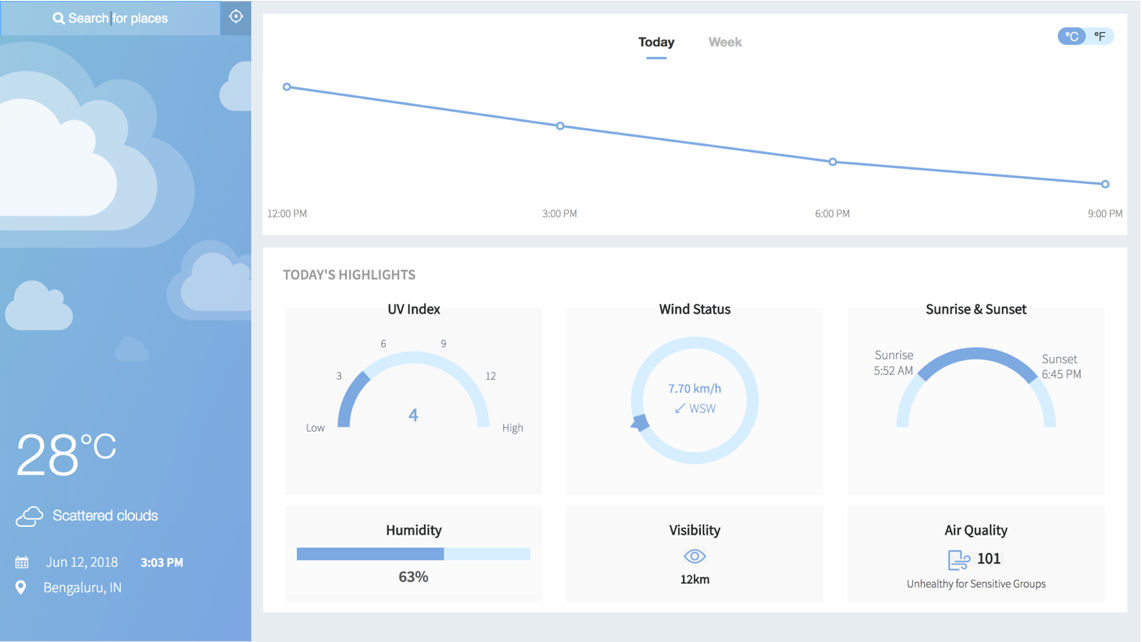
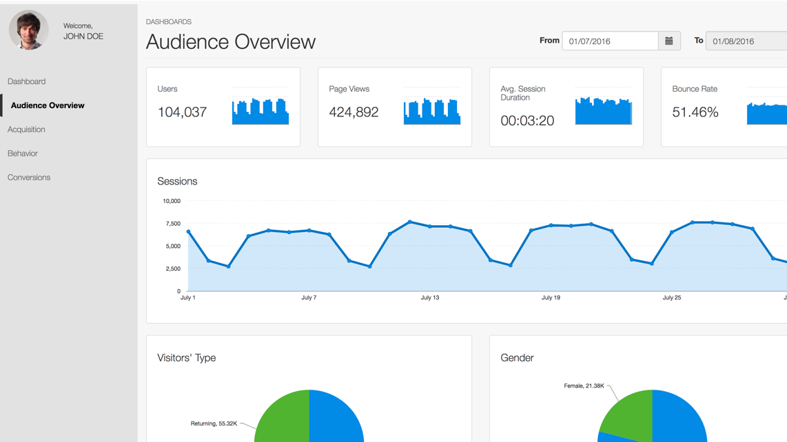
Line charts in action
Business Dashboards
Interactive Data Stories


Want to add interactive charts on your web or mobile app?
Fusionchart’s expansive library lets you build and use insightful & intuitive charts in minutes.
Conclusion
In conclusion, line charts are a powerful tool for visualizing trends over time, making them invaluable for tracking changes and comparing data sets. They simplify complex information, aiding in trend identification and pattern recognition. By following best practices and understanding their limitations, you can effectively use a number line chart to present clear, insightful data visualizations for any audience.
Get Started with Line Charts Now!
Line charts are a fantastic way to bring your data to life and gain valuable insights. Don't wait; dive in and start exploring the power of line charts today with FusionCharts!