Angular charts make it easier to turn raw data into clear, interactive visuals inside modern web applications. Whether you are building a SaaS dashboard, analytics platform, admin panel, or business reporting tool, charts help users understand trends, compare values, and make faster decisions.
In this guide, we’ll look at practical Angular charts examples, including line charts, pie charts, area charts, and multi-series charts. You’ll also learn when to use each chart type and how a JavaScript charting library like FusionCharts can help you create interactive Angular charts with less development effort.
Table of Contents
What Are Angular Charts?
Angular charts are data visualizations built inside Angular applications. They help developers present information using chart types such as line charts, bar charts, pie charts, area charts, and multi-series charts.
Instead of showing users rows of raw data, Angular charts make information easier to understand at a glance. For example, a dashboard can use charts to show monthly sales, website traffic, customer growth, revenue trends, or product performance.
Developers can create Angular charts from scratch using SVG, Canvas, or JavaScript. However, many teams use an Angular chart library to save time and add built-in features such as tooltips, legends, animations, responsive layouts, drill-downs, and export options.
Read our complete developer guide on creating interactive Angular charts.
Common Angular Charts Examples
Angular applications can use different chart types depending on the data, the user’s goal, and the dashboard layout. Some charts are better for showing trends, while others are better for comparing categories or explaining proportions.
Here are some common Angular chart examples you can use in modern web applications.
Multiseries Chart Example In Angular
A multi-series chart displays two or more related datasets in the same chart. It is useful when users need to compare values across multiple categories or time periods.
For example, a SaaS dashboard can use a multi-series chart to compare monthly revenue, new subscriptions, and churned customers. This makes it easier to see how different metrics move together over time.

You can find the code for the above multi-series charts example here.
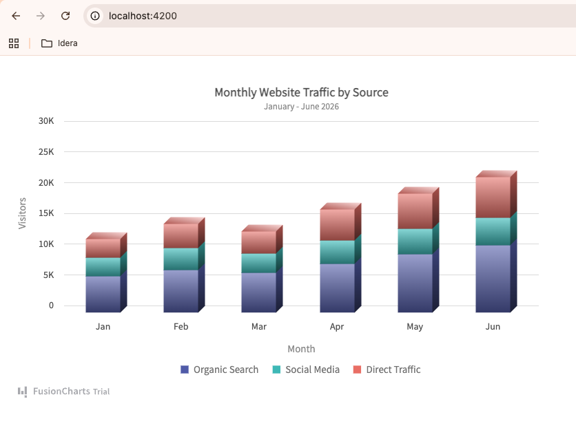
Area Chart Example In Angular
An area chart is useful for showing changes over time while also emphasizing volume. It works well when you want users to understand both the trend and the overall size of the data.
For example, an analytics dashboard can use an area chart to show website traffic growth over several months. If the chart includes multiple data sources, such as organic search, social media, and direct traffic, users can quickly understand which channel contributes the most.

You can interact with this chart and access the code for this Angular chart here.
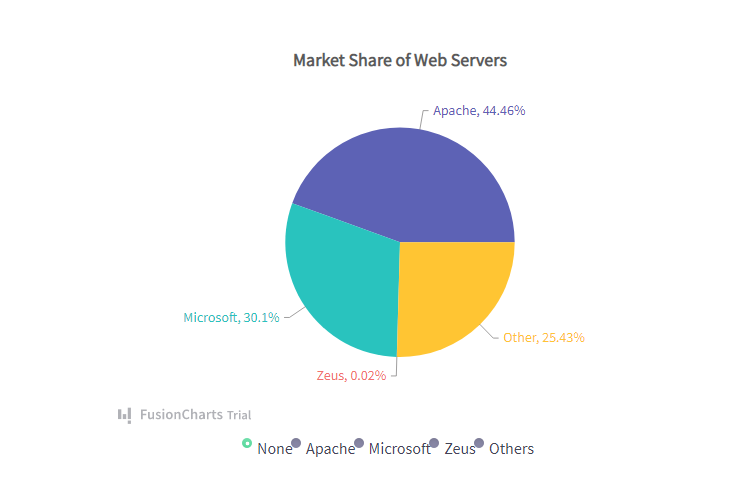
Angular Pie Chart Example
A pie chart shows how a total is divided into smaller parts. It is best for simple part-to-whole comparisons with a limited number of categories.
For example, a business report can use a pie chart to show revenue share by product category, traffic share by device type, or customer distribution by region.
Angular Line Chart Example
A line chart is one of the most common chart types for Angular applications. It is useful for showing trends, patterns, and changes over time.
For example, a financial dashboard can use a line chart to show monthly sales, stock price movement, customer growth, or recurring revenue. Line charts are especially helpful when users need to identify increases, drops, or seasonal patterns.

Find the code for the above Angular line chart example here.
Angular Bar or Column Chart Example
A bar chart or column chart is useful for comparing values across categories. It is easier to read than a pie chart when there are several categories or when users need to compare exact values.
For example, an Angular dashboard can use a column chart to compare sales by region, support tickets by department, or product performance across different months.
Get the source code of this example from GitHub.
Discover more charting capabilities in the FusionCharts documentation.
When to Use Each Angular Chart Type
Choosing the right chart type is important because different visualizations are designed to answer different questions. Using the wrong chart can make data harder to understand, while the right chart helps users quickly identify trends, comparisons, and patterns.
Use a Line Chart for Trends Over Time
Line charts are best for showing how a metric changes over a continuous period. They help users identify growth, declines, spikes, and seasonal patterns.
Common use cases include:
- Website traffic trends
- Monthly sales performance
- Customer growth
- Stock prices
- Revenue over time
Use a Pie Chart for Part-to-Whole Relationships
Pie charts work best when you need to show how individual categories contribute to a total. They are most effective when there are only a few categories to compare.
Common use cases include:
- Revenue share by product
- Traffic sources
- Market share distribution
- Device usage breakdown
Use an Area Chart to Highlight Volume and Trends
Area charts are similar to line charts but place greater emphasis on the magnitude of the data. They are useful when users need to see both trends and overall volume.
Common use cases include:
- Website traffic growth
- Resource consumption
- Monthly active users
- Cumulative business metrics
Use a Multi-Series Chart to Compare Multiple Metrics
Multi-series charts allow users to compare several related datasets within the same visualization. This makes it easier to identify relationships and performance differences.
Common use cases include:
- Revenue vs. expenses
- New users vs. returning users
- Sales performance across regions
- Multiple product categories over time
Use a Bar or Column Chart for Category Comparisons
Bar and column charts are ideal for comparing values across different categories. They make it easy to identify the highest and lowest performers.
Common use cases include:
- Sales by region
- Revenue by product
- Support tickets by department
- Performance by team or location
The best Angular dashboards often combine multiple chart types. For example, a dashboard might use a line chart for traffic trends, a pie chart for traffic sources, and a column chart for comparing monthly conversions. Choosing the right chart for each dataset helps users gain insights more quickly and improves the overall user experience.
Angular Chart Libraries You Can Use
While it is possible to build charts from scratch using SVG, Canvas, or JavaScript, most Angular developers use a charting library to save time and access advanced features.
Modern Angular chart libraries typically provide:
- Multiple chart types
- Responsive layouts
- Interactive tooltips
- Animations
- Legends and data labels
- Real-time updates
- Export and download options
Some popular options include FusionCharts, Chart.js, Apache ECharts, Highcharts, and D3.js. Each library has different strengths depending on your project requirements, customization needs, and budget.
For example, Chart.js is often chosen for simple visualizations, while D3.js offers extensive customization for complex data-driven applications. Libraries such as FusionCharts provide a larger collection of chart types and built-in features that help teams build dashboards and reporting applications more quickly.
If you’re evaluating different options, check out our guide to the best Angular chart libraries to compare features, use cases, and pricing in more detail.
Best Practices for Angular Charts
Creating an effective chart involves more than choosing a chart type. Well-designed charts help users understand data quickly, while poorly designed charts can create confusion and hide important insights.
Here are some best practices to follow when building Angular charts.
Choose the Right Chart Type
Different chart types are designed for different purposes. Use line charts for trends, pie charts for part-to-whole relationships, and bar or column charts for category comparisons.
Selecting the right visualization makes your data easier to understand and improves the overall user experience.
Keep Charts Simple
Avoid adding too many data series, colors, labels, or visual effects. Overloaded charts can become difficult to read and interpret.
Focus on the most important data and remove unnecessary elements that do not provide additional value.
Make Charts Responsive
Users access applications from desktops, tablets, and mobile devices. Ensure your charts adapt to different screen sizes and remain readable across all devices.
Responsive charts help maintain a consistent user experience regardless of screen size.
Use Clear Labels and Tooltips
Axis labels, chart titles, legends, and tooltips provide important context. Users should be able to understand what the chart represents without needing additional explanations.
Clear labeling reduces confusion and helps users find insights more quickly.
Prioritize Performance
Large datasets can affect chart rendering performance. When working with high-volume or real-time data, consider techniques such as data aggregation, lazy loading, or pagination to keep dashboards responsive.
Optimized charts provide a smoother experience and reduce browser resource usage.
Maintain Consistent Design
Use consistent colors, fonts, spacing, and formatting across all charts in your application. Consistency helps users interpret information more easily and creates a more professional-looking dashboard.
A unified visual style also strengthens the overall usability of your application.
By following these best practices, you can create Angular charts that are not only visually appealing but also easy to understand, responsive, and performant.
Conclusion
Angular charts are an effective way to transform raw data into clear, interactive visualizations that help users identify trends, compare metrics, and make informed decisions. Whether you’re building a dashboard, analytics platform, reporting tool, or business application, choosing the right chart type can significantly improve how users understand and interact with your data.
In this guide, we explored some of the most common Angular chart types, including line, pie, area, multi-series, and bar charts. We also looked at when to use each chart type and the best practices for creating responsive, user-friendly visualizations.
The best Angular charts are not necessarily the most complex ones. They are the charts that present information clearly, load quickly, and help users find insights with minimal effort.
If you’re ready to build interactive Angular charts with advanced features such as responsive layouts, real-time updates, drill-downs, and export options, try FusionCharts and explore its extensive collection of chart types designed for modern web applications.
Try FusionCharts Free →
FAQs
What is the best chart type for Angular applications?
There is no single best chart type for every use case. Line charts are ideal for trends over time; bar charts work well for category comparisons; pie charts show part-to-whole relationships; and area charts help visualize both trends and volume. The right choice depends on the data and the insights you want to communicate.
Can I create interactive charts in Angular?
Yes. Modern Angular chart libraries allow you to create interactive charts with features such as tooltips, legends, animations, zooming, drill-downs, and real-time updates. These features help users explore data more effectively.
Are Angular charts responsive?
Most modern Angular chart libraries support responsive design, allowing charts to automatically adapt to different screen sizes. This ensures charts remain readable and usable on desktops, tablets, and mobile devices.
What are Angular charts used for?
Angular charts are commonly used in dashboards, analytics platforms, reporting tools, financial applications, SaaS products, and business intelligence solutions. They help users visualize trends, compare data, and make data-driven decisions.
Do I need a charting library to create Angular charts?
No. You can build charts from scratch using SVG, Canvas, or JavaScript. However, charting libraries can significantly reduce development time and provide built-in features such as responsiveness, interactivity, animations, exporting, and advanced chart types.
Which Angular chart library should I choose?
The best Angular chart library depends on your requirements. Factors such as chart variety, customization options, performance, ease of implementation, and budget should all be considered. If you’re comparing available options, see our guide to the best Angular chart libraries for a detailed comparison.