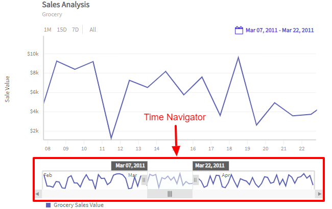
Time Navigator
The time navigator component in FusionTime gives the pattern of complete data. Using the active window, one can narrow the focus to a specific time period without losing the context of the entire data.
The time navigator component is drawn below the time axis of a FusionTime chart. You can see it in the image below:
The major features of Time Navigator include the following:
Shows the entire underlying data (including all data series) as data plots.
Has a scroll bar with scroll buttons at both the ends.
Has an active window with a pair of draggable handles which you can use to display the selected time period.
You can pan the active window of the time navigator to view the data of a specific section in greater details in the chart shown above.
The active window of the time navigator resizes itself every time you perform a relevant action, such as zoom in/out of the chart, select standard time periods from the standard range selector, change the date/time in the custom range selector, etc.
The chart canvas updates automatically every time you make a selection using the handles of the Time Navigator.
In case of multivariate charts, there is only one common time navigator for all the canvases.
In this article, we will discuss about the different interactions of the time navigator and how to hide the time navigator.
Zoom in/out
You can use the handles on either side of the active window to select a time period. The data plot in the canvas zooms in/out respectively. This behavior is also applicable when you zoom in/out from the chart canvas, i.e., with the interaction in the chart canvas the time navigator gets updated accordingly. Refer to the image below:

Pan the active window
You can pan the active window across the time navigator and see the data plots in the canvas update according to the time spread of the active window. Refer to the image below:

Active window labels
When you hover the mouse pointer over the active window of the time navigator, the time labels appear on both ends of the active window. These labels show the start date/time and the end date/time of the plots in the main chart canvas shown above. You can drag these labels to change the active window.
Refer to the image below:

Set the Initial Spread of the Active Window
Starting v1.2.0, FusionTime allows you to set the initial spread of the active window of the time navigator. This flexibility gives you the option to initially load your time-series chart according to your requirements.
To set the initial spread of the active window, create a newly added initialInterval object under xaxis object. Set the value of the from and to attribute in the initialInterval object.
The date-time format of the
fromandtoattributes should be the same as of the value oftimein schema.
Refer to the code below:
"dataSource": {
"xaxis": {
"initialInterval": {
"from": "2016-01-01 12:00:00",
"to": "2016-01-31 12:00:00"
}
}
}In the above code:
Create the
initialIntervalobject in thexaxisobject to specify the spread of time axis on initial loading or rendering.In the
initialIntervalobject:fromattribute is used to set the time from where you want your time-series chart to be rendered.toattribute is used to set the time up to which you want your time-series chart to be rendered.
If 'from' is not specified, then the first timestamp of the data will be taken, and if 'to' is not specified, then the last timestamp of data will be considered.
Show/Hide Time Navigator
By default, FusionTime shows the Time Navigator at the bottom of the chart (and the final chart in the case of multivariate charts). However, if you don’t want to display the Time Navigator, you can hide it using the enabled attribute within the navigator object.
Refer to the code below:
“dataSource”: {
"navigator": {
"enabled": 1
}
}Configure Tooltip Output Format
By default, FusionTime shows Navigator tooltips in the format %b %d, %Y, you can change this behavior using the outputTimeFormat attribute within the navigator object.
Refer to the code below:
“dataSource”: {
"navigator": {
"outputTimeFormat": "%B/%Y"
}
}For a list of supported formats refer to Date and Time Formats
Grid Lines
The Time Navigator contains grid lines that visually represent data bin levels, to avoid cluttering and overlapping when there's a lot of data these grid lines adjust automatically and might show labels at different intervals depending on available space.

Style Definition
FusionTime allows you to add style to the time navigator of the chart. Time Navigator of a time-series chart can be divided into two sub-sections:
- Window
- Scroll Bar
Refer to the image shown below:
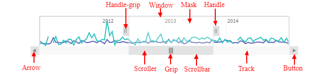
You can customize both the above sub-sections of the time navigator.
The styling of the time navigator in FusionTime is handled by SVG styling.
Customize the Time Navigator Window
You can customize the window of the time navigator using the style object under window object.
Refer to the code below:
"dataSource": {
"navigator": {
"enabled": 1,
"window": {
"style": {
"handle": {
"padding": "1px"
},
"handle-grip": {
"padding": "2px"
},
"mask": {
"color": "#ffffff"
}
}
}
}
}In the above code:
- Set the value of
enableattribute to true to enable the scroll bar of the time navigator. - Create a
styleobject under thewindowobject to add styling to the scroll bar. - In the
styleobject:handleused to style the handle element of the scroll bar window.handle-gripused to style the handle-grip of the handle element.maskis used to style the mask of the scroll bar window.
Customize the Scrollbar
You can customize the scroll bar of a time navigator using the style object under scrollbar object.
Refer to the code below:
"dataSource": {
"navigator": {
"enabled": 1,
"scrollbar": {
"style": {
"button": {
"padding": "10px"
},
"arrow": {
"color": "#ff0000"
},
"scroller": {
"padding": "1px"
},
"grip": {
"color": "#ff00ff"
},
"track": {
"color": "#ff0fff"
}
}
}
}
}In the above code:
- Set the value of
enableattribute to true to enable the scroll bar of the time navigator. - Create a
styleobject underscrollBarobject to add styling to the scroll bar. - In the
styleobject:buttonis used to style the buttons present on the left and right most corner of the scroll bar.arrowis used to style the arrows present inside the buttons of the scroll bar.scrolleris used to style the scroller of the scroll bar.gripis used to style the grip of the scroll bar.trackis used to style the track of the scroll bar.
Customize the Grid Line
You can customize the vertical grid-lines of the x-axis in the time navigator using the grid-line style in the xAxis object.
Refer to the code below:
dataSource: {
"xAxis": {
"style": {
"grid-line": {
"color": "#ff0000"
}
}
}
}In the above code:
- Create a
styleobject underxAxisobject to customize the grid-line. - In the
styleobject,grid-linestyles the vertical grid-line of the x-axis in the time navigator.