Reference Line
A Reference Line is essentially an arbitrary fixed line, which runs parallel to the time axis and is mapped to a specific value of YAxis. It can help you quickly compare any data point against a fixed value line.
Refer to the image below:
The salient features of the reference line:
- A
labelwhich is by default displayed on the opposite side of the YAxis, when you hover on the knob of the reference line. - A
valueis by default displayed in the reflect tag when you hover on the knob of the reference line. - A reference line can be customized in terms of shape, size, color, etc.
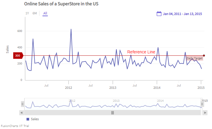
A chart with a reference line is shown below:
In the example given above, a reference line appears, parallel to the time axis. Hover on the knob of the reference line to see the label and the value.
Add a Reference Line
You can add a reference line using the following attributes of the referenceLine object inside the YAxis object:
- Use the
valueattribute to set the value at which the reference line should appear. - Use the
labelattribute to set the text of the label.
Refer to the code given below:
{
type: 'timeseries',
dataSource: {
data: dataStore,
yaxis: {
//Reference Line
"referenceLine": [{
"label": "Daily Target",
"value": 300
}],
}
}
}Reference Line in Multivariate chart
For multivariate charts, each chart canvas can have its own reference line. A chart with reference lines in each canvas is shown below:
The code to render reference lines in each canvas is given below:
{
data: dataStore,
caption: {
text: 'Pollution Control Report'
},
yAxis: [{
plot: 'Temperature',
title: 'Temperature (in °C)',
referenceLine: [{
label: 'Controlled Temperature',
value: '6'
}]
}, {
plot: 'Carbon mono-oxide',
title: 'CO (in µg/m³)',
referenceLine: [{
label: 'Controlled Carbon mono-oxide',
value: '3'
}]
}],
}In the above code, the reference line is set for both the canvases of the chart.
Multiple Reference Lines
In FusionTime, each chart canvas can have endless reference lines. A chart with multiple reference lines on a canvas is shown below:
The code to render multiple reference lines in a canvas is shown below:
{
data: dataStore,
caption: {
text: 'Pollution Control Report of China Town'
},
yAxis: [{
plot: [{
value: 'NMHC'
}, {
value: 'Nitrogen dioxide'
}],
title: 'Pollutants Concentration (in µg/m³)',
referenceLine: [{
label: 'Controlled NMHC',
value: '150',
style: {
marker: {
fill: '#A4A7D5',
stroke: '#A4A7D5'
}
}
}, {
label: 'Controlled NO₂',
value: '80',
style: {
marker: {
fill: '#87DEDB',
stroke: '#87DEDB'
}
}
}]
}],
}Customize Reference Line
You can use CSS styling to set the cosmetic properties of a reference line. To set the styling, instead of creating a separate CSS file, define the style properties in the StyleDefinition object.
Customize the line color
You can customize the color of the reference line by defining the styleDefinition object and set the color in an object. The code is shown below:
styleDefinition: {
"styleReferenceLine": {
"fill": "#ff0000"
}
}In order to understand better, we have named the object as
styleReferenceLine. You can name the object as per your choice.
After defining the StyleDefinition, use the styleReferenceLine as the value of the stroke property within the referenceLine object to customize the cosmetic properties of the reference line.
Refer to the code below:
{
data: dataStore,
styleDefinition: {
"colorstyle": {
"fill": "#ffff00" //color of the reference line
}
},
chart: {
},
caption: {
text: 'Online Sales of a SuperStore in the US'
},
yaxis: {
"plot": {
"value": "Sales",
"type": "line"
},
"referenceLine": [{
"label": "Daily Target",
"value": 300,
style: {
text: "colorstyle",
marker: "colorstyle"
}
}],
}
}In the above code, styleReferenceLine is called to set the color of the reference line.
The chart after applying the above attributes will look like as shown below:
Style Reference Line
You can render the reference lines as dashed lines, instead of the default continuous lines. To do so follow the steps given below:
Set the
stroke-dashattribute within the style object.To change the width of the dashed lines, set the
stroke-widthattribute in pixels.To set the transparency of the dashed lines, set the
stroke-opacityattribute.
Refer to the code given below:
{
data: dataStore,
caption: {
text: 'Temperature readings of an Italian Town'
},
yAxis: [{
plot: 'Temperature',
title: 'Temperature',
format:{
suffix: '°C',
},
referenceLine: [{
label: 'Controlled Temperature',
value: '10',
style: {
marker: {
'stroke-dasharray': '4 3'
}
}
}]
}],
}A chart with a dashed reference line looks like as shown below:
In the above example:
- The reference line has been rendered as dashed. The length of the dash has been set to
4whereas the dash gap has been set to3. - The width of the dashed lines has been set to
4px.