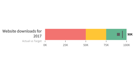
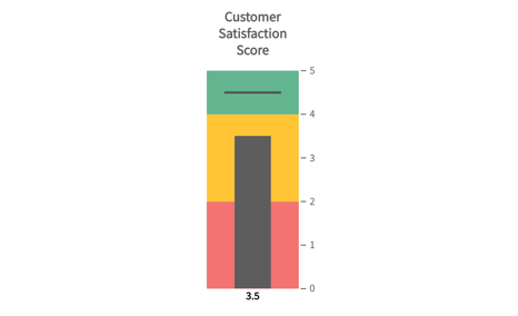
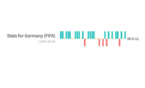
Bullet/Spark Charts
The bullet graph is used to compare a measure against a preset value while also showing the qualitative range the measured value falls in. It also indicates if the value is good, bad or ugly, and all this in a limited space. The gauge is rendered as a horizontal bar, divided and color-coded according to the qualitative ranges decided. It is used to display a single key measure. A horizontal line, the target line, is drawn within the horizontal bar as an indicator of the measured value
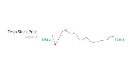
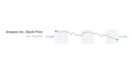
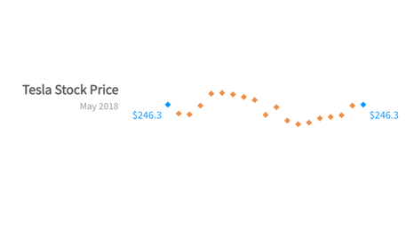
A spark line chart is similar to a line chart, except that it is a word-sized graphic used inline with text. Data values are plotted as data points that are then connected using line segments. Given that it is used inline with text, the size of the chart is same as that of the text surrounding it. This chart is not rendered with the x and y-axes. It is often used on executive dashboards to show several KPIs in a single view.