Area Charts: A guide for beginners
What is an Area Chart?
An area chart is like a line chart in terms of how data values are plotted on the chart and connected using line segments. In an area chart, however, the area between the line segments and the x-axis is filled with color.
An area chart is a good choice when you want to see volume change over a period of time, without focusing on specific data values. It gives a sense of summation of the quantitative data.
 Area Charts help in showing change over a time with an emphasis on magnitude. Play with more Area Charts to see for yourself
Why do you need an Area Chart?
1. Adds a sense of volume to your data
Area charts are primarily used when the summation of quantitative data (dependent variable) is to be communicated (rather than individual data values). The area underneath the line(s) helps in graphically depicting quantitative progression over time.
 is to be communicated (rather than individual data values)") The Google Music Visualization depicts popularity of different music genres through the ages
The Google Music Visualization depicts popularity of different music genres through the ages
2. To see part-to-whole relationships between groups
The distinctive feature of an area chart is the filling done between the line segments and the x-axis to emphasize the magnitude. When rendered with stacked data plots, the area chart serves well for a part-to-whole analysis of each category - members of any category can be summed on any common quantitative variable and the same can be stacked to see contribution of each member to the total. If y-axis is %, stacked area also helps in knowing the trend of percentage share of each group.

3. Analyzing trend of magnitude of a quantitative data
The filling between the line segments and the axis line facilitates understanding the magnitude, something which cannot be done using the line chart. This chart works better when used to plot a small number of data values, since the entire area is colored.

4. Comparing trend/proportion of each category
Area charts give a clear and concise picture of each group’s performance trends separately.
One glance at the stacked area chart on the right above gives you a clear understanding that while the food products’ sales have been consistent, the non-food products’ sales have shown a lot of fluctuations.

Business Uses of Area Chart
- Trend of magnitude of a single quantitative variable
 Area charts help in looking at the growth in revenue reserves of a public company, program participants of qualifying subgroup by year, trends in mortality rates over time by major causes of death.
- Comparison of contributions of multiple members of a category (or group)
 Area charts help in showing the difference between the number of people in each department, or support tickets raised for different issues
- To distinguish the relative part-to whole magnitude of a trend component
 Area Charts help in finding out how many leads came from which traffic source
 Area charts help in looking at the growth in revenue reserves of a public company, program participants of qualifying subgroup by year, trends in mortality rates over time by major causes of death.
 Area charts help in showing the difference between the number of people in each department, or support tickets raised for different issues
 Area Charts help in finding out how many leads came from which traffic source
Limitations of Area Chart
1. Only useful for comparing trends, not exact values
Reading exact data values from an area chart is not something easy. In charts with overlapped data plots, it is difficult to even make out where a data plot begins and ends. While by setting colors and transparency to appropriate values, the overlapped data plots can be made readable, with stacked data plots the solutions are even more limited. Area charts are also ambiguous to read when the data values are very far apart.

2. Works efficiently only for smaller number of groups
Rendering multiple categories on an area chart will make it difficult for a user to understand the data. In a chart with overlapped data plots, more the number of categories, more the overlapping, and consequently, lesser the visibility. The stacked area chart is comparatively easier to read than the overlapped one. Yet, it certainly takes considerably more effort in reading ones with many categories than it took for a chart with just two categories. For multiple categories, you might want to use the line chart instead.

Best Practices for Area Charts
- Start the y-axis at 0 to accurately reflect the proportionate difference in data.
- Use contrasting & transparent colors to improve readability.
- While stacking keep highly variable data on top of the chart, and low variable data at bottom
- Use a stacked area chart if you have to display the contribution of each value to a total over time
- However, if you have to show part to whole relationship in a case when cumulative total is unimportant, it is best to use 100% stacked area charts
Variants of Area Chart
Area with multiple series
The multi-series area chart is plotted with data values pointed as data points that are connected using line segments. The area between the line segments and the x-axis/edges of other charts is filled with color.

Where to use Area with multiple series?
- Cost vs revenue magnitudes over time for a company
- Export vs import magnitudes over time for a nation
- Birth and death counts over time for a region
Area with scrolling
A scroll area chart is used to show the magnitude of change over a period of time. A large number of data points can be rendered on the chart owing to the scroll interactivity. The chart is rendered with data values plotted as data points that are then connected using line segments. The area between the line segments and the y-axis is filled with color. A horizontal scroll bar is rendered at the bottom of the chart to navigate through the chart.

Where to use Area with scrolling ?
- Count of deaths over time for a country
- Federal Bank reserves over 5 decades
- Volume of trade of a particular stock
Simple spline-area
A spline area chart is a specialized form of the area chart that can be used for plotting data that requires the usage of curve-fitting. Like the area chart, data values are plotted as data points. However, instead of using straight line segments to connect the data points, this chart draws a fitted curve to connect the data points.The area between the curve and the x-axis is filled with color.

Where to use spline-area?
- Web visits in a month
- Sales revenue for multiple quarters
- Forest Spread area
- Defence expenditure
- Volume of oil import
Spline-area with multiple series
A multi-series spline area chart is a specialized form of the multi-series area chart that can be used for plotting data for multiple categories of data that requires the usage of curve-fitting. Like the multi-series area chart, data values are plotted as data points. However, instead of using straight line segments to connect the data points, the this chart draws a fitted curve to connect the data points. The area between the curve and the x-axis is filled with color.

Where to use spline-area with multiple series?
- Spread of urban area and rural area
- Spread of hot days and cold days in a region
Want to add Area charts on your web or mobile app?
Fusionchart’s expansive library lets you build and use insightful & intuitive charts in minutes.
Other related charts
- Bubble chart
 The bubble chart is used to visualize data that is defined by three numeric variables. Typically, this chart is used to compare and depict relationships between variables for analyzing patterns and trends in data.
- Candlestick chart
 A candlestick chart is used for analysis of equity and commodity prices.It allows showing the opening price, closing price, highest trading price, lowest trading price, and the trade volume on a single chart.
- Gantt chart
 The Gantt chart is used for showcasing timelines. It is a date/time-based chart that allows plotting tasks with their exact start and end date/time.
- Heatmap chart
 A heat map chart is a specialized chart that uses colors to represent data values in a table. It is mostly used to plot large and complex data.
 - Stacked chart
 Stacked charts are used to compare different data and show the composition of each item compared. These charts helps in displaying the cumulative magnitude of two or more datasets.
 The
The  A
A  The
The  A
A 
Area charts in action
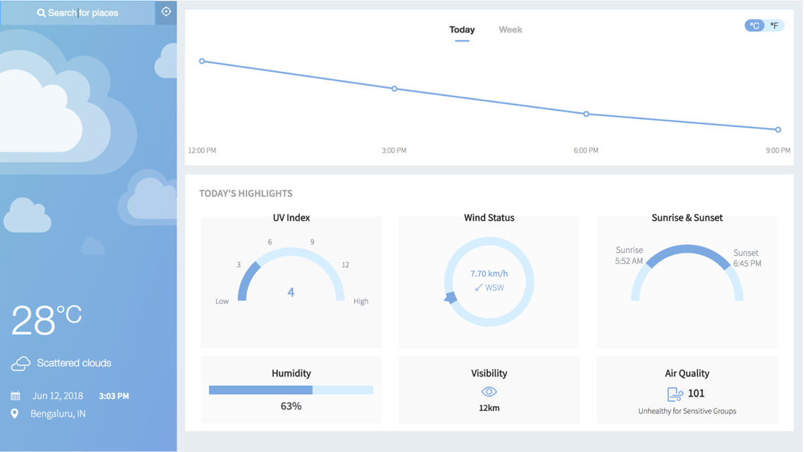
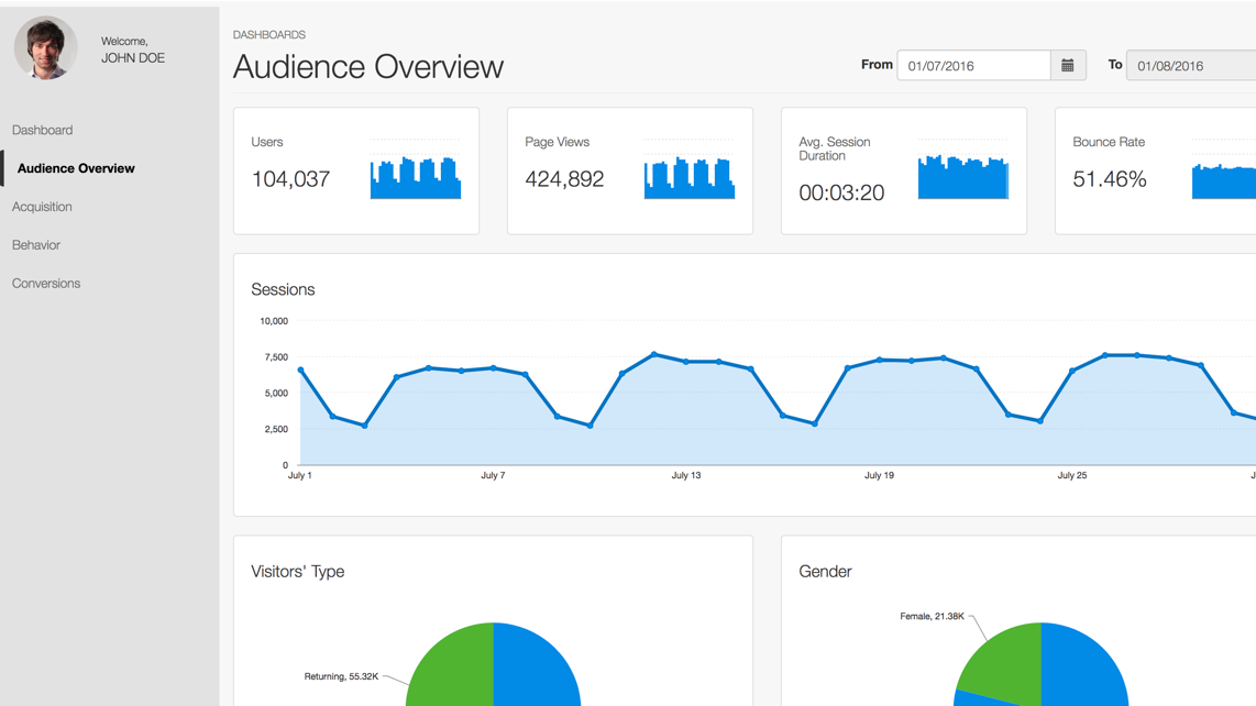
Business Dashboards
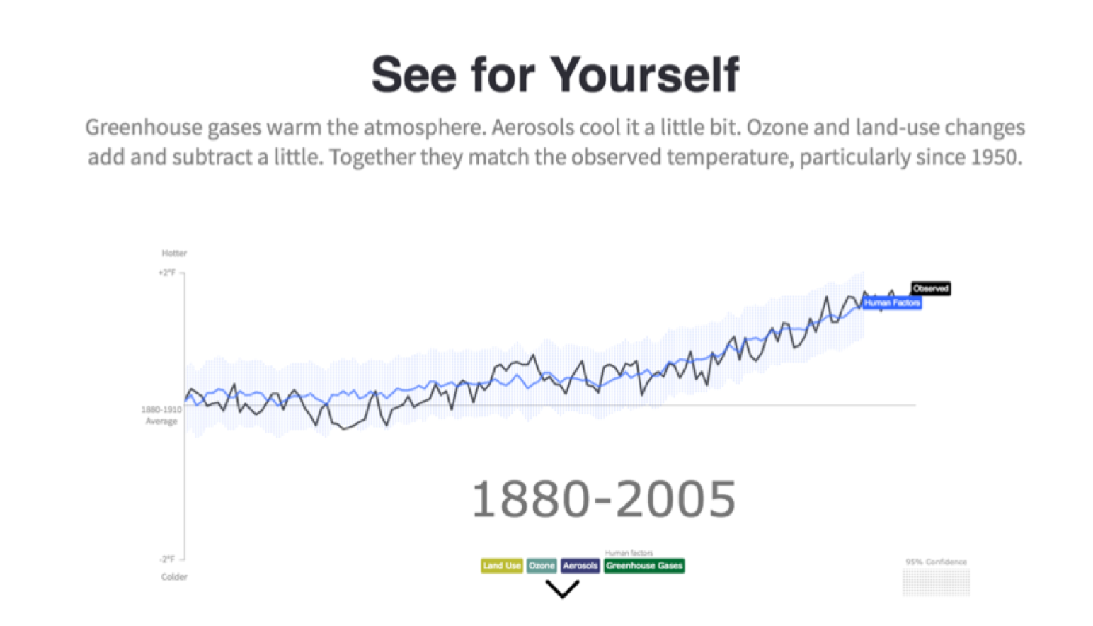
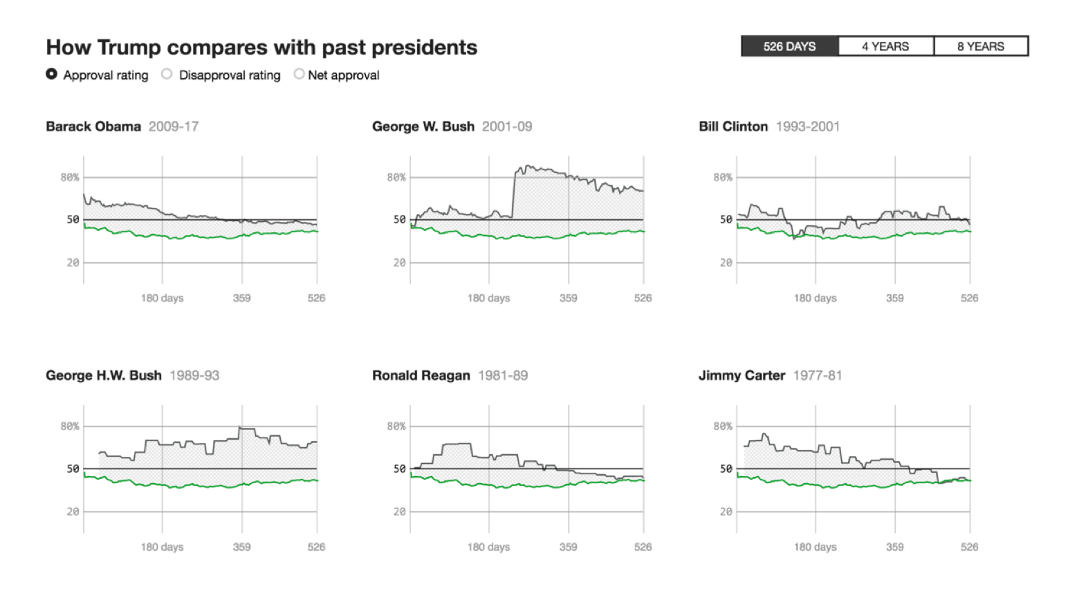
Interactive Data Stories
Want to add interactive charts on your web or mobile app?
Fusionchart’s expansive library lets you build and use insightful & intuitive charts in minutes.