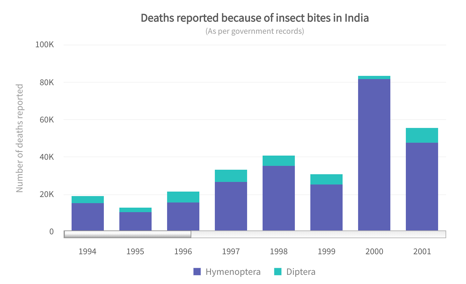
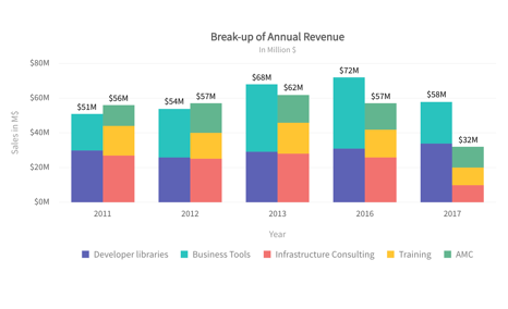
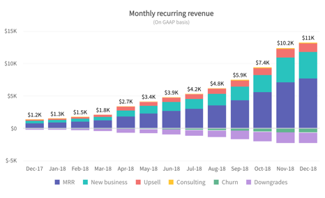
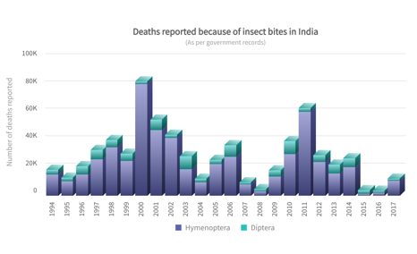
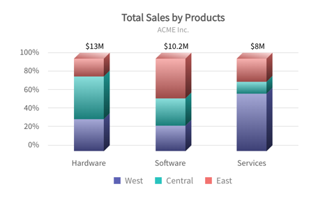
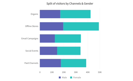
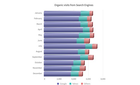
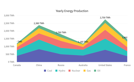
Stacked Charts
This type of visualisation depicts items stacked one on top (column) of the other or side-by-side (bar), differentiated by coloured bars or strips. A stacked graph is useful for looking at changes in, for example, expenditures added up over time, across several products or services. The graph integrates different data sets to create a richer picture of (the sum of) changes. Items are "stacked" in this type of graph allowing the user to add up the underlying data points. Stacked graphs should be used when the sum of the values is as important as the individual items. Stacked graphs are commonly used on bars, to show multiple values for individual categories, or lines, to show multiple values over time. Thus, stacked graphs must always work with positive values.