Overlapping Bars in JavaScript Part of FusionCharts XT
Related charts and Widgets
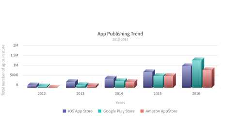
Grouped column in 3D with multiple series
Analyze and compare grouped sub-categories in 3D
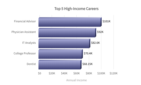
Bar in 3D
Visualize catagorical data in 3D for comparisons and analysis
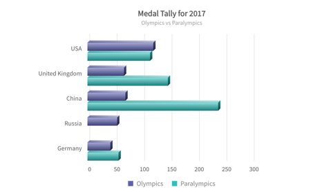
Grouped bar in 3D with multiple series
Analyze and compare grouped sub-categories in 3D
Build 100+ charts and 2000+ maps
Go beyond column charts and pie charts with our 100+ charts made for any kind of data. From area to donut and marimekko to radar, we’ve got all your charting needs covered. Don’t just stop at charts, with 2000+ maps, gauges and more, your dashboards and reports will become more meaningful and insightful.
Chart Gallery
Explore 100+ charts for your React application
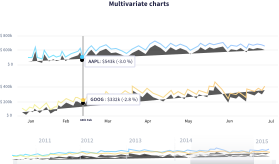
Time Series Gallery
Explore how to plot millions of data on a time-series chart in React
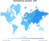
Maps Gallery
Render 2000+ Maps for your React project
Explore dashboard with bar chart
We have built over 20+ dashboards for various industries and use-cases. The best part of these dashboards? They are open source and completely free to use! Just download them and explore how you can use React Charts for FusionCharts in the real-world.
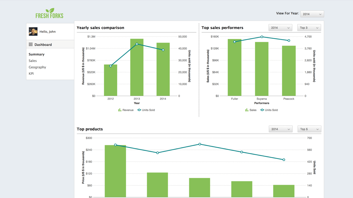
Sales Management Dashboard
Simplify sales admin functionalities with a centralized view of the location, people, product and inventory metrics.
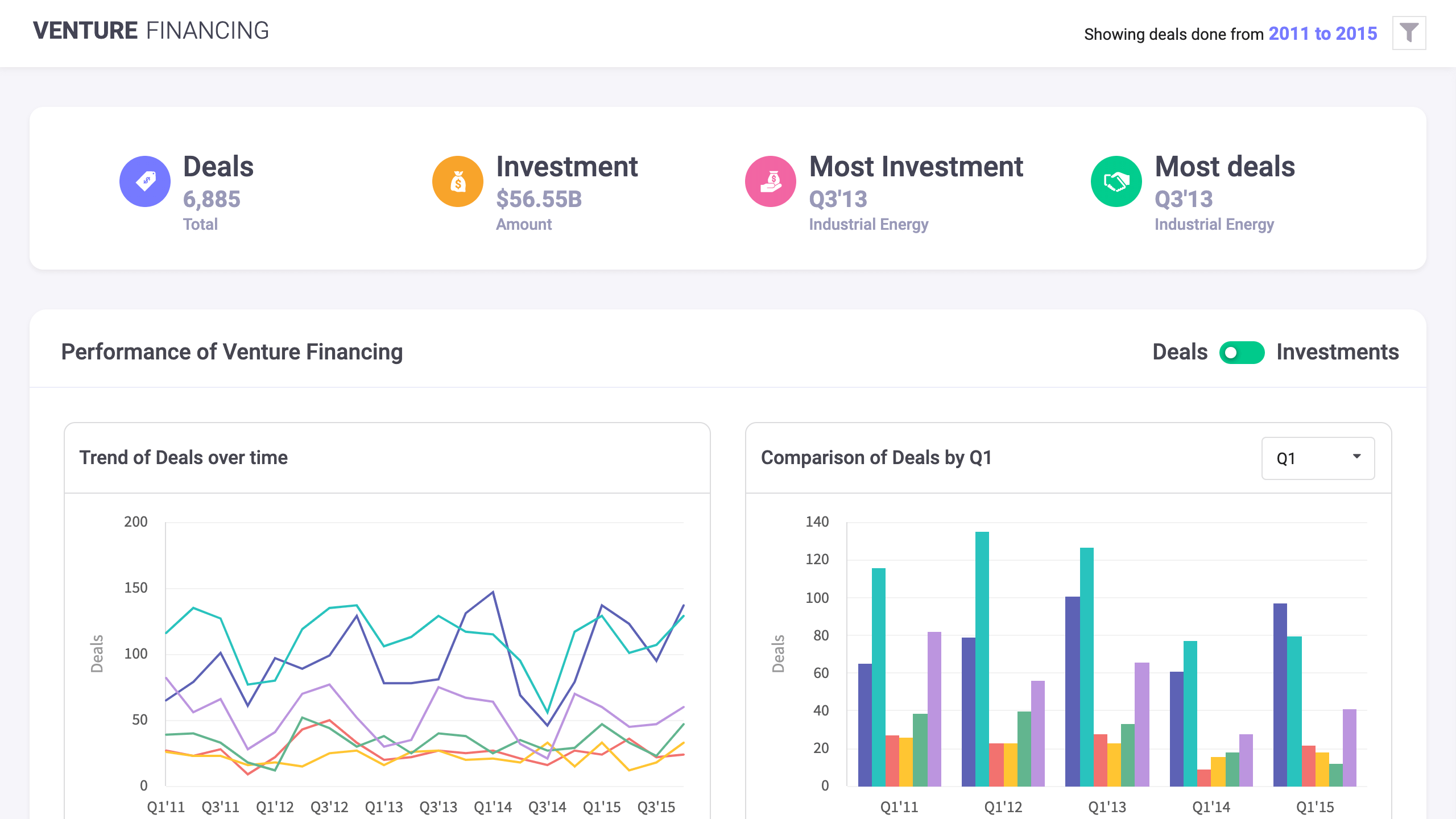
Venture Financing Dashboard
This dashboard allows you to see the trends in venture financing. It depicts the overall summary of the deals and investments in various sectors and compares them over a period of time.
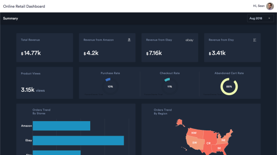
Online Retail Dashboard
The online retail dashboard shows the monthly performance of an online store. Important metrics like product views, purchase rate, checkout rate, and abandoned cart rate are also readily available.
