Jobs Gain & Loss
Data Story by FusionCharts
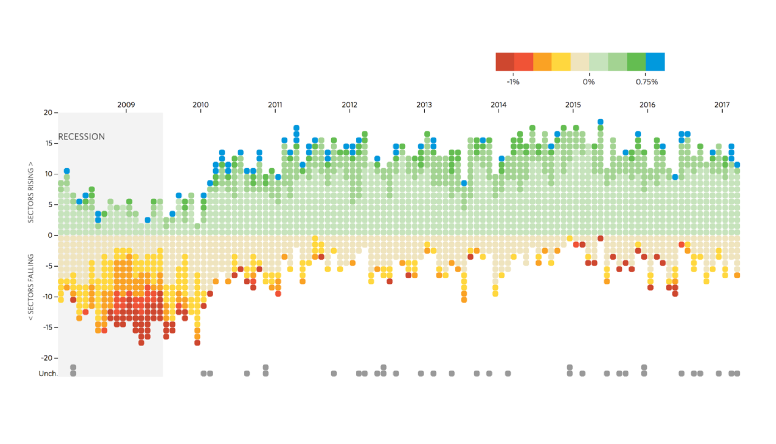
This story helps us understand the job scenario across different sectors over the years. The month-on-month percentage change in job count for each sector is plotted. It gives us a realistic picture of created or lost jobs. This used in conjunction with the ‘Unemployment Rate in the USA’ story, gives a candid picture of employment and job scenario across different sectors.
This sample dashboard is built using FusionCharts Suite XT, which needs a license for commercial use.
Want to use this Data Story in your projects?
We can plug in your data into our data story templates, or customize the template for your needs, or even build a completely new one. We would love to talk to you!