Statistical Charts
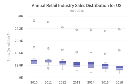
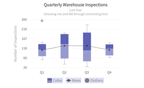
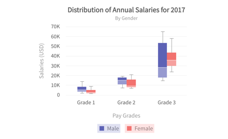
A box and whisker chart shows distribution of data into quartiles, highlighting the mean and outliers. The boxes may have lines extending vertically called “whiskers”. These lines indicate variability outside the upper and lower quartiles, and any point outside those lines or whiskers is considered an outlier. Box and whisker charts are most commonly used in statistical analysis. For example, you could use a box and whisker chart to compare medical trial results or teachers' test scores.
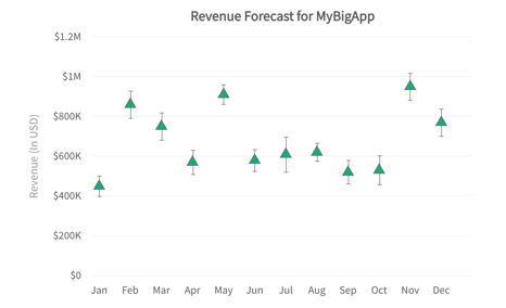
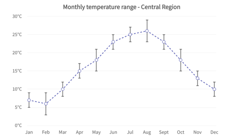
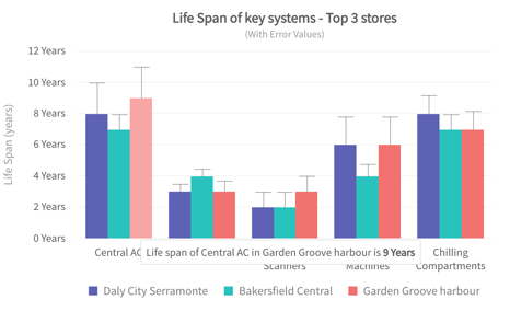
Error charts can be used to show the range of values that can be taken up by a data point, instead of being restricted to a point value. ... Error charts give a general idea of the accuracy of information or, conversely, the amount of variation in data from it's expected value.
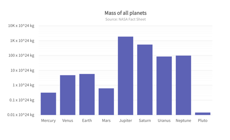
Log Charts are used to respond to skewness towards large values; i.e., cases in which one or a few points are much larger than the bulk of the data. The second is to show percent change or multiplicative factors.