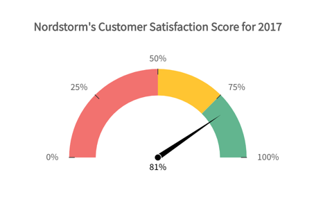
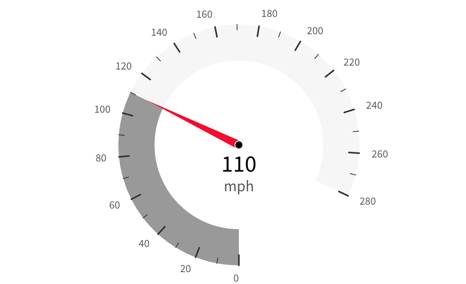
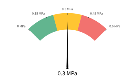
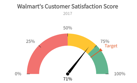
Gauges
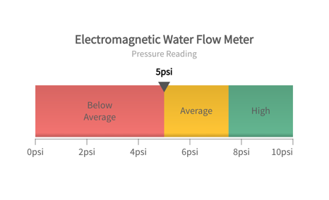
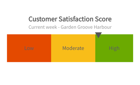
Gauge charts use needles to show information as a reading on a dial. On a gauge chart, the value for each needle is read against the colored data range or chart axis. This chart type is often used in executive dashboard reports to show key business indicators. Gauge charts are useful for comparing values between a small number of variables either by using multiple needles on the same gauge or by using multiple gauges. A gauge chart consists of a gauge axis (which contains the data range, color ranges, and intervals markers), needles, and a center pivot point.